
Hallo.
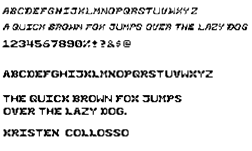
This is the face that I chose to develop more because it seemed to go in a more interesting direction. The X's came first (in the case of both the italic and roman face) and I based the rest of the letters, for the most part, off of the shape I formed with the strokes of the "x."
I am really going just for consistency now, and I realize that some characters still seem to stick out from the crowd, but I'd like to hear what everyone else has to say about that. My italics face obviously has some "wigglies" in it that seem to lean back to the left at the top (the W, M, and N are good examples). I am not sure if I like this...I don't think I do. No, I don't.
Other than that....I guess that's all I have to say about my face. Any and all comments welcomed! :) Thanx.
Posted by Kristen at January 27, 2005 01:27 AMHi Kristen,
I think it's crazy that you started with the x. I tried to avoid the x altogether... it's really hard!
The non-italic one is working pretty well for me. There is a nice overall roundness that is ironic for a pixely bitmap font. It has sort of a country western feel. Maybe it's the display font used on a virtual saloon. Push the B(eer) key and an ice cold one appears on your desk.
I think that your vertical strokes that are only one px wide feel like they're going to snap off like little bird legs. T, I, Y. I don't think just doubling it up would work but maybe go halfsies or give them a little weight just on the bottom so that they don't fall over?
I like the bigger bowl of the O rather than the smaller bowl of the D.
DOG, when viewed on its side, is a cute snowman/alien.
cheryl.
Posted by berkowitz at January 27, 2005 10:23 AMHi Kristen,
You are so awesome at everything you do. I know you think I'm exaggerating, but I'm really not.
If only I were as awesome as you. *sigh*
Posted by K at February 1, 2005 09:48 PMKristen,
I have been so interested in this typeface, since our first "post & share" session in class. It's got some sort of Country & Western thang going, and ordinarily that would make me cringebut it doesn't! It has that down-home, southern hospitality aspect vs. the whiskey-tinged twang of c/w music.
I hesitate to criticize the italic face, simply because I commend anyone who's given it a try. Having said that, the letterforms just aren't as sturdy as they are in the Roman face, and aren't deliberately delicate enough for it to be working on that level. It looks like the letters are reacting to someone blowing at it from the left... and yet, I don't know how to suggest a fix. It's so easy to be a critic...
On your Roman face, though, there's a really cool cross-stitch aesthetic. I don't entirely agree with "berkowho?" on the bird leg comment, but the "I" and the "T" and the "H" lose the stitchy quality for me. They just seem too linear to me. The "E" and the "F" are examples of linear letters that work really well with the rest of your system.
Ohand the elusive "K" had some really insightful comments, too. You should listen to her. ;o)
Posted by Tracy at February 2, 2005 12:02 PMHey K,
Nice work. I agree with TK - that there is a total western flare channeling through your work. Okay here are my thoughts. In terms of consistency, the sides of the B, P, K, F and such have a nice thickness with that little flare out toward the bottom - and I want to see this same treatment on the M and W - they seem too thin on the sides - but my suggestion is just to thicken up ONE side - not both as I think both would be too much. It think you can consider eliminating the top of the J altogether and just don't cross it - either that or shorten the cross piece on the top perhaps? It seems a bit left-heavy.
In terms of the Italics - the U, J and L stick out to me - they appear straight up and not tilted like the rest - try to even out their lean/slant like the others.
Just some stuff to consider - yee-haw cowgirl!.
Posted by Jessica G. at February 3, 2005 12:55 PMforms are nice'n'human -- hard to do with the bitmap. only criticism: watch out for blotchy bits in the letters that cause dark patches in longer texts.
Posted by pk at February 6, 2005 05:16 AM