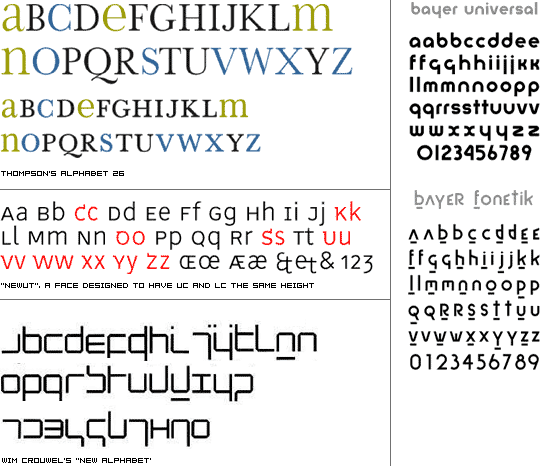
a typographic topic that has cropped up several times over the years is the issue of uppercase (uc) versus lowercase (lc) letterforms. historically i know of three different designers wrestling with this topic, and trying to resolve inconsistencies between certain uc and lc forms.
herbert bayer is the first i know of with the introduction of his universal alphabeta well known face from his bauhaus days. the basic argument is for consistency and economy of form. why have two symbols for the exact same thing? another is bradbury thompsons alphabet 26, which was done for similar reasons. check out this site for more info on that. finally, wim crouwel has his new alphabet, which was primarily designed to work well with emerging photo/digital typesetting systems in the 60s. regardless, it is a lowercase font with caps indicated by a bar above it. the result is one form per signified letter. then there is the whole realm of unicase fonts.
a few pros and cons to using uc ive identified so far:
cons: forms are different than some lc forms, makes less distinct and recognizable word shapes, more letters make it harder for kids to learn.
pros: greater diversity of letterforms to design with, more clear differentiation at sentence beginnings. once the forms are learned its easy to retain.
so what do you think? is society ready for something a little different/better, are the idiosyncracies charming (like folk art), should tradition be upheld without question, or would this just be like trying to implement the metric system?

I don't think that anytime soon Dr. Seuss's "Green Eggs and Ham" will be published with Thompson's or Crowel's unicase alphabets, but maybe one day, when they come out with PlayStation 22, and XBox 21, that might just be the mainstream for children's books. Realistically though, I think that like all other types of major changes in our society, universal type will have its chance to prove itself. Personally, I don't think that the human mind would accustom itself unicase type very easily. It would be too difficult to "pick out" the beginnings of sentences, or even names for that matter. Of course, I am speaking in the sense of book of text, or a long segment of body copy. I suppose my reference to Playstation 22 of the future is meant to illustrate the capabilities of the human mind to adapt to new ideas, things, or conceptssuch as body copy in a unicase alphabetbut only over a longer period of time that probably will not be in our lifetime. I love Thompson's alphabet as a display face, but just as all other such display faces i think they would never fit into the universe of body text that clear and concise upper and lowecase letterforms have occupied for so long.
Posted by Liollio on January 24, 2005 12:31 AM
good points, alex.
the first issue you raise has to do with change in general, which at least in design terms, seems to typically be incremental--evolutionary versus revolutionary. when dealing with reading, "revolutionary" change would involve a large paradigm shift such as learning hebrew or any non-latin language. it seems that evolution is the best answer if any change is worth making. that can be seen in the 500 year history of the production of metal types from humanist to garalde, transitional, didone, to sans and now bitmap. but i guess the issue is that through all of those changes the actual letter shape hasn't been altered beyond basic recognition--only subtle shifts of stroke contrast or overall proportion.
the issue of picking out names and sentence beginnings poses a couple of interesting problems--ones that the faces above don't solve. i've always thought the ending punctuation and space are adequate for separating sentences, but maybe it's not enough, especially at text sizes. ideally i would propose some system that utilizes both large and small forms (as thomposon's face above does--the uppercase is above, the lowercase under it), but that also retains ascenders and descenders for easy recognition of word shapes.
so are we stuck with what we have for the next 500 years?
Posted by tyler on January 24, 2005 02:28 PM
Very interesting topic!
I was just wondering about my native language, Kannada, which has 56 alphabets! If I had to learn all 56 alphabets in upper and lowercase I would have never passed my schooling!
Coming to think of it in all Indian languages we just have a single case. We use these letters as is never faced the problem of sentence structure like in the English languagethe first letter of the sentence and the nouns starting with uc.
The other interesting aspect I noticed comparing English and my native language, Kannada is that it has ascenders and descenders. They also follow a varied structure ratio. This quality helps it not seem as uniform as the English uppercase alphabets at the same time they look lively and dynamic in the copy.
About having single case for English language I think it is a great idea but impractical. Because we have a system that is been evolved for centuries to arrive at where it is now. Having a single case would be to set our clock backwards. If you really think about it out of 26 alphabets we already have six of them that are similar in both cases then we are left with 20 upper and 20 lowercases. Totally we still would be learning 46 alphabets, which is any day lesser than 56! :)
Posted by preethu on January 25, 2005 04:13 AM
Tyler posed two questions: "Is society ready for something different?" Perhaps.
"Is society ready for something better?" Of course!
But whether society will immediately embrace this new system is irrelevant. Too often we err on the side of caution, so it's virtually impossible to gauge what people are ready for when we give them little to react to. Let's continue to push conventional norms to their limits until we surpass the boundaries (boundaries which can also be defined as 'restraints')!
As it pertains to typography, and specifically to some of Tyler's examples, my reaction is this: Crouwel's "New Alphabet" is pretty cryptic, but as the pace of society hastens, the notion of deciphering alternative letterforms is more palatable today than it would have been in decades (& centuries) past.
Another thought regarding non-latin languages... hebrew, for example, has a set of vowels that Roman alphabet-ers would most closely associate with punctuation. These symbols rest underneath the letterforms, much like the Bayer Fonetik example above. It is also largely a unicase alphabet, though a couple of letters have a "final" form when it is the last letter in the wordbut English also used to have such letterforms, such as the final "s" (which looked like a lowercase 'f'), which goes to show that we have already accepted some fairly drastic shifts in our alphabet over the years.
My 2¢
Posted by Tracy on January 25, 2005 04:19 AM
This is just a funny observation of mine:
We are looking at Wim Crouwel's new alphabet and determining that it is not very legible, or rather, difficult to decipher. When this face was developed it was probably the most legible face for one of its intended uses, ubiquitous really low-res mono color computer terminals of that time period. I just think the lack of context and the seeming shift in our determination of legibility is quite humorous, though I do agree it is quite indecipherable for many modern uses.
Posted by Jon on January 30, 2005 01:22 AM
There is another typeface you might look at for this discussion: Cassandres Peignot. It has an uppper and lower case but I think he tried to design a single case alphabet (the forms are mixed) but then found readers needed caps for more comfort. Still I have seen this face used in lowercase only and it works well. Look at the new ascenders he invents. Go to Design Library slide database (http://www.databases.lib.ncsu.edu/design/slides/search/index.cfm) and type in Peignot for keyword and look at several examples.
Posted by Martha on February 8, 2005 08:38 PM


