Please post comments on these options.
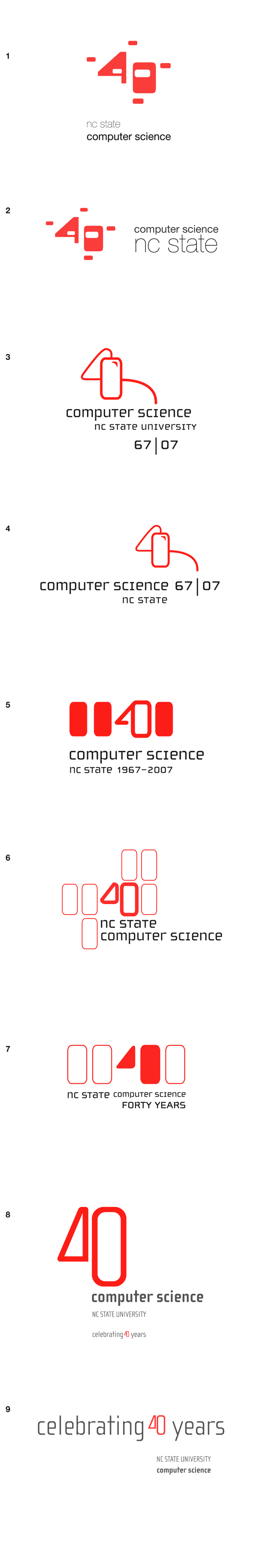

In my feedback, they mentioned that not having 40 years or 40th anniversary may have hurt the design? Does anyone else think that? Should that be added? (Mine are the first two)
Posted by Kalesia Kuenzel on November 14, 2006 10:07 AM
My favorites are designs 3 and 4
Carol
Posted by Carol Miller on November 16, 2006 11:10 AM
Designs 4, 8, and 9 are excellent.
Posted by James Lester on November 16, 2006 11:15 AM
The number 40 is toooo abstract and it's hard to understand what's all about.
Design 3 is probably the most discernible, because it actually gives the dates.
Maybe, if the number 4 is rededsigned so that it's easier to recognize,
some of the other designs will become more interetsing...
Posted by Harry Perros on November 16, 2006 11:20 AM
I like #3. It's kind of whimsical, but I think it's the most attractive. It's nice to include the years.
I think the first two and #6 are ugly, but then I don't have experience with punch cards and the memories that go with them.
Posted by Fay Ward on November 16, 2006 11:21 AM
#1 and #2 are OK, with a preference for #2. I'm surprised you're not using the font for NC State that is part of the university's official graphic identity. Doesn't have to be white font on red background, just
the same font would be good.
#3 and #4 OK, with preference for #4, although I don't like that "Computer Science" much larger than "NC State".
#5, 6, 7 I didn't care for - too many blocks, no meaning.
#8 and #9 my favorites, with preference for #8, this does use a font similar to the university logo.
Posted by Douglas Reeves on November 16, 2006 11:34 AM
I like 3 and 4 because of the simple clean lines and effective use of space. Number 7 would also be ok, and I would like it even better if it did not fill in the 40 (see number 6).
Numbers 1, 2, and 5 have filled in geometric objects and text, which I don't care for.
Numbers 6 and 8, and to some extent 9, are simply too big; inefficient use of space. In addition, numbers 8 and 9 have no real graphical appeal.
My favorite is 3. Least favorite is probably 8.
Posted by Matthias Stallmann on November 16, 2006 11:37 AM
Was not over impressed with any. In #1 and 2 40 what? Will everyone know 40 will represent 40 years? Do not like the way 40 is designed in # 3 and 4.
In 5, 6, 7, 8 and 9 the 4 looks as if the bottom was left off. Also in # 7 forty is misspelled. I would not vote for any to represent the department.
Posted by Linda Honeycutt on November 16, 2006 01:49 PM
1st choice is #5.
2nd choice is #3.
3rd choice is #1.
Posted by Carol Allen on November 16, 2006 02:17 PM
prefer #2 to #1 among those two -- landscape looks better but a mystery what we're celebrating if you don't already know it's a '40'...
Can't read a '40' in #3, #4, or #8 at all except bottom #8 which is redundant...
#9 is clearest on what we're actually doing...
graphically #5 looks best-of-show to me...
prefer #5 to #7 to #6 among those 3...
maybe #5 could say 'celebrating' somewhere....
Posted by Dennis Bahler on November 16, 2006 02:28 PM
Rank Order of Ones I like:
2
1
9
8
Posted by Jason Maners on November 16, 2006 02:28 PM
I like #6 the best. I wish that the "4" had a descender, because otherwise it might not be obvious that it really says "40". Other than that, I think it is the best looking.
I also like #4, except it doesn't look very "computery." #3 differs from #4 only in that it has a different footprint, which I think would make it more difficult to fit in printed matter. Other than that, #3 and #4 are equal in my book.
Posted by Ed Gehringer on November 16, 2006 03:25 PM
I like option 8 the best.
If you had not pointed out the punchcard reference in your email, I don't know that I would have realized it. I'm not sure an outsider would "get it" - the "40" design looks like abstract art if you don't know you're looking for "40.
"
I don't like the "40" design in 3 or 4. The date reference 1967 - 2007 in option 5 reminds me too much of an obituary.
Option 6 is ok - but option 8 clearly states the purpose "celebrating 40 years". If you added that to Option 6 - I'd like it, too.
Posted by Missy Seate on November 17, 2006 08:46 AM
I like options 1 and 6.
Posted by Ben Watson on November 17, 2006 12:33 PM
the first two options seem to seperate from their type.
i lose the feel of baloons in the second pair and start to lose the feeling of the mouse. is this purposeful?
5 and 6 seem to work best with their typographic bylines.
9 is most pleasing to my eyeballs in terms of color. i like the gray.
Posted by Kevin Lee McGee on November 19, 2006 05:28 PM
1 and 2) As a non-computer science person, I would not have "gotten" the punch card idea had it not been told to me before I saw the logos.
3)This is my favorite. The idea of the mouse forming the 40 is ingenious. However, instead of the 67/07 (since the 40 isn't immediately apparent to those who don't know it's supposed to be a 40), put "Celebrating 40 years" in the same location in the same font, but small. I like this font the best of all the logos.
4) This is my second favorite if it had the above changes. However, the logo is too wide.
5) I don't see the 40; I just see a 4. Plus the dates make it look like an obituary.
6-9)I don't see 40; I just see 4.
Posted by Ginny Adams on November 20, 2006 09:47 AM
Design 3 is my favorite
Posted by Carlos Benavente on November 28, 2006 09:59 AM
...and #3 has been chosen and will represent Computer Science's 40th Anniversary! Cheers to all the student designers.
Posted by Tony Brock on December 9, 2006 09:00 AM


