What are the main issues in reaching your audience(s)? What are your goals for this project?
Post links, thoughts, questions, etc.

I'm not up to fully tackling that problem yet, but here are a few links I have found that effectively categorize the audiences by age, enumerate the problems online, or summarize the problem concisely.
BeWebAware is a pretty bland web site, but it categorizes safety tips by age. That's nifty.
There's a video on Microsoft's web site that is similarly stale, but the actress isn't half bad, and it's funny when she says "pornography." (like she doesn't know if she's allowed to say it)
And for those who like numbers, CyberTipline has a very direct list of FAQs for those who want to sound credible.
I stumbled upon this which is pretty sick. Maybe someone can use it...
Finally, if you're not up on your leet speak, here's a quick how-to for creating ugly combinations of characters (also on Microsoft). ©1!¢X /\/\ξ
Posted by Joshua Smith on August 24, 2005 12:37 PM
issues
::k-12 is quite a broad range. i don't feel that a poster can act effectively on every reading and interest level...and gender for that matter.
::you have to get past the 'educational' value in order to reach every kid (my sis mentioned that there was a poster in the hallway about online safety in her high school, but "it's all stats and nobody reads it"). you have to do more than get them to look at it.
::we will have to get out of that pesky 11x17 format
goals
::create effective solutions to all above mentioned issues. get them to read and understand the message.
::provoke them to a point of becoming gossip
::scare them! :)
i have a dozen+ books on my desk about poster design, please feel welcome to peruse!
Posted by Jenna W. Bailey on August 24, 2005 08:35 PM
Im still in the gathering phase, but the main thought that comes to mind is how do I grab the attention of 12-17 year olds who are not interested in yet another public service announcement. Teens are especially bombarded with marketing and ads geared toward them to the point where I think they begin to filter what they digest visually. My thoughts have now been geared toward figuring out the balance of the visual/verbal elements. Which speaks faster or more pungently to teens?
I found interesting journal articles at Jstor, and other helpful info at protectingkids.com.
Posted by Andre Thompson on August 24, 2005 11:06 PM
andre, i couldn't access either websites. Jstor appears to be an educational database like WebCT and protectingkids.com was just a reserved url. am i missing somthing? thanks
Posted by Jenna w. Bailey on August 26, 2005 09:02 AM
well, i had a little conversation with my 15 yr old sister, she is a sophomore in HS. she said that she would be attracted to any poster that had bright colors and would be least attracted to photographs...unless used in an unconventional way. also, she brought up a good point... for high school age, and middle school too for that matter, not many kids want to be seen reading the posters in their school, especially one about sexual exploitation and internet safety. so basically, the heirarchy levels should end at "readable accross the room" and maybe keep smaller information (if needed) of a lesser importance.
with that said: i feel like this is a very challenging assignment. as of yet, i have 3-4 conceptual ideas, still in sketch form. i'd really like to try to design several (10-15+) limited designs (like 90% typeography, image, photo, illustration) and then combine or pick and choose. we shall see if this very new approach for me will work and keep my work load and stress levels down...this should be a fun and interesting assignment...let's keep it that way!
Posted by ERiCA McDonald on August 26, 2005 01:24 PM
having completed a very similar assignment myself, i'd love to see people start posting sketches (no matter how rough they are). get it out there, let it be seen!
+ + +
Thanks Mia!
Posted by mia on August 26, 2005 05:25 PM
"The poster is perhaps one of the few remaining sites for the graphic designer where the very essence of simplicty and functionality - the reduction of for or the use of visual metaphor - give rise to the purest form of visual communication."
Just a nifty quote I found in a book, Up Against the Wall, that I've been going through while I'm at work here. I think that a simple solution could be just what we need here, something that speaks, on the first level at least, stongly and succinctly without giving these kids too much to figure out - do we really want them to have to work to get this message? I don't think that they would hang around long enough, especailly given the piles and stacks of visual information that pour into classrooms and hallways. That's our challenge - to have this message heard over all others, over the tired crayon drawings of different colored people holding hands, and the pleas not to talk out of turn, chew gum, drop library books in mud puddles or chew with your mouth open.
So I think there's an opportunity here. And, with a few thousand iterations, I think we should be able to take advantage of it.
Posted by Libby Levi on August 27, 2005 07:08 PM
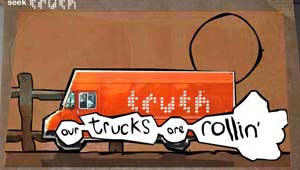
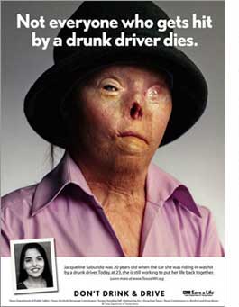
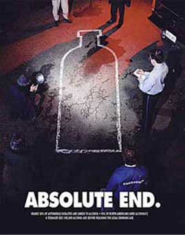
I found some good resources for our 12-17 group. First, the most memorable campaign for me in high school was probably Truth or that poster with the toe tag. Click on the images for more examples of effective postermaking.

or you can go to their main site.
Posted by Joshua Smith on August 28, 2005 02:11 AM
And I think the reason these campaigns are so effective is because they are
IMAGINATIVE
FUNNY
SHOCKING
KITSCHY
SCARY
and OUT THERE.
Posted by Joshua Smith on August 28, 2005 02:13 AM
Here's a breakdown of advertising messages:
HUMOR catches your attention, expecially for kids and teens, but humor may trivialize serious issues.
SHOCK TREATMENT provides a realistic look at an issue, but mayturn people off entirely. Also, clients may be reluctant to produce posters that they feel may be too controversial.
PREACHING has a fine line between earnestness and appearing to be patronizing
USING KNOWN FIGURES gets favorable attention, but sometimes people are so distracted by the figure that they forget the message.
GOOD POSTERS ARE:
relevant to their audience
interesting or entertaining
leave the audience with a message that can be summarized in a single declarative sentence
demand an action or response from the audience
are empathetic and simple in their execution.
This text was adapted from the educational packet on the last post
Posted by Joshua Smith on August 28, 2005 02:23 AM
It looks like it's all about hitting home. Showing something famliar in an un-orthodox way. We've all been in these age groups, and pretty recently compared to alot of people that are designing for them. Maybe we should look first at what would shock us and what would get us to read. Because we're Graphic Designers we've seen alot. So maybe shock yourself.
And wit is definitely going to play a huge role.
Posted by Islam Elsedoudi on August 29, 2005 06:24 AM


