Post sketches, roughs, image studies, and finals for online review.
Posters : NC DOJ Online Predator Awareness : Multiple Audiences (k-12)

Here are my first 4 ideas:
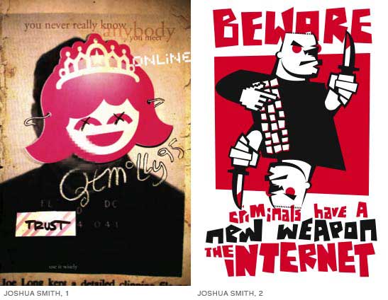
The first is intended somewhat universally. The bottom little tag says "use it wisely." (not really showing up in that size. The second is for elementary school. (I thought using the word like "criminal" was a better choice... not really exposing kids to fear of sex. That's a little premature...) The third is too intense and illegible, or not. I'm not sure. Jon, it's your idea. Do something better. The last is for elementary and middle school. Tell me what you think.
Posted by Joshua Smith on September 2, 2005 01:41 PM
Josh: These are all pretty solid beginnings. Here are some initial thoughtsmore to come.
#1The hidden identity/false identity spin is tough to pull off without a secondary level of info or a serious kick in the gut visually. Image can be pushed here. Consider including a URL to the DOJ page. Pointing to additional info even the simplest way is a good policy for all posters.
#4You approach the same issues here as in #1 and I am drawn to it more than most such approaches play off the IM/iChat visuals. You seem to have more control in this one. Maximize the pageincrease scale. Nice qualifier visuals and text. Change criminals to 'scum' or some suchwordsmith here.
#2The illustration just says "tough, mean guy with knife"leverage the illustration to have double meaning or secondary meaning. Maybe you are trying to do this with the mirror image but I am not reading it. Not too sure the knife will make it into the schools. Good that you are considering the 'criminal' verbiage here vs. sexual tones. What other terms can you use or how can you be more specific with this age without loosing them?
#3 This is a solid idea. Lets see some additional treatments. Maybe you and Jon can team up on this one.
Thanks for posting. More from me soon.
Posted by Tony Brock on September 4, 2005 08:50 PM
Josh,
I'm sure you've made a lot of changes by now, but here's a few things I wanted to put out there.
On #2, I dig the illustration style. I think that this is a language that might speak to high school kids. It reminds me of a low-fi gorillaz video. However, Tony made a good point that the knife isn't going to make it into the schools. But, really, is the knife his weapon? You're aren't trying to scare kids as in nightmare on elm street, but really warn them/scare them into being careful. Nice sneak in of the "hand" and whatnot. I think the composition is working for you, but the content isn't quite there.
#4. The kind of tagline you've developed at the bottom is nice. Good visual play on words. But, this seems like part of an identity that could be put on any promotional piece at a very small scale with a URL. Unfortunately, its not strong enough to hold that poster together. Don't give up on using some sort of identity with your posters, though.
#3. digital language is good, but its got to be easily read, especially from across the room. think about contrast. also, consider other ways of comparing the photo to the actual person sending it. It reminds me a lot of a poster F. Causby did for this project (I'd link it, but it seems he has taken it down off his porfolio. Maybe Tony can dig it up.), and it was really subtle, but hit the false identity thing right on the head.
Good luck.
Posted by mia on September 6, 2005 10:52 PM
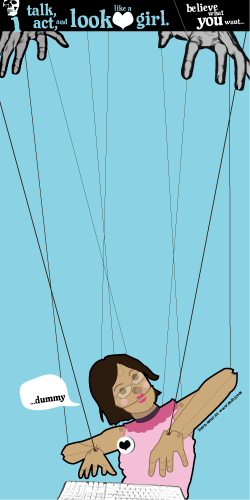
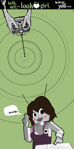
Hey guys, I thought i would post my most complete iteration of this assignment. I want the design to be understood quickly and have an impact. I think it's best if a poster like this in its environment can be read discretely to avoid embarassment. I also wanted to steer away from computer-related imagery and thought the "wolf in sheep's clothing" adage would be understood and taken seriously by all age groups. By literally putting this adage in the hands of a child in a form with which they are famliar (the paperdoll), it shows them the amount of power they posess in protecting themselves as online chatters.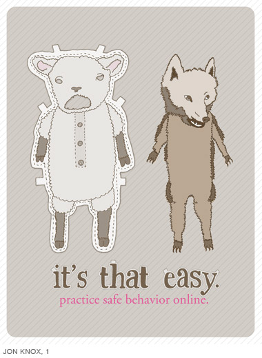
Thanks in advance for any input. More ideas/iterations to come.
Jon Knox
Posted by Jon Knox on September 7, 2005 09:53 PM
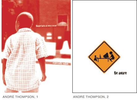
I have been approaching this in different directions, and there many paths I can take. I have been trying my hand at illustration, which is something I do not normally do. The one photographic piece was a spare of the moment opportunity that I was able to take advantage of.
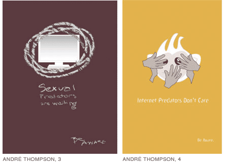
#1 Danger lurks around every corner... especially online.
#2 Be Aware
#3 Sexual Predators are waiting... be aware
#4 Internet Predators don't care... be aware
Posted by André Thompson on September 7, 2005 10:40 PM
Ok, here's a second round
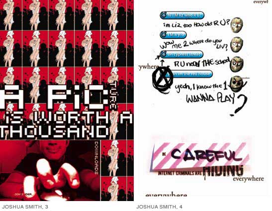
The first as of now seems to wordy. I kind of got into a drive that didn't stop until I saw lots of shapes and words, all of which made sense at the time. The second idea works much better. There is a conflict when I use the words "sexual predators" and "kids." That in turn speaks to two different audiences. More ideas coming tonight or tomorrow...
Posted by Joshua Smith on September 9, 2005 11:51 PM
here's my first poster that i like...hopefully one more to come. the audience for this one is k-5 however i think that even older kids... grades 5-12 might think it's cool too (due to the memory of the seame street song). i tried to integrate the type, yet have it be easy to read and understand due to the reading levels of the k-5 group. i really like the image...should it be on white...should i add a bright boarder around it. i'm just not sure what a solid color would look like due to the many colors already used. i call it BAD BUDDY.
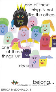
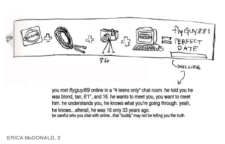
Posted by ERiCA McDONALD on September 10, 2005 07:22 PM
this is just a sketch of a long poster...prob around 2ft x 8ft long and would essentally be folded to mail. it's the simple math idea...condom+rope+tripod and camera+downloading computer= flyguy89's perfect date and a blurb at the bottom that reads:
you met flyguy89 online in a 4 teens only chat room. he told you he was blond, tan, 6'1'', and 16. he wants to meet you, you want to meet him. he understands you, he knows what youre going through. yeah, he knows...afterall, he was 16 only 33 years ago. be careful who you chat with online...that buddy may not be telling you the truth.
so that's my idea.
here's a pretty valuable thought. i was asking my boyfriend how would i make this idea work for a teen boy. he said that it wouldn't. he doesn't think that "meeting" is the issue for teenage guys. he mentioned an experience he had in a chat room when he was in 8th or 9th grade. he went into a chat room to meet girls, and he went into the heterosexual chat room and he was talking with "sexygurl86" for instance and he asked to see a pic...and "she" said no, you first...VIDEOCHAT with me, and he said NO...you. and then this naked 30 something guy popped up in the videochat window. needless to say, no more videochat in chatrooms for him. MAIN POINT: for teenage guys, a bigger issue might be sending pictures or videochatting with a questionable person, or sending theirs first thinking it's some really hot babe. another thought to ponder for those attempting this project.
Posted by ERiCA McDONALD on September 10, 2005 09:03 PM
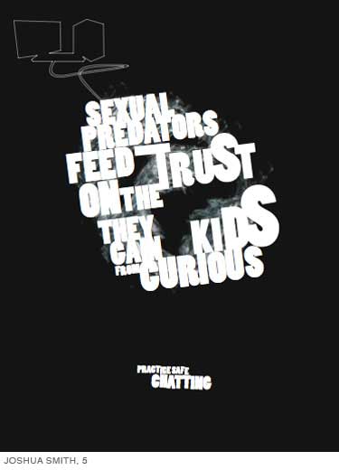
Josh, i just looked at yours harder, the black one just above my posts, the words don't make any sense...i read, "sexual predators feed on the trust they can from curious kids" or "sexual predators feed trust on the they can kids from curious" i know what you might be trying to say, but it seems like a word is missing or something. i like the orange (golden yellow) one better. the image is more captivating and the text is interesting, but still readable and easy to understand.
Andre, keep going with all but #1. it seems too "public school system put it on the wall" and i think kids would ignor it. it lacks a shock value. i like #4 the best because of the message, maybe refine the image to something more understandable...i don't know what tho...sorry
Jon, could you make the sheep smile...look more friendly? and green (like a lime green) pinstripes in the back...i think it would POP more on a school wall. just try it...i could be very wrong...
that's it! yay!
Posted by ERiCA McDONALD on September 10, 2005 09:17 PM
Ok, so I got my 11-year-old cousin and her friend over here this afternoon for a round of photos in the Brooks basement - more on that to follow, when i get them turned into something - but I showed the two of them most of the posters stacked up in the front and posted around the studio, to get some feedback from our median audience (7th grade).
So here's what I got, I hope it is much helpful:
Josh, all of yours caught thier eye, so good job on that, but they had a difficulty "getting" them, especially the "picture is worth a thousand downloads" one. Also, they didn't get the hand-written bits of the iChat one, but I personally think it's right on the mark - maybe it speaks to an older audience than these two. Also, the orange one in your second post really got thier attention in a "I can't beleive it says 'sex'" sort of way. So if you could actually get it into schools, I think that could be a way to demand major attention.
Jessica, I showed them the one on your desk you've been working on, and the concensus was "too many words," but i think that came more from how they were positioned all in one area...
whoever did the creepy man - I can't remember - they really reacted to the image (as did my aunt) but then decided he was more funny than creepy. So, maybe go for creepier? When I asked them what "creepier" meant, things as varied as "older" and "more tatoos" came up.
Jon, they thought the wolf/sheep was clever, and there was definately an "ah-ha moment."
Also, I was talking to the girls about what they would look at while I was taking thier pictures, and they said that rhyming or illiterative (points for them knowing that word already, by the way) slogans were a sure sign of "dorkiness," but that using im-talk was definately cool. They also seemed to like the idea of pictures that sorta told stories, which is making me think that posters showing cause-and-effect relationships could be a good direction.
Posted by Libby Levi on September 10, 2005 10:08 PM
alright, so I lit a fire under this. Let me know what you think.
An attempt to hit home on the issue of online profiles, which seemed to be a new idea for the girls I was taking photos of. So I think that needs to be addressed. I plan to add some text, but I'll have to come up with it first.
I took the idea I had from last week and added a photo, one to add a second level of interest and two, because my "focus group" was much more interested in posters with photographic images. The vertical text reads "Just because something happens on the internet doesn't mean it's ok, or even legal. Talk to a parent, a teacher, or even the police. It's never alright for someone else to make you feel uncomfortable or unsafe, even online"
This is one of many photographic studies of the ransom note. I don't really know where to go from here, and would welcome any advice.
Posted by Libby Levi on September 11, 2005 02:17 AM
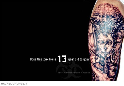
The small type at the bottom reads: he can be whoever he wants to be online
I'm thinking that a series in this same vein could be effective. Focusing on body parts: mouth, hand, hair, etc. The copy could use some work I'm sure.
I'm also trying to find a logical and visually interesting way to use the concept of JAILBAIT. It's such a loaded word especially in relation to the topic. I don't really have any visuals attached to this thought yet
Posted by rachel gamage on September 11, 2005 02:42 AM
JON KNOX, poster 1
Simple can be effective. This is a case where illustration is being used for the right reasons. There is a ho-hum, matter-of-fact feeling here but the illustration gives it enough of an edge while supporting these qualities. The tabs hint at the action of putting on the suit but a small arrow pointing from the suit to the wolf may further connect the its so easy text. Along these lines, consider how you might reconfigure the two main parts of the illustrationthis wouldnt be to complicate the visuals or the message, but to see how an identity of these parts can be built over a series of posters. What would a grid of 9 (8 suits and one wolf) offerbasic compositional relationships that might develop your wolf character and build a dynamism/story between multiple posters.
Practice safe behavior online seems to an odd fit with the text above. There are two actions discussed in the piece: hiding ones identity for questionable purposes and practicing safe behavior online. Are we practicing safe behavior online by making our identity easily masked? Nope and to interpret this as such is a stretch, but it would be more proactive to tie these two things together. Be specific in how one should practice to respond to the ease in masking identity. Your audience may have no clue in how to respond to your directive. This doesn't need to be long and drawn outjust make every word count.
Think about age range. Is the illustration too cute for young kids and not sarcastic enough for older ones? Wordsmith, and iterate within the palette you have created.
+ + +
ANDRÉ THOMPSON, poster 1
The use of photography such as this is a good question to raise. Does it feel as though the author/designer is speaking to kids? What is assumed of an audience when you use this sort of photography and message? Would one see this as too much of a top-down PSA that mimics being effectivemimics speaking to the intended audience? Does it do anything more than describe the water when someone is drowning instead of jumping in? If you are going to describe the waterthen you better know it in detailboiling ice at the molecular level. Generalities or simple messages can be presented with devices that allow for the most basic to be memorable. Employing illustration or photography or words to leverage their greatest impact is what you need to striving forpretty obvious, but this is a case of questioning our media and what it CAN do very well. Are you wielding photography to make an impact or just describing the water for some other audience?
ANDRÉ THOMPSON, poster 2
There is a language of such literal signsmany have used itdo it so we dont have a 3 second experience with the poster and walk away. Haunt. Nag. Inculcate. Be memorable.
ANDRÉ THOMPSON, poster 3
Yes they are. Now make something that makes me want to do something about it.
ANDRÉ THOMPSON, poster 4
Yes they DO. Now make something that makes me want to do something about it.
+ + +
JOSHUA SMITH, poster 5
It reads: Sexual Predators Feed Truston the they can kidsCurious? This is far more interesting than what you intended. FEED TRUST is pretty rich. Nice type, good to see use of b/w. It has presence but no soul.
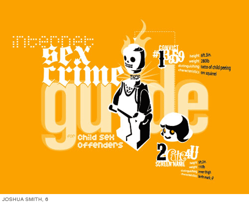
JOSHUA SMITH, poster 6
This one is memorable because of the bit about the tattoothis is squeamish ground this is not passive. In a very few words you have painted a world that I didn't know about, didnt want to know about, and am not sure if I should know aboutdid I just grow up too fast? How do you do this sort of thing without the PTA burning your poster. Is this too vivid? Did you just spark something in me that was dormant? Are you too effective and now you have turned on my wacko gene? How do you stay on this line and make sure you are still doing the public a service? I do not want to see someone get an idea for their next tattoo.
This one is rich with text and visual possibilities. It is feeling like a branded aesthetic. What would a series look like?
+ + +
ERICA McDONALD, poster 1 + 2
Wacky-cute illustration. Wack-good. Cute-good. This is all true, but then... Your k-5ers may be far more sophisticated than you are giving them credit and your 9-12ers may bounce a chuckle around but dismiss the message.
Explore a broader range, post stuff that you do NOT like and make this process much more open. Talking to your boy friend about his online experience in a chat room is what you should be drawing onthis gets you beyond the obvious so you can do more than describe the water I am drowning in. Assume that all your audiences have heard about online predators, seen all your posters, and have gone online ANYWAY because of some need for friendship OR you made them curious and they want to mess about and play dangerous. What do you say to them that would be meaningful? Think about the full cycle. It is not about warning them of the danger.
+ + +
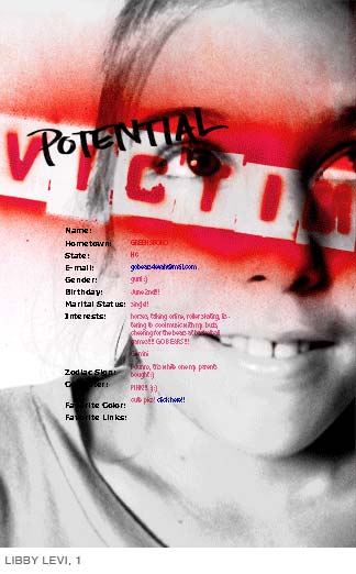
LIBBY LEVI, poster 1
A girls online profile or offline profile is very important even if she shuns societys eye and dons all black. This is where you will find a reason for speaking/designing. This is the research that you need to find a reason to address. The poster has a fair dynamism to it. The girl is not frowningshe is moving forward but being stamped/stopped by your type. What is happening with the blood running from her eyewe read this and it is detail like this that keeps me from walking away and thinking that this is a mere top-down PSA to make someone feel good about their poster benevolence. More photos, more details, play out a series.
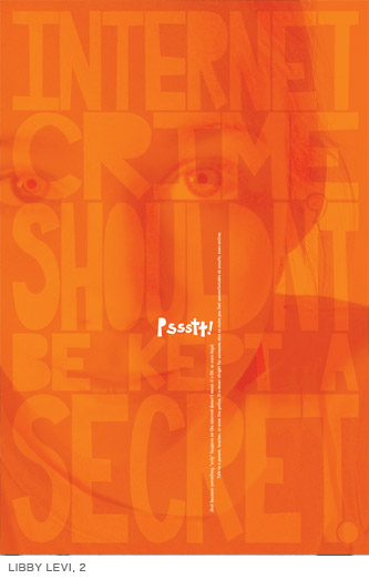
LIBBY LEVI, poster 2
Loose the kid in the background. Explore the levels of reading that could take place. Shift the kids photo to a story about the kid or any kidmake this a story that one stands and reads if they choose. You hint, you draw in close, you give general detail, then you give the punch, then you give a way to find more info. What would a text reading experience be like that never seemed to endthere was always a few more lines of 6pt type that I could read. GIVE ME MORE FACTS, DETAILSforget those who will not read it, some will and those who do will have more than your standard information when they walk away. This is an interesting start with the scale and orientation shifts. Explore further. Explore the push and pull of typographic message and modes of writing. Good colorgrab + alert.
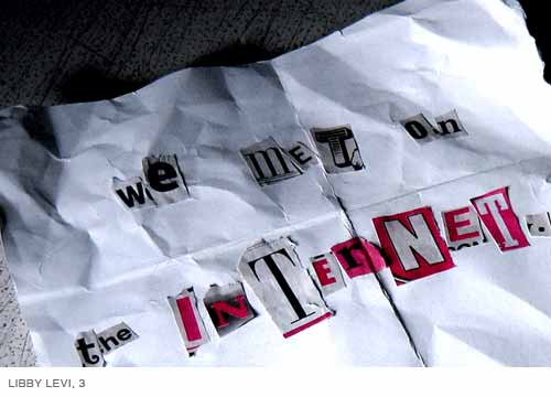
LIBBY LEVI, 3
I responded to the care that was put in the presentation of the statement. It was purely a response to typographic presentation. You are doing this to some degree in poster 2. It is not just about choosing a typeface. It is the quality of the form. I responded because the image and text carried more detail than most type messages that are up in the studio. What is it to cut letters out of a newspaper and tape them to the page. The script, circus fonts, etc. loose their meaning while retaining their form. This is powerful. It also has to do with the texture of the page and engagement with materialsthese all bring meaning to the final word. There is a tendency to erase much of this level of communication when you do RESEARCH! and you COMMUNICATE CLEARLY!
+ + +
RACHEL GAMAGE, poster 1
The mechanics of text to image and length of text, etc. are in proportion. This a bit more complex strategy to talk about hidden identity without complicating things. Feels like advertising, works like advertising, put it on a billboard. Now, can you do some fine PS work with a custom tattoo that maintains the affect of this one while giving us a secondary punch?
In other news: Hey! Tattoos are coolI would like to know the guy with that onebet he is cool! I want that tattoo! I am a rebel and I need to go online and meet a hardcore rebelthat's the guy for me. Give me an IM account quick!
Nice control of form as advertising mainstream. What next?
+ + +
Thanks to those who posted. Please read ALL the comments aboveif notes toward the bottom get shorter, it is because it has already been stated above. All should leave further comments. Last question: What kind of word-play can you employ at what age? See you in class tomorrow. Cheers.
Posted by Tony Brock on September 11, 2005 10:38 AM
Playing off a concept Travis used last year, here are some text only "posters" with double meanings. Hopefully if printed correctly (working on it) you can read the disguised reddish message from far, but you can see something is wrong up close, thus you read the hidden message. When you do it says at the bottom, "be safe online. don't share personal information."
also i tried to consider printing all three on one 11x17 and having a bunch of these everywhere.

want to meet somewhere? / want to BE MOLESTED?

want to share pictures? / want to BE EXPLOITED?

click here for my pics! / click here for my TRAP!
Posted by Islam Elsedoudi on September 11, 2005 05:19 PM
Here is another iteration that moves outside of my first four. Comments? Suggestions?
Posted by Andre Thompson on September 11, 2005 11:44 PM
Okay, it is time for feedback fellows.
#1 is trying to expose the actual predator vs. his online identity. Not sure what information or tag line would be included...but I know it needs more context in order to get the point across. target age group: middle and high school
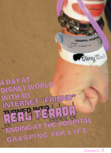
#2 is from the victims POV. If this idea has potential, I would like to get a 'real' hospital tag and play it up a bit more. Perhaps make the hospital bracelet more prominent than the misc. admission IDs.
#3 is again, from the victim's POV. I WANT TO USE A TRUE/REAL CASE STUDY HERE. Although I believe the copy needs to be cut down, I'm not sure how to do it.
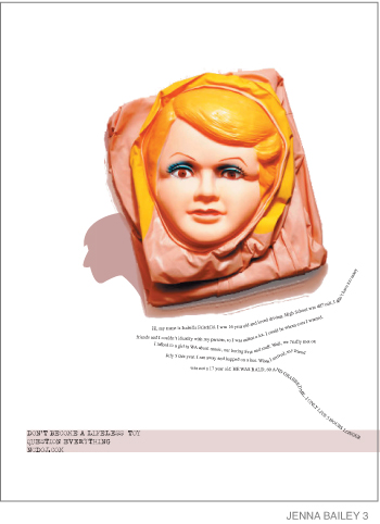
Copy/Words: "Hi, my name is Isabella Fairchild. I was 16 year old and loved driving. High School was difficult, I didnt have too many friends and I couldnt identify with my parents, so I was online a lot. I could be whom ever I wanted. I talked to a girl in WA about music, our boring lives and stuff. Well, we finally met on July 5 this year. I ran away and hopped on a bus. When I arrived, my friend was not a 17 year old. HE WAS BALD, 60 AND GRABBED ME...I ONLY LIVE 5 HOURS LONGER... DON'T BECOME A LIFELESS TOY. QUESTION EVERYTHING NCDOJ.COM"
If anyone has ideas about the copy, please let me know! I'm strugglin'
Posted by Jenna W. Bailey on September 12, 2005 01:45 PM
this poster plays off of the words "virtual playground for internet perverts" that Melinda Collins quoted.
it reads:
Internet Chatrooms
AKA
Virtual playground for Internet Perverts
AKA
a place for [RomeyO24576] to pretend he is 13 again.
Posted by stacy on September 12, 2005 05:09 PM
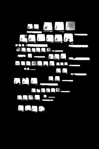
Here is my latest iteration. I want to see how I can manipulate the audience into experiencing the poster. As mentioned in critique where do I leave, or direct the audience? What are the opportunities to further the language and experience?
"We met online she thought I was fifteen... ha ha ha she didn't have a clue"
Posted by André Thompson on September 14, 2005 08:34 PM
I am noticing a trend of telling kids what not to do. We all know how effective this is. Perhaps one of you will like to approach the idea of "setting a good example". Instead showing bad things that happen to you, focus on safe methods that that need to be emphasized. This carries a positive reinforcement that is lost in a scare tactic. Guiding the audience in the direction of how best to asses a situation is different than telling them when they are going to die.
Posted by ANNAW on September 22, 2005 02:02 PM
I'd like to add a few comments about what's been posted so far. It's nice to see you guys tackling a 'real world' topic in interesting ways.
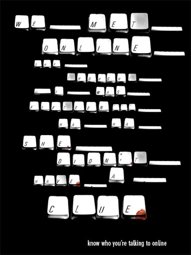
André > I really enjoyed your poster. I got it RIGHT AWAY, and I appreciate that in a poster, because it's harder than one initially thinks to make a poster understandable instantly. I've had various models of Apple computer in my house since 1986, and this is how every key has been labeled. But what is part of personal (and cultural) history may not be understood by others; Apple has something like 3% market share, and some of their newer laptops abandon this italic face for something roman and shorter. So while I love the basic idea, it might be nice to see this explored to become more universal.
Another thing that I really liked about André's was that it dives in to using the language of technology itself (and Josh, you started this in your #4 with the IM elements and in #2 with the mouse hand pointer). Instead of the scare tactic (more regarding Anna's comments later), it gives the poster an analytical quality, leaving the message to act almost as evidence of an unseen action. I would love to see more posters starting to adapt this technological languagebut again, in a more universal manner. There's a galaxy of elements out there that kids are picking up from using PCs daily: the Start button in the lower left corner, the icons of C: and D: drives, things appropriated from popular games or AOL, to name a few examples. If people see things that they can relate to something they're already familiar with, they're more inclined to interact with the poster.
Jon > I get a good deal of enjoyment out of seeing the idea of the cut-out sheep costume, but I fear that the message is lost for two reasons: 1. this looks too light-hearted for the poster's purpose, and 2. I agree with Tony that the tagline mostly contradicts the image. Or rather, it doesn't complete the sentence started by the image. The reader is left believing that online identity is malleable and simple to do. But I love that you've used a metaphor that [hopefully] many children are familiar with, and I'd like to see this concept of the original fable possibly carried over into whatever text/tagline appears. I might add a 3. that I don't even know if paper dolls are still around and played-with. (Not being a girl nor having children, I don't know if this is an old-fashioned concept that would appeal more to parents/worrying moms than youth. I did a very similar idea for a client a couple of months back and they didn't understand it, because three of the four decision-makers were men, and the lone woman didn't play with them as a child. Needless to say, they went with a less abstract concept). I also really love the randomness of the type; it's so much nicer to read text in a seemingly-handdrawn face than to read a typeface that purports to be seemingly-handdrawn. I'd like to see more ideas incorporate elements like cut-out letters that would give the posters more authenticity (Josh, this is well-done on your #2 with the tagline).
Josh > I agree that poster #5 is hard to understand, but I like the boldness and starkness of it. Having the grey texture behind the textis it smoke? My laptop has relatively low resolution and with the compression I can't quite tell, but it adds a bit of a sinister edge to it. #6 is enjoyable for seeing a Lego guy dressed as some kind of Ghost Rider-esque resident of New Jersey (to complete the ensemble, add a wrench from one of the town garage/car sets and you are THERE), but this is a rather complicated poster with no conclusion. You pack in information about this person's two identities, but leave the viewer no statement explaining what they need to do after reading it. It seems a little too edgy: the identity detail text is relatively explicitin both senses of the wordfor such an audience, but your choices of typefaces (the digital all over + the informational "guide" + the unintentionally grotesque combination of "sex crime" and its blackletter face) convolute the poster quite a bit. This is the most 'designerly' of all the posts, but that quality really gets in the way of getting the message. To me, anyway. I think you're on the right track by simplifying the number of elements and colors from #1-4 to #5-6, and this simplification makes a viewer more inclined to approach it, because the information on both is coming from the visual starting point of the top left corner, and moving down and to the right, just like how folks read.
I'll come back and leave comments on others that have been posted so far, but since I don't know at what stage this project is at, I hope they won't be for naught.
Thanks for giving me the chance to drop by.
Mike Joosse, BGD '01
Posted by Mike Joosse on September 24, 2005 05:25 PM
I havn't posted these yet, but I've been working on them for quite a while. I basically need ideas for how to handle the type, but otherwise i think the imagery is appropriate and the words the characters are speaking should be appropriate unless someone else thinks so. I'm definitely thinking middle school.
Islam #1
Islam #2
Posted by Islam Elsedoudi on September 26, 2005 04:20 PM
ANNAW- fyi....your advice has really been resonating with me for my HIV-education/prevention project for Maura's studio... thanks!
Posted by lauren broeils on September 26, 2005 04:59 PM
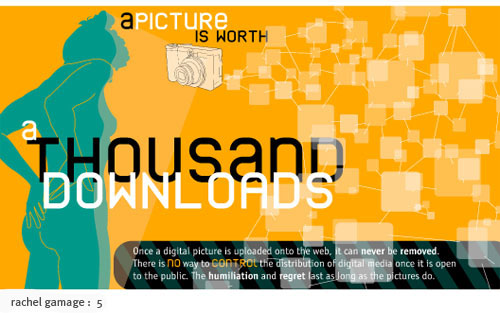
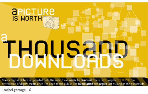
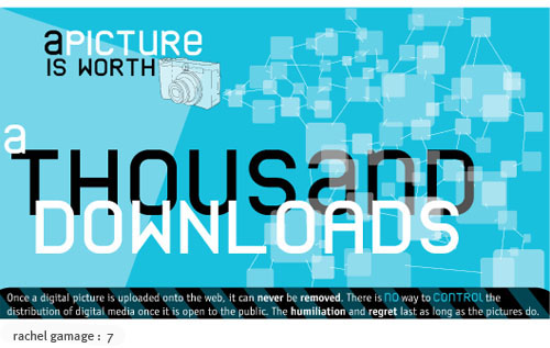
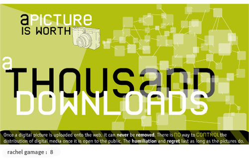
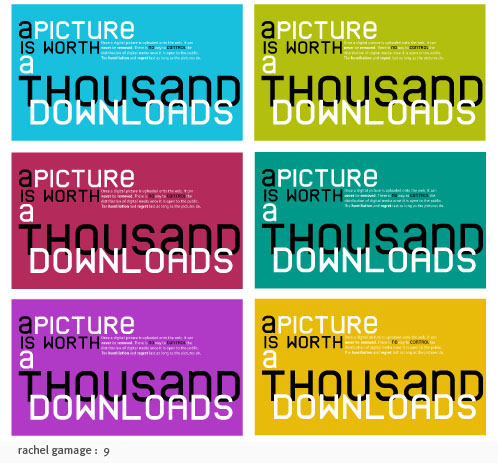
The first two posters are earlier iterations, while the last seven are a system. All of the posters are 17 x 30 except for in #9 in which they are 11 x 17 respectively.
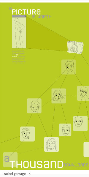
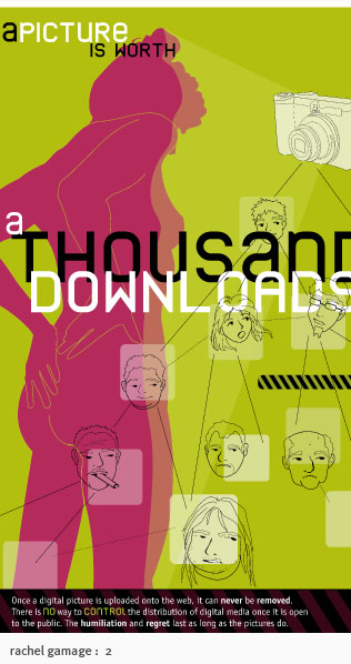
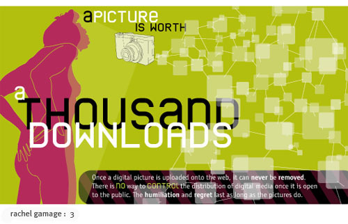
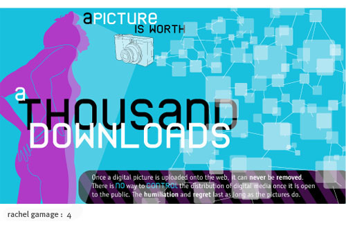
Posted by rachel gamage on September 26, 2005 08:56 PM
Oh yeah, the small text is:
Once a digital picture is uploaded onto the web it can never be removed. There is no way to control the distribution of digital media once it is open to the public. The humiliation and regret last as long as the pictures do.
I'm thinking high school, maybe middle school.
Posted by rachel gamage on September 26, 2005 09:05 PM
Hey guys,
Any comments would be helpful. I think I need more levels of communication, maybe below the revealing notebook paper.
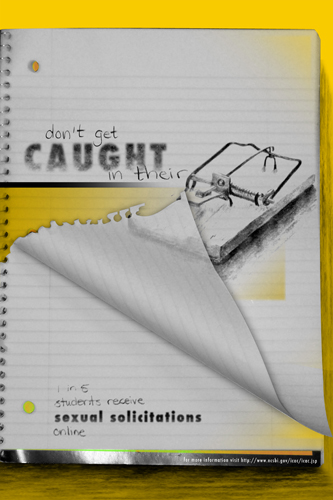
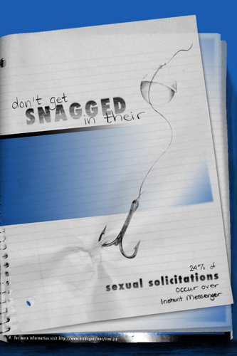
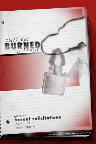
Posted by Colleen Cambre on September 28, 2005 01:09 PM
Hurray for Colleen!!!... (in a cuban accent) composition is wonderful. You have a great exploration of color here and have created interesting pieces with a limited palette. I love the convergence of tangible objects with their respective illustrations. I wonder how this method would transfer to other kinds of objects known to kidDom besides notebooks or anything school related. Also, maybe there is a great opportunity to allow for more play between the message found atop the page and a message found below the page being torn, burned, pulled, disgruntled....a couple of ideas for marination. GOOD LUCK AND TAKE CARE!!
Posted by Wes Richardson on September 30, 2005 12:49 PM
OK, back for more. I've looked at these almost every day this week and, in seeing some of the concepts that were posted since last Sat., there's plenty left to talk about.
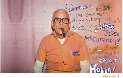
Jenna > There's some massive differences between your #1 and #2-3. This can be boiled down to tone; in #1, I think you do an excellent job of hitting your target audience. The juxtaposition of old dude in incredibly obvious environment with the juvenile text clearly ripped from some other context is everything I would want to see in an ad aimed at high schoolers. It's droll, clever, and has a touch of sardonic bite aimed both at the reality of situations like this and the naivety of kids who might find themselves in situations like this. With the exception of adding some sort of concluding statement/web address, I don't think anything else is needed. And that's what's so cool about it: you're trusting that high schoolers are smart enough to see that juxtaposition and know what it means. And furthermore, to begin to think about talking online with more caution, instead of outright fear.
That's unfortunately what I feel comes out of #2 and #3. To be fair, you are pretty accurate in conveying the emotion of a real-life example that you want to show. But, to agree with Anna's comment earlier, there isn't a light-at-tunnel's-end or recommended action that saves this poster from being anything other than utterly terrifying. (Side note: I think this would be especially true if mothers are to view it; the little girl with the 1950s/1960s idyllic look speaks volumes of the idea of a very specific brand of American idealism from that time period. Their reactions would be much stronger than kids, who lack the personal history of that kitschy element.) In #3, I think the image and some variation on the line "don't become a lifeless toy" together make a very strong message. I'd like to see that line blown up (err, uh, no pun intended) to be much larger. It starts to get at the issue of poweryou want the readers to have power over their lives and take caution, not become so scared to turn on the computer. In the end, I guess I personally feel that the real story and details detract from what could be a more positive and impactful message. If there's a way to tweak the text to be less frightening, you'd have a very strong poster on your hands. I like the pink and yellow color palette, but it slants heavily towards the female half of your audience. Maybe a male-centric companion poster could help balance this out?
Rachel > Yours have given me a lot to ponder this week. I've had several reactions to the general look of your latest batch. Here are some of them:
1. "I like the techiness of the transparent squares and the unicase face, and I appreciate that she respects her audience enough to get that too."
2. "Is that a Toulouse-Latrec nude?"
3. "I appreciate the simplicity of the headline, but I wonder if it isn't misused. Maybe something slightly different that still hits home with viewers?"
4. "Seriously...nude? Doesn't she know what horndogs teenage guys are? Putting a nude silhouette on a poster is like wearing a shirt made from steak and walking into a bear's den!"
Now, a few days later, I think I can organize them enough to ask what the next iteration will be like. I'm curious as to where the line art faces went to from your earlier version, as I think it makes the idea of information being passed like wildfire stronger. Don't get me wrong; in the later versions, I still get the concept of many, many screens networked together, but putting faces to these screens (especially the faces of what look like a few rather dirty old men) gives the concept some edge that feeds into the words "humiliation" and "regret." As for the title, I still wonder if it isn't misused; doesn't "a picture is worth a thousand words" mean that you SHOULD send a photo, instead of writing? And aren't you suggesting that you SHOULDN'T send a photo? Maybe something like "a picture equals a thousand downloads" or "one picture starts a chain reaction" could be more appropriate. You're onto something really interesting here (the diagonal bars add an extremely subtle hint of danger/warning that people will pick up subliminally) and you keep all the artwork simple and easy-to-understand too. Oh, and I feel like #2 is the strongest, because by confining the available space and enlarging the figure, you subtlely indicate that the connections between the original girl and all the people who are seeing her photo are much, much tighter. In the horizontal ones, this point gets lost, because she's separated somewhat from that network. Overall, yours is a very good idea.
Posted by Mike Joosse on October 1, 2005 02:35 PM
ok...finally something new...there's still kinks, but here it is...
BAD BUDDY
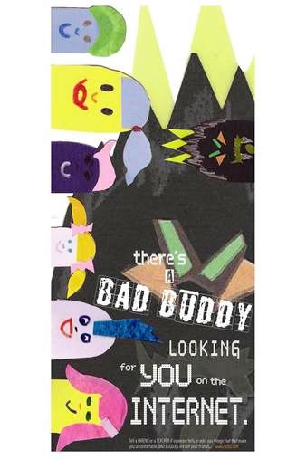
Posted by ERiCA McDONALD on October 4, 2005 09:59 PM
Hello there,
Joshua Smith sent the URL for your project web site to me some time ago. I think this is a great project. I had the students in my developmental psychology class this semester look at and evaluate your posters. Here are a few reactions from my students (I only included those comments I considered pertinent and valid):
Joshua Smith #1: age appropriate; good, meaningful text; suggest to make text a bit darker
Erica McDonald #1: appropriate for K-5; not preachy, not too revealing; not violent; cartoon characters get straight to the point; good conversation starter for child-parent dialogue; colorful, easy words, and clear font; kindergarteners may not be able to read all of the words yet; suggestions: frame the characters inside of a computer screen in the image.
Jon Knox #1: appropriate for ages 7-11; they know the story of Little Red Riding Hood; good touch with the paper dolls for "wolf in sheep's clothing"; suggestion: text may need to be more concrete for this young age group.
Rachel Gamage #1: gripping, attention-getting for middle school age group; suggestion: make text stand out better from background.
Libby Levi #1: for middle schoool and up; poignant; discussion starter at home and at school; chilling; good message.
Jenna Bailey #1: would work for high school; will get their attention; suggestion: include a warning on left-hand side of poster, something like " Warning: Sexual Predator online--you could be at risk" or "Keep your life in your hands, not those of a stranger."
Joshua Smith #4: design is very good; powerful message; simple layout; middle school age; "Wanna Play?" is chilling but also what a middle school child would be interested in (making friends, playing); thus, this sends the message that they need to be careful; text arrangement (with various sizes) at bottom of pposter is good; realtive sizes are great, but smallest print needs to be a bit larger.
Joshua Smith #5: simple; to the point; nice take-off on "Practice safe sex" with "Practice Safe Chatting"; appropriate for high school; maybe more color, but then again, the black symbolizes evil and makes that point.
Joshua Smith #3: great for middle school and high schoool; vertical pics and text is a great combo; powerful image at the bottom.
I hope these will still be of use to you.
Very good work!
Best regards,
Jutta Street, Ph.D.
Visiting Instructor
Dept. of Psychology
NCSU
Posted by Jutta Street on November 20, 2005 10:45 PM


