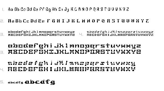
1. Decali Doce
2. Decalon Once Boulder
3. Decalon Sieteman
4. Decalon Sietemano
5. Decali Tamale

SevenHand? this is a nice, unique face. it reminds me of needlepoint, frank lloyd wright or some kind of mackintosh design. i think the squareness of the forms gives them that arts and crafts kind of feel. the "m" and the "n" look a little confined though. could you open those up a little?
Posted by jfhyland on January 26, 2005 07:00 PM
daniel: number one has a nice organic feel--definitely unusual for a pixel font, but it's honestly nothing i would use personally. it would be nice to see most of these in a sentence setting for context and letterfit.
number two has a nice consistency, but the rationale for the horizontal negative line is lost on many characters--C, I, L, O, Q, T, U, V, W. it makes sense on letters like A, B, etc because it echoes the crossbar.
number three is probably the most successful overall. it has a quirky, pseudo-techno feel to it, like fonts made out of chrome tubes and wires, but definitely above that literal level. this face evokes that without being overly direct. at actual size those effects come across simply as slab serifs. the O, U and Q appear convex at that small size. nice work.
four is pretty nice as well at the larger size. at the base 7 size, many of the l.c. forms appear oblique, some leaning right, and some leaning left. it's the added weight in the corners. for example. "n" appears to lean to the left b/c of the heavier top stem and the heavy lower right "leg". a strange effect. your M and N get confusing at the small size.
nice names too.
Posted by tyler on January 26, 2005 09:49 PM
Daniel,
The range of options for viewing is nice and broad, but while I can respond to what interests me visually, I echo tyler's comment on wanting to see it in line as a sentence, so as to critique more effectively. As I developed my typeface, I noticed that the forms I may have been drawn to did not always work in relation to other letters once they were set into sentences, and that other forms that seemed 'ok' as forms revealed themselves to be much more effective once they were put into context of words.
Regarding Decalon Sietemano (a.k.a. #4): the uppercase is far more successful than the lowercase version. In the lowercase, the middle dots seem arbitrary, and repetitious with the exceptions of 'f' and 't'. By taking out the mid-dots, the 'f' and 't' still hold because the dot is serving a purposeit provides that break in line as do the others.
In the uppercase version, the dots make a more restrained cameo appearance, and so they avoid the risk of overexposure. When they do appear, there seems to be more interest and purpose for their presence, although I think I'd like to see the "C" and the "P" without the dots.
Posted by Tracy on January 27, 2005 11:01 AM
Hi Daniel,
I really like the way your font translates to a smaller size. I know lots of us seemed to have trouble with the fact that a pixel font looks different when it's at it's actual size...but I think #3 is a great example of your ability to do this.
1 and 2 are really interesting because, as I'm sure has already been said, it is so NOT bitmappy. I admire anyone who went into more than a 11-by-11 basethat's a lot of pixels to deal with!
I would def. use 1 and 2 as header fonts. 3 would work for me in small-type on-screen applications.
Posted by K on February 1, 2005 06:04 PM
1: i want my phone to use this font. lord knows our personal technology needs more organic elements.
2, 3, 4: these blind me. i have this weird thing happen where if there's a pattern in, my eye automativally focuses on that and ignores any other information. the shapes are really regular, and therefore make a really stringent pattern.
5) is a nice midway between type and patternmaking. the shapes are distict enough to be readable, but regular enough to start to make some pleasant shapes when set up in a line of text.
Posted by pk on February 6, 2005 05:09 AM


