updates: 01/30. . . . . . . . . . . . . .

As the designer of this typeface, I should bring you into my head (a sometimes scary space) and fill you in on my thought process:
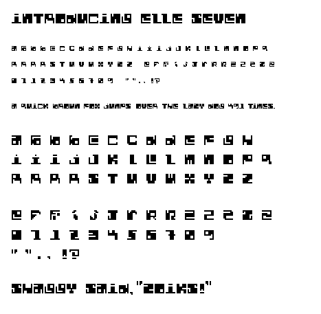
"Elle Seven" is a base-seven bitmap font, and my very first attempt at designing a typeface. Her name is derived from the fact that she is based on a perfect square (L7).
Other details:
You'll notice that there are several variations on some letters. My assessment of the ones that work best have found their way into the sentences | panagrams. Feel free to challenge me on these choices.
Elle Seven is unicase. I've also attempted a couple of punctuation marks & numerals.
Each letterform began as a black square, 7x7, which I then chiseled each letter out of. It is intended to embrace the density of the solid square that it originated from. Is this disturbing, or is it working to some degree?
Thanks in advance for all of your comments...
-T
Posted by Tracy on January 26, 2005 05:59 PM
I think it's working, oh yes.
I especially like the letterforms that consist of two parts (see C and L). I always thought it was weird that we accepted that for the lowercase i and j, but for none else. It seems like it would have been pretty radical at one time to suggest that a letterform should have two parts. But other character sets do this a lot (hebrew, chinese, japanese...). We always have been a bit behind other cultures.
The quote marks are smart. Who needs two that look the same... we get the idea even if the presence of the inner one is just suggested.
Your four R's in a row look like wallflowers at the school dance.
Your eight knocks my socks off.
cb.
ps: i think shaggy's better known around here for saying "oh carolina".
Posted by berkowitz on January 26, 2005 09:24 PM
Hi Tracy - this is so fun! I've liked your Elle Seven from the beginning - but what a blast to see it all knocked out in a row - it's like a mini-puzzle that you know just fits together nice and neat.
Something about the perfect squares fights my visual minds' need to understand the shapes of words, but I ENJOY that bit of extra work - it's a treasure that you EARN when you read the message. Here's my one comment - the "X". I don't love this letter and I think it's because it's so symmetrical. I wonder if there is a way to treat it that feels more funky/quirky/offbeat like the other letters? Other than that - EXC-ELLE-ENT job!!!!
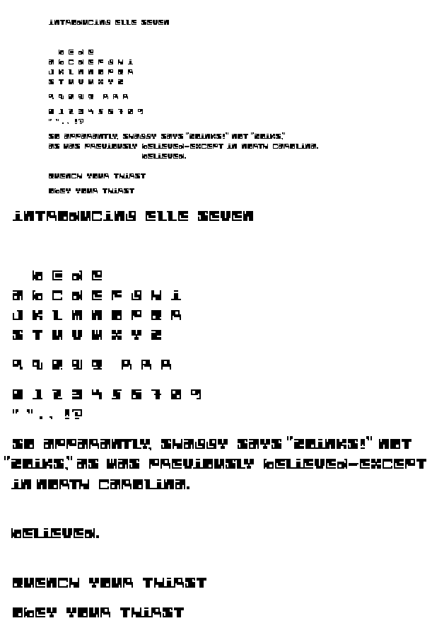
These are my picks: B2, I3, J2, L3, R2, Z1
Jess G.
Posted by Jessica G. on January 26, 2005 09:53 PM
cheryl, please put your socks on; it's getting a bit smelly in here.
i think your overall approach is working "quite nicely" as some would say. i don't think you necessarily have to limit each character to one option--use your best two as u.c. and l.c. alternates. that way users have some choice.
the density is really interesting, and the sentence makes some nice patterns. my favorite characters are the E and G. somehow they look like profiles of goofy faces. the Q seems a bit too light. not sure how to resolve it though. i agree with cheryl on your quote marks. nice work there. your X and Y are pretty rockin' as well. they look like crazy slab serif letterforms. zoinks!
Posted by tyler on January 26, 2005 09:58 PM
This is a face I think would benefit also from out of the box exploration. Something this wacky but with close-proximity apendages may work better at actual size with more distinctive perimeter contours. As it stands it makes a fresh display face, reminiscent of Dexter's Laboratory. Excellent deconstruction exploration.
Posted by D-cal on January 29, 2005 09:28 PM
this font reminds me of what happens when you mix drugs and science fiction. and listen to the band YES in your basement. i've already personally complimented you on your "8". for some reason i would like to see the punctuation big, filling the space like your letters, but given additional room. just a thought. i like the "b" and the "d" with serif best.
Posted by jonathan hyland on January 29, 2005 11:49 PM
you know what's weird? this typeface has every single thing i usually hate about type design all in one face, but i still like it. a lot.
i think the smartest thing tracy's doing here is accepting the fact that with all of these parameters (unicase, strict geometry, bitmap) her baby's gonna look kinda funny. so she goes the bestey johnson route and celebrates how funny it looks. she's letting the typeface be exactly what it wants to be. very, very smart.
Posted by pk on January 31, 2005 05:12 AM
Tracythis face is surprisingly legible. When I first saw it I thought "How are we supposed to read this?" Then I looked at a sentence, and it read quite easily. It's amazing to me that you've made all the little "inconsistencies" in your letters part of the system, instead of constraining them and formatting them to some other pre-concieved system.
What can I say? Me likee. I agree with all the comments already made in class, as well.
Posted by K on February 1, 2005 06:08 PM


