Dosi-Doe

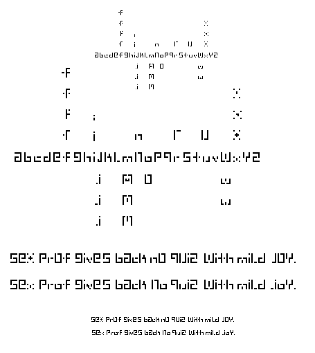
Sarah: I really love the range of exploration here, and you've established some very interesting relationships. For example, the "g" serving as an alterego to the "e" is a very sophisticated connection to make. I've been looking at g's to q's to p's, but you've offered up a very different perspective.
Your chosen 'x' is another very interesting form (the one with that looks like a + embedded in brackets), but as part of the system, it pains me to say that I'm not sure it's working. Instead of losing it entirely, perhaps it spawns a whole new set of characters? You know, like in your spare time. ;o)
The scale changes within the face are also intriguingthe omission of ascenders & descenders, and the prominence that the 'a' takes over the 'c' for example. It forces us to be aware of the fact that our eyes are scanning up & down as they are also reading left to right. While this might sometimes be taxing, I don't think it is necessarily a bad thing. The reason I say this is because: a) it's something new; and b) 'Dosi-Doe' attracts my attention enough to WANT to work at it. It experiments with some of the questions Tyler poses on his "U&lc" post.
Posted by Tracy on January 26, 2005 06:07 PM
I agree about the comment of the x... scaning the row of letters as a whole it doesnt quite match the value of the rest of the letters. It seems to fade back because it doesn't have any grouping of pixles to make it darker. What you did with the v is a little better. I'm sure there is better terminology for what I'm trying to say but you get the point right?
Posted by Colleen on January 26, 2005 08:37 PM
Hi Sarah - what a sweet face! I like that you follow some simple rules as you developed the letters - it's very clear to the reader how the design came to fruition. I really like how you thought about the face in a matrix-like way - with interchangeable parts that allow for a lot of customization. As far as I know - this is not done - and is a TERRIFIC concept. In fact, if you really want to get carried away. Certain letterforms can "retire" over time for a sort of planned obsolescence (in theory). This kind of face and transformability can make it worthy of editions.
Anyway - back to the point. The X and V are too light weight in color and such to hold their own next to the other forms. Also the little "dot" on the F seems too disconnected and unnecessary. Other than those minor comments - I think you've got a great looking face here Sarah!
Jess G.
Posted by Jessica G. on January 26, 2005 10:01 PM
I actually really like the X (the first "sex" one). It's not consistent with the rest of the letterforms, but i like it so much that i'd rather see some of the others emulate it a bit. Some more dots floating about in the other ones maybe?
Maybe if the dots on the x were just one pixel longer??
The lowercase t is cool. I just like the way it has that dot that completes it.
i'm curious about how this would look if you pushed the letters with descenders down. I know it wouldn't be 7 high anymore and Tony would get really really mad and his face would turn purple and stuff, but i'm just curious.
Posted by berkowitz on January 26, 2005 10:58 PM
regarding all this "x" tomfoolery: i prefer the second "x"--the one without the plus in the middle. you use a vertical two-pixel center for that character, but what if each leg were two pixels as well, but still disconnected from the center, with a one pixel center? that might take it up to the capline. or maybe each mark in the "x" is two pixels tall, including the middle.
the first "m" [the top one] is the best in my opinion. but you might want to consider what characters it normally appears next to, and wether those characters are tall or short. like the "ac" issue tracy mentioned--there are interesting scale changes happening that could drive your decision.
Posted by tylerg on January 28, 2005 09:07 AM
I named it Dosi-Doe based on the choice of exchange and interchange between letters. Just like the "Dosi-Doe btwn partners at the ever-so lovely square dances held in grade school. Sometimes I was dancing with a boy that had cooties then passed on to the most popular boy in the school.hee hee. Like Jessica said, "allowing for customizaiton. There is a default line but after looking back at the letters used as default, there is the chance to exchange them based on a person's desires. Sometimes a pair of letters look better beside eachother creating a similar cap height or x height. HOwever, variation and scale change may be desired over a consistent unicase.
Posted by sarah on January 30, 2005 01:55 PM
Hi Sarah:
Your typeface is very interesting to me, because I think it is very interesting how you explored the idea that all the characters in an alphabet do not have to have the same x-height. I think your studies with the actual sentences really show how your face has a rhythmic, almost musical quality to it.
It's funny, because I look at it and think it must be less legible than it actually is. It's an interesting quality for a typeface to have.
I remember you commenting on how hard this project isI think you did a great job of pulling through :)
Posted by K on January 31, 2005 09:04 PM
i like the overall lightness of the forms and tension between strokes in each letter -- but i'm not buying the x-height thing. it makes me focus a bit much on the letters as individual shapes and inhibits readability in longer texts.
Posted by pk on February 6, 2005 05:14 AM


