additional faces: 01/30. . . . . . . . . . . . . .

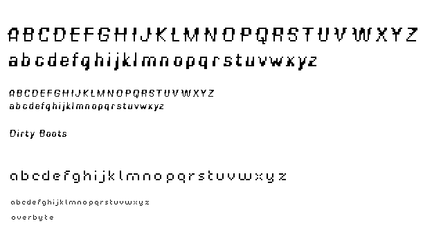
jon: dirty boots is rockin'. the positioning of the thicker stroke portions gives a subtle italic feel, which is awesome. also, your title sample is a nice showing of how the u.c. complements the l.c.things seem to get shaky on the u and l.c. v w x y z. though. i'd try those in context and tune them up a bit. the l.c. v and w are blotchy in their crotches--maybe trim a pixel out there. same with the u.c. W and Z--on the inside of the joints there. very nice overall. me likey.
on "overbyte" (nice play on "bite") i enjoy the subtle openness of the a, e, g, x. also we talked about the open pixel in those joints in the f, h, k, r, t, y, z. that goes well with the aforementioned open spaces. while it's not incredibly original, i think those subtlties do make it more unique than most "workhorse" pixel fonts, so it gets a good amount of character without going nuts. i think a key also lies in the generous letterspace you have in your display. i'd retain that as it adds another level of uniqueness and openness.
Posted by tylerg on January 26, 2005 09:55 AM
Hey Jon - great job on the Dirty Boots. I love how the upper and lower case alternate in the weighted/bolded portion of their "bodies". It makes for an intriguing interplay as the cases are mixed in usage. Further, the overall feel of the face has a light and spunky quality that feels especially fresh. As far as the upper case is concerned, I question the little "spur" on the J - it's the only letterform that juts to the right instead of the left. Finally - the X and Y seem to be the two letters that seem most awkward. I wonder if the spur on the X should be made longer - to make up for the optical inward shortening of it due to it's postion on the letter. And for some reason, the Y appears a little lopsided. The leg of the Y just feels unbalanced to me - more than any of the other letterforms.
Okay, now that I'm all warmed up...I'll keep going! I want to pick on the k, w, x and y in the lowercase. I love all the rest - but those feel a little clunky as the bolded sections are addressed. My suggestions would be to do iterations varying by one pixel here and there to exhaust the possibilities.
But - really, you've developed a very nice face and I love the name. I can't wait to use Dirty Boots in the big bad dusty design world.
Posted by Jessica G. on January 26, 2005 09:38 PM
Well, I too love a good pair of dirty boots, but I'm going to comment on bucktoothI mean, "overbyte:"
This typeface seems to be loosely inspired by avant garde or futura, but updated for the digital age. Very readable, very elegant, and proof that simple can be sophisticated.
I can't believe I'm quoting tyler, but "me likey" too.
Posted by Tracy on January 26, 2005 11:00 PM
mmm, sexy. i'd say out of the bunch these typefaces are the most legible and could actually be used in a larger amount of text. i really like how the first font has the appearance of being italic via the heavy weight vs thin. as for the second one, well done with the open quality of the a, e, etc. its quite beautifully geometric with its own quirkiness. i think the x feels a little thin compared to the rest just because of the middle pixel missing. however, i'm not sure it'd fit the set if it didn't do that. just a thought. overall, very very nice. i'd love to see the rest of the overbyte family.
yum.
Posted by m.blume on January 27, 2005 05:26 PM
Jon: you know your mud puddles intimately. I smell action titling. The K lowercase has a single serif? The lowercase G has a pixel suggesting a more round bowl than what is present for, say, the lowercase B.
Overbyte looks like a pixelized version of the freeware LCD emulating display face. The lowercase Z feels scriptish unlike basically everything else.
Very pleasing to the eye kind of work.
Posted by D-cal on January 29, 2005 09:51 PM
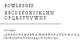
Jon, I'd have babies with you based on Scriptor alone.
And I don't even have a womb.
Posted by m. courtney on January 30, 2005 09:38 PM
I think this message board could do without your unabashed lusting, Mr. Courtney.
Everyone knows I'm going to have Jon's baby.
Posted by D-cal on January 30, 2005 09:48 PM
back off, sluts. he's mine.
overbyte and scriptor: both sublime. both have a forthrightness to them that makes them seems sweet and modest. i think it's the purity of the geometry and the lack of struggle to make those geometries be what they need to be to portray the letter accurately (uh, i hope that made sense; talking about design is like dancing about architecture).
the emotional content of both faces is incredibly mature -- it gives voice to whatever information may be set in it without imposing itself on that information. you know?
i am totally not loving dirty boots. i almost like it, and i see where it's going, but it doesn't quite get crazy enough to be a great display face.
i think, based on this, your strength is in more traditional typographic forms. dirty bootsthat's not a criticism; that amount of self-restraint and adherence to tradition is something i'm still struggling with after fifteen years of making type professionally (said the dork with the mohawk).
Posted by pk on January 31, 2005 05:25 AM
Overbyte is awesome. But everyone else has said that already. It really is futura-ish in that it has a rounded, geometric flow to it but it is more catered to an on-screen experience. Even the "missing pixels" in the characters give it a personality despite it's elegant simplicity.
"bowlegged" has some very strong horizontal serifs going on there. It would make for an interesting header font :)
Posted by K on February 1, 2005 06:22 PM


