updates: 01/28. . . . . . . . . . . . . .

Hi all - welcome to my two faces - I hope you like them. I'm gonna jump in a make a few cautionary comments - but then I'll stop - feel free to comment/compliment/criticize - I really appreciate your thoughts.
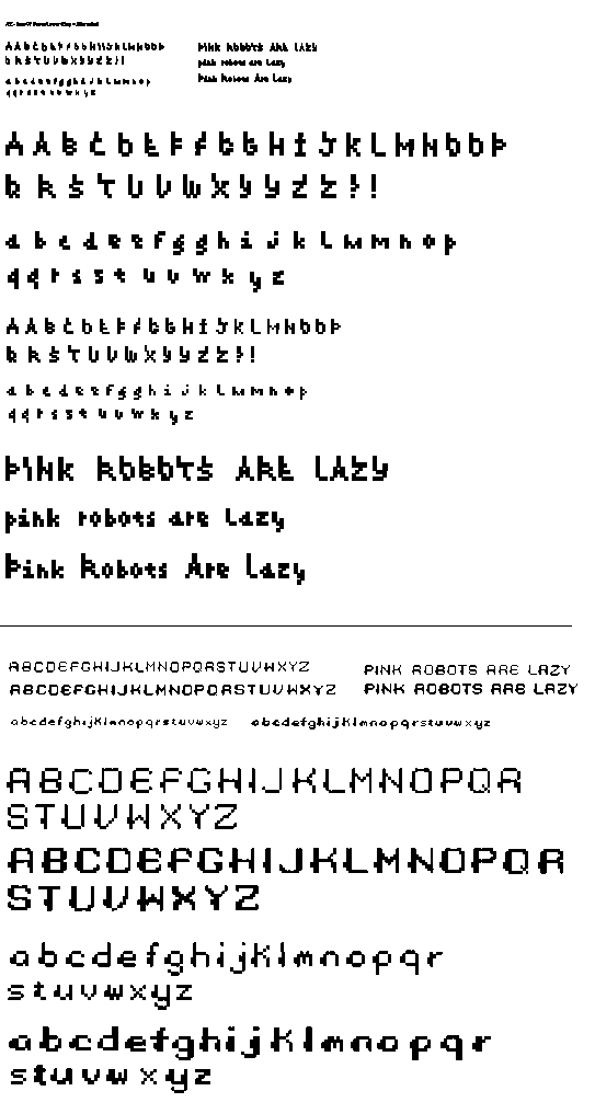
Okay - on the Base07 - I was intrigued with the little stems. I tried to add a sort of "cherry" feeling to the letterforms and feel that most of the letters are working. I included a few alternates and right now especially question the cap I, Q and S. What do you think of the lowercase? I kept it only 4 pixels high, but dropped off on the little stems - because it seemed to crush the little letterforms. I could bring those back - but hope not to overdue that initial inspiration idea.
The second face is a Base09. I attempted two weights a reg and a bold and added a chunky little left block to each to chunk it out. Please hit me with inconsistencies. Right now my bold weight s and x in the lower case are absolutely not working.
Thank you!
Jess G.
Posted by Jessica G. on January 26, 2005 09:45 PM
Jess,
I think the lowercase in the base 7 is working better than the too-consistent cherry stems on the caps. I like the idea, but it just doesn't need to be on every single letter. It kind of bonks you over the head with cherries. It just feels a little more natural/less forced on the lowercase. Also, the overall texture in a written phrase is more pleasing with less stems.
I like the blob on the left side of each letter form in the base 9 typeface. It acts as a magnet or those things that hold a string of conference chairs together. Again, i don't think it needs it on every single letter just to adhere to a strict set of rules. Maybe on some letters the blob appears on the inside right of the bowl? p, q, d. The E, L and F are doing a nice little angle on the bottom left that would be cool to see in other letters, maybe the A, B, P, etc.
cheryl
Posted by berkowitz on January 27, 2005 10:35 AM
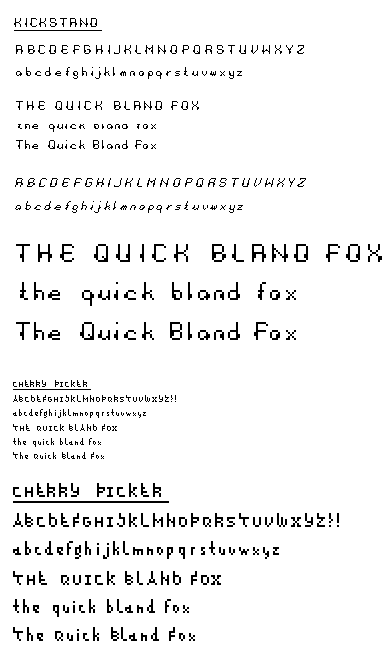
i agree with cheryl on overdoing the 'stems' -- maybe they only appear on rounded forms (c, o, Q)? the other face is starting to work really nicely i think in the lighter weight. there i think rigid consistency might actually help... i want to read them in dimension, but switching around the rules kind of messes with that. the work KICK works pretty well for me, but STAND gets a bit strange with the blobs opposing each other.
Posted by jay on January 29, 2005 09:18 PM
Cool name, I agree though with cheryl about the stems not having to appear on every letter. Your concerns about the I, Q and S dont even need to have the stems however it might be interesting to add stems to the rounded characters like Jay said, then that would carry through the idea of cherries on a stem. It would really be interesting if you took the caligraphic features of "Kickstand" and applied the stem ida to those letters. "Kickstand" really appears more natural and rounded like a cherry. Then if you added a "stem" to the character, it would contrast and complement the round letterform. Just an observation, worth a try, right? Or if you put some letters on a slant, kinda like italic with a stem, then that would give an impression of a cherry hanging. I think the "T" does that with the one pixel at the baseline offset. the "D" looks nice, and the J. Maybe explore the letters that already have a physical appearance of a crry a cherry and add the stem. Its a really cool idea, and I think youll be right on the "pit" with everyones suggestions.
Posted by Sarah on January 30, 2005 12:40 PM
very nice improvements to both faces over the original. kickstand is shaping up pretty nicely, and with a good italic even! looking closer at kickstand, the m looks a little small, and maybe the negative spaces should be two px wide rather than one, but leave the "wart" on the outside left. the roundness of the l.c. is quite nice. the descender of the g is appealing to me--it exists in the space between a more modern g and a classic eyeglass g. on the italic, the bumps are getting lost, which might actually be good. you may want to consider removing the bumps altogether when you make the italic. the leg of the l.c. k is falling apart.
on cherry picker. i like how the l.c. ascenders are extra long, but the "stems" aren't forced onto every character. i'm unsure about the squareness of the Q and O, but if they become rounded, they lose some character. but i think there's enough character overall in the face that normalizing those two characters won't kill it.
Posted by tylerg on January 31, 2005 09:53 AM
hi hi. pk here, late nuight commentary from chicago.
melissa, what you're doing here is approaching your letters like pictures of letters. basically, you're adding shapes that are kinda arbitrary. the nice thing is, due to the eensy size and ways that the eye fills in the missing parts (note my monitor is set at 1900x1200, so it might be eensier to me than others), you're coming out with some forms that are very close to scripts or handwritten forms.
i'm glad you decided to not use the stem forms throughout, as others have mentioned; uniformity of shape in letters just doesn't need to happen. i know a lot of typographers like to say that you should always use a structured vocabulary of shapes, but you know what? not everyone likes looking at precision.
oh, and with the m and w in both sets: let the characters be wider. they need the exctra air inside to keep causing blotchy color in your lines of text. a standard rule is that double-wide characters generally like to take up one and a half times the width of an N. (ymmv)
Posted by pk on February 6, 2005 04:58 AM


