updates: 02/02. . . . . . . . . . . . . .
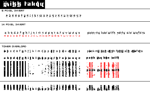

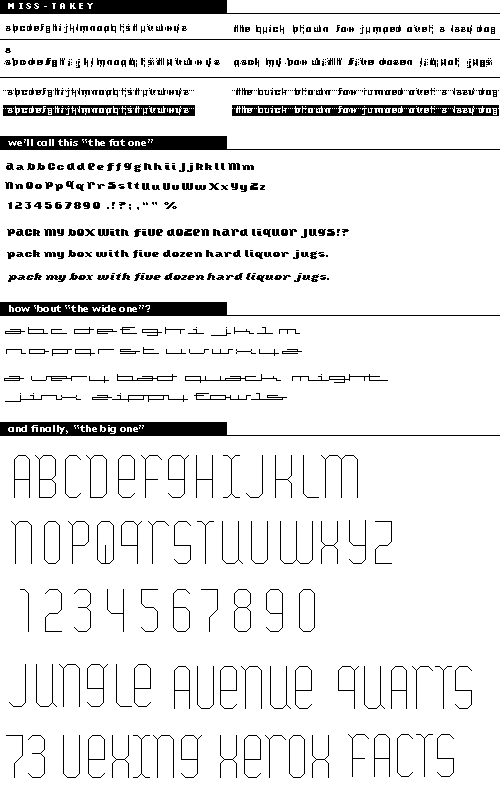
miss-takey (base 7) is an attempt at showing digital error / digital noise to varying degrees. that, and the age-old legibility issue: how degraded can it be and still retain some legibility?
the fat one (base 7) is a fun, bold, humanist face (think gill sans meets cooper black) where i'm trying to get some friendly character as well as achieve consistency btw all u.c. and l.c. forms.
the wide one (base 7) is a look at extreme extension coupled with a notion of geometric "cursive" like connections. ideally there would be variants of each letterform that allow for smooth connections across all letter combinations.
the big one (base ??) is looking at the same u.c. and l.c. issue as the fat one, but also making use of the geometry/angularity inherent in screen-based technology. the "tails" are meant to add character and hark back to more conventional (classic, you might say) letterforms. i'm unsure about the "q" (there are two up there), and i tried to get a little more funky on the "i" and the "t". i want to add a l.c. and heavier weights.
Posted by tylerg on January 26, 2005 06:07 PM
Tyler - Magic! Pure mystical typo-magic here. Nice going. First off, I must comment on your hyper-clarity among all the typefaces. You've managed to work in some serious readability in some seriously small spaces. I'm really impressed.
I'm gonna talk about the fat and wild and mr. big ones - those are my favorites. I have nothing to say about fatso - he's gorgeous. PS - how'd you make it italic? Wow - can you teach me? On wild child, I want to see the H with a tail in the opposite direction and I want to see some alternate Z's if possible. Somehow ole' Z looks like a number 2 - and I can't divorce myself from that. Hmmm...things to ponder....Finally on the biggie, only Ms. Q is sticking out to me - I think it's that upward thrusting, um, thing. Maybe that can be tilted? This would make me a little more comfortable. I'm not just being funny here - I feel that a rule could be broken here - just to make it less sylized - what do you think? I think this font will be very interesing in other weights as well.
Rock on! Jess G.
Posted by Jessica G. on January 26, 2005 10:10 PM
The names are outstanding.
Posted by Caroline on January 27, 2005 09:55 AM
WOWWWWWWIE!!!!! youre so awesome, anyways, enough praise, I think Im just gonna ask some questions about some just to understand how you make decisions and choices. Everything is so consistent. So, for the "wide one" which is a very kewl concept as far as looking at the connections that each letter form would make with the geometric lines creating a "cursive" How did you decide where to put the connectors, did you just make tons of sentences and pair common letter combinations? It looks sweet connected but it could be interesting to see if the connecter didnt always connect creating interesting space between the letters...kinda like the "w and l" in the bottom sentence, and the " z and i" of zippy. Even just the way the alphabet looks is nice in how they dont connect.
"The Big one" just kicks some arse... I love it , the color, line weight, consistency, and flowness , you get a 10 out of 10.
Posted by sarah on January 30, 2005 01:34 PM
I dunno, man it seems weird to post my comments in this forum, seeing as we sit across from each other, face-to-face in studio, but for the benefit of a group discussion, here goes:
Each of these faces exhibits such a firm grasp on how to design a typefaceI have very little to say about any gaps in your systems.
I LOVE miss-takey. It's a very unique approach to pushing the boundaries of readability, as many of the letterforms would be indecipherable if they were alone on a page, but they make sense in the context of words awesome!
"The Wide One" is intriguing because it behaves like a script face, without having to be script; the notion of joining roman letters is an interesting approach. However, I see your lowercase 'f' as an uppercase 'e' and had a hard time figuring out the word "fowls."
"The Fat One" is the least interesting to me as a whole, but only because of the other ones that you've submitted for comment. I appreciate the general success of it though, particularly as an italic, which is soooo difficult, having tried only a few letters myself.
Love it, love it, love it. I'm inspired.
Posted by Tracy on January 31, 2005 12:24 PM
tyler,
let me takey a moment to talk about your first face in this series. we discussed it in class today, but i just wanted to give you some extra encouragement. what is interesting about miss takey is how it moves towards a rich pattern language. i wonder what would happen if you gave yourself even more space around each of the letterforms? THE FAT ONE has a lot of character and is still quite legible. i'm impressed that you managed to get an italic out of it. nice werk.
Posted by jon hyland on January 31, 2005 01:19 PM
the degraded fonts: not so sure if i'm feeling these, but i was never one for that kind of thing. it feels like a gimmick to me and always has, no matter who does it. i guess i never understood the point of making what amounts to a stock-art set of machine mistakes when it's much more convincing to make those mistakes yourself.
fat face: nice, bold forms, and i read them really easily. forms are really human, which i love in bitmaps -- a few weird areas where color gets too dense. (bottom of o, bottom of z, etc) and makes the letter stick out from the rest of the text.
wide one's a nice script. i think i remember seeing this idea doen fairly similarly in t-26's library (big surprise, considering how big it is).
tall one: this is one of those fonts i just don't like and probably won't, but that's just personal preference. the font is perfectly serviceable.
Posted by pk on February 6, 2005 05:26 AM


