updates: 02/01. . . . . . . . . . . . . .

matt: with the exception of your first faded sample and your second boxy sample, it looks like all of your fonts are displayed at least at 200% of actual size. i'd like to see the first five samples at actual size, meaning each "pixel" you have up there being equal to one true pixel. right now each "pixel" you show is equal to two actual pixels in photoshop. the end result being that your strokes could actually be half as thick as they are, freeing you up to deal with your l.c. s that is collapsed. let me know if you're confused, and we can discuss face to face.
the boxy one: this is the most interesting to me because of the unusual take you have on your module unit. it's obviously an outlined pixel, rather than a pixel. to me, this has connotations of a more literal and chunky building block, construction, and cross stitch for some reason. because the o is bottom heavy, i'd suggest rotating your x 180 degrees to make it bottom heavy as well, rather than the top heavy look it has currently. also consider doing a second weight where only the negative spaces are filled in. then if they are turned into 'real' fonts and carefully spaced, you could set a line in the outline, color it, then copy that line, change the weight, color it a second color and you have a fill / stroke look. again, let me know if that's confusing.
the swash caps are pretty nice, but they beg for some l.c. forms. it's kind of like typing edwardian script in all caps--not much fun.
Posted by tylerg on January 27, 2005 10:29 AM
Tyler,
Thanks on the comments. They gave good direction on my updates (which I am finalizing as we speak and will post ASA) I wish I had posted first, but as you can see I am late to the party.
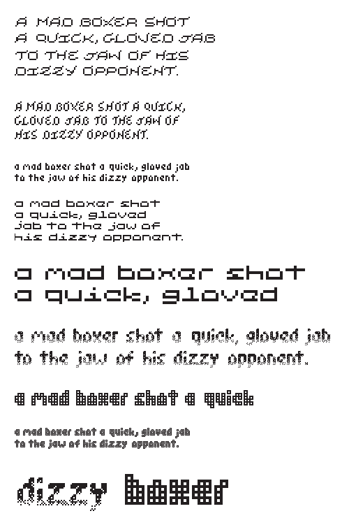
I am including a replacement image with the updates (again, ASAP). You will notice that the X is flipped to work better with the gravity of the other letters. Also, I am including names so that it will be easier to say "Suchandsuch" needs improvement on the X... etc.
Also, I am including all of the new letters at full scale (each square=1 px) in addition to my current scales.
I hope this helps in the critique.
Posted by m. courtney on January 30, 2005 09:47 PM
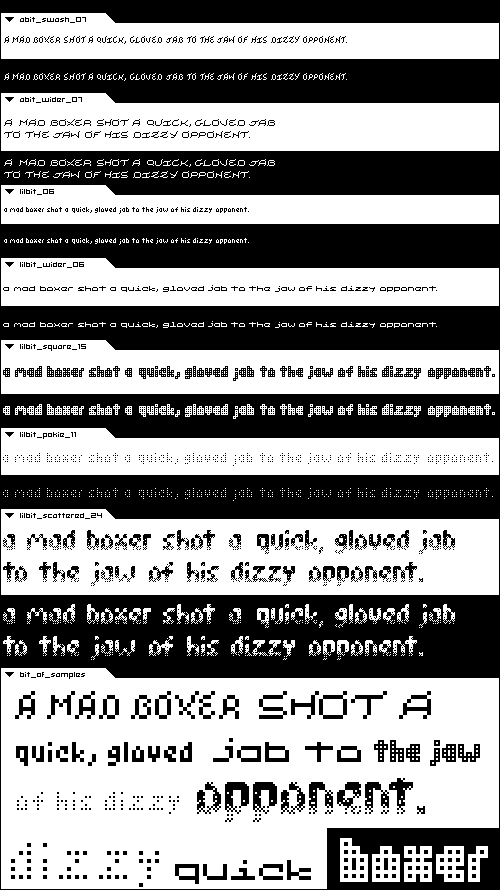
Matt - the sheer prolificness of your exploration is to be applauded. Wow! That being said, I'm going to comment on my favorites - libit wider, square, and libit pokie 11. On wider, I love the extremely short x-height. You've managed to keep it quite legible and clean. I would like the middle of the "M" and "W" to be lengthened on both as it partialy disappears for me.
Square is pretty interesting, It makes my eyes a little tired though and I wonder if a variation could include some solid letterforms mixed in with the wire/mesh feel. I realize you tried to do that in scattered which is interesing, but I think it would be BIZARRE and therefore neat to try splattering in a few solid letters rather than be so consistent. Just a thought. Nice job overall.
Posted by Jessica G. on January 31, 2005 11:29 AM
hello matt,
thanks for offering to have my baby. the fact that you don't have a womb and still make such an offer raises some interesting questions that i feel would be inappropriate to discuss in this forum. having said that, you have so much to comment on that it makes it difficult to make comment. having said that, i'm feelin' little bit scattered. this is your most EXPERIMENTAL face, and your most successful one... I think. the reason why i like it is because you don't often see a display face with such texture / atmosphere. i would love to see this real Big overlaid some medieval tapestry, or city scape, next to any image with a lot of detail... even if the letterforms were solid they would still have nice shape. i appreciate the gusto with which you have approached this exercize. keep up the good work.
sir jonathan hyland of durham
Posted by jonathan hyland on February 1, 2005 10:37 PM
i am totally feeling these. it's like some of the funny shit zuzana licko used to do (narly, those bizarre versions of modula that had feelers) before she inexplicably started making baskervilles.
Posted by pk on February 6, 2005 05:03 AM


