updates: 01/29. . . . . . . . . . . . . .

I wanted to make a typeface that was pretty standard but quirky when you get close to it (we see ourselves in everything we make, right?).
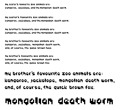
It was a really gradual evolution. In each of the above phrases i changed something pretty minor. When we started this project I found something online where a type designer made very small changes in his typeface and showed how it looked set in a whole body of type. I thought this was a good way to work, especially when one pixel really makes a difference.
I like how you can focus on the negative spaces and feel a consistent pattern. I tried to pull the strokes towards the right-bottom so that it had more of an even color overall. The extra pixel in the bowls serves as sort of an arrow that points that way. I think.
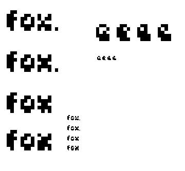
I still hate the X. I'm sorry about the profanity, i just really thought it was appropriate since the X was so frustrating. Who ever uses x's anyway? For fox sake, not me.
shirly.
Posted by berkowitz on January 26, 2005 10:45 PM
Hey CB, nice job. I like this font a lot - it has a Curious George type feel - bouncy and mischeivious. It has a great weight and rounded friendly feel.
Overall - all the letters look great together except for the X and the E. Somehow the part that crosses back to the main swoop on the E disappears and breaks up - I think because it's on a diagonal - and I'm not sure what to recommend as far as fixing it. I wonder if an additional pixel can thicken up the color. My suggestions for the X would be to make it more symmetrical and remove your funky pixel from the base slabs or shorten one leg - rather than have it asymmetrial. Maybe?
Good luck if you try those - but I like your face a lot!
Jess G.
Posted by Jessica G. on January 27, 2005 10:10 AM
I'm trying to provide more insightful comments than "I like it," but let's start there, shall we?
If you really set out to create a "standard" typeface (which I read as 'conventional'), then fortunately you've fallen short. But quirky, definitely! I appreciate your approach in trying to change things slightly, and think you've very near mastered the subtlety of pixel shifts most notably with the 'a', 'o', 'g', and 'q'.
Your 'x' is a little 'wonky', I would agree. Maybe you just pulled the pixel the wrong way. Perhaps the mid-pixel should join up with the heavier right side. For fox sake, I have no idea either.
This typeface holds a lot of interest to me, for some reasons that I can't even articulate very well, but for those that I can: good contrast between heavy & thin strokes; a beautiful pattern that really stands out at actual size; and a sense of mongolian worm-like movement through the angles you're suggesting in letters like 'm', 'n', 'i', 'l', 'w'.
Posted by Tracy on January 29, 2005 02:55 PM
shirl, i actually like the swooping, off-centered quality of the original 'x' and 'e' -- if i'm reading the revision order correctly. be nice to see the latest stuff in text to compare tho. otherwise i think this is nifty, whimsical face that's working well. in terms of an even color, i think you're pretty successful, with a few off spots -- the 't' and 'j' throw their weight to the upper left, rather than the very nice lower left / upper right axis you set up with the 'm', 'w', 'h', etc.
Posted by jay on January 29, 2005 11:44 PM
Hi Cheryl:
I don't know how much more I can say along the lines of individual characters that hasn't already been said. I will say that I think your face reads reasonably well at a small size, and perhaps the only thing that bugs me a bit is how the "rounded" vowels (a,e,o) seem to be a bit too similar at a smaller size, in the top one. It appears you've attempted a fix for this already, however...whether that was your intend or not :)
I really like it, though. It reminds me of writing with a fat permanent marker. I also think you did a good job of distributing the "heavy" parts of the letters so that no one part of a given sentence feels too heavy and black for the rest of it.
Posted by K on January 31, 2005 09:09 PM
what's most interesting about this is that you've completely inverted the most common mistake a young typographer makes. usually when folks start out, the indivisual letterforms are wonderful, but when you set up a line of text, it's a car crash because there's just too much personality.
what you've managed to do is make it work best as text first, but remain almost completely illegible on a character-by-character basis.
i think you've done some exemplary work here and made a new sort of text face that works in a completely unique way.
Posted by pk on February 6, 2005 05:29 AM


