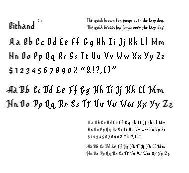

i guess this evolved from a base 7 to base 10 face, base 12 for the swash version. the original was so condensed that an italic really didn't hold up, so i took the suggestion from an earlier crit to sort of imply a rightward oblique angle. lemme know if it's working.
Posted by jay on January 29, 2005 09:27 PM
I like the swashiness, thats kinda kewl how it evolved into a base 12. It adds variation to the potential of different families. Maybe when you add other families they change in base. Anyways, I think the regular face is working well. I have some comments abouththe "W, X, and Y" In the non-swash, it seems as though the X and Y have serifs and should resemble the "W"'s ascender. Then when you add the serifs to the swash face you can either chose btwn 1 or 2 pixel swashes on the end of the W,X, and Y. I think I like the flow of the X and Y on the swash face better than the regular one. But just try taking of the offset pixels on the top of the X and Y to make it more like the W, M and N. Hope that makes sense. Also, the M, of the swash version kinda plays tricks with my eye, at one point I see an M, then I see some kind of V. It seems like there are too many swashes going on there and could just add one pixel at the top right ascender and the bottom left. I like how you continue the swash under in the G and S, try adding one more pixel to the C for the same effect.
Posted by Sarah on January 30, 2005 01:02 PM
I think the first face is working really well, but I agree with Sarah regarding the V, X, W, and Y. Additionally, the lowercase s feels too light in comparison to the other letters. I like how the x-height of the e and a is one pixel higher, but it might look more consistent if you did that with a few more letters. Maybe one more on the s?
The tall ascenders on the first lowercase is really a nice touch. It makes the whole face look elegant.
Your second face is interesting on it's own, but I don't think it acts as a complement to the first face. Seems like a totally different face to me. It's like when someone gets plastic surgery and you know who they are, but they look totally different. I'd like to see the lowercase m and n with the penultimate pixel removed.
Posted by berkowitz on January 30, 2005 04:24 PM
Hey Jay. In looking at the "fancy" typeface - I notice the Upper G and S are the only few that have a loop and I question if that's not too much flourish. While it is a scripty font, it has a measure of reserve in the other letters that I feel works, and these letters take it too far. Further, to help the caligraphic-ness even more, I would exaggerate the length of the titled serifs. What I mean is the Upper X, Y and Q have a lovely taper, while the other letterforms still feel a bit static. Would it be possible to lengthen their tapers for a sweepier feel?
The regular font seems pretty tight, I like how the lower case rise up above the upper. Nice touch.
Posted by Jessica G. on January 31, 2005 11:22 AM
these are kinda gorgeously perfect. they're really traditional, until you go, "who the hell makes a prim and proper script out of bitmap?" and then your whole reality caves in because there's just no polite answer to that question.
i'm totally not kidding.
Posted by pk on February 6, 2005 05:32 AM
I agree with patrick these are well refined, traditionally contemporary, digitally old skool, and all the rest. The l.c. 'x' is my ab fav!!
Ok nit picky remarks: The x-height on the l.c. e and a in both faces seems too high and is inconsistent with the rest of the face. The % sign reads as a 2 to me.
Posted by stimmel on February 2, 2006 10:33 AM


