updates: 01/28. . . . . . . . . . . . . .

I was semi-excited about my fonts until I put them on here. I realized that they were not very "web-friendly" because the user cannot change how close he/she is the the page. Because of this, I had a very hard time getting my first font to look like it's supposed to. Therefore, I think some major changes will be happening. With that being the case, please let me know some ways that I can explore these fonts more to make either small or radical changes. I love and-and-all input.
Posted by Jessica on January 28, 2005 09:51 AM
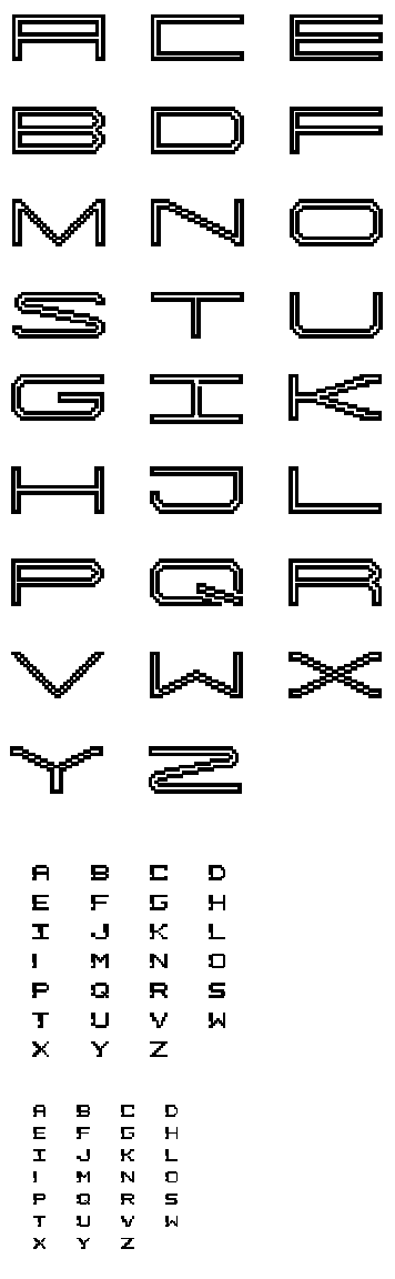
The S,G, and Q of the first face give it some distinction. A,C, and E appear to have fallen out of that system, and have taken on a purely block formation that likely won't aid the eye in reading this long face.
I'm rather intrigued by the J and the X in the third face. The missing pixels on the J stroke seem to have moved themselves over to the left end of the letter, and I think that this sort of suggested rearranging can make for an interesting system. The X intrigues me because it is calling out for its own system. The weight on one half of the letter and the slight twisting of the strokes at the center junction is a sexy combo.
Posted by D-cal on January 29, 2005 09:17 PM
i agree with daniel about the shifting quality of certain chars in the second face -- and i think it's working better at the smaller size. maybe this could be emphasized in chars like the L, I, and X (i agree also that it seems like it belongs to a different system right now). the Z might play out interestingly as well -- the shifted pixels suggesting a crossbar? one notably awkward char is the V, there isn't a shift happening as much as it feels badly aliased. perhaps the missing 'bite' doesn't have to appear in the same vertical location every time? that would free you up to move it to the thicker stroke and suggest some internal motion -- like what i think is starting to happen nicely with the K. i'm also not sure about the O and Q, there it appears that two blobs have been added, rather than one chunk taken out.
Posted by jay on January 29, 2005 09:38 PM
Hi Jess - Nice face. Jay is right on the money with his comment on the "V". I think that widening it if necessary will help smooth out the transition as it tapers to a point at the bottom. In this case, it's okay to break the system in an effort to smooth out the flow. The cap "O" "H" and "W" appear to thin out too much on the edges compared to the other letters. If this shift in line weight is desired, it should be applied to the rest of the alphabet. Overall - it's a clean, simple concept idea and is very readable.
Posted by Jessica G. on January 31, 2005 11:37 AM
im interested in your first, larger face, it's v. bold and consistant in terms of volume. you might see how it looks to fill in various pixels or remove from the outline as you did in the I and Q.
also the K jumps out at me as being a Y on its side. a whole new alphabet could be created by turning each letter to a vertical orientation.
Posted by d. gazzia on February 1, 2005 07:44 PM
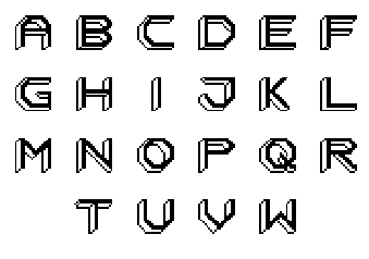
these are totally retro -- aggressively ugly but well-drawn type from the early days of computer interfaces. i could see these working really well screen-printed on concert posters for cheeky french electro acts.
Posted by pk on February 6, 2005 05:37 AM


