
hey Jon,
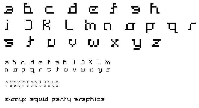
Ta da- here it is. Nice job - I think the face uses the slabs in a fresh and interesting way. You've managed to invert many of the letters beyond the obvious - but they still read cleanly and easily. There is a really nice flow across the letterforms, they pull and grab hurtling your eye onward. I only take issue with the "K" - somehow it's less poetic than the rest.
Posted by Jessica G. on February 14, 2005 09:03 PM


