Notes, thoughts, goals, research on CAM.

Hey guys, I thought I would post my first attempt at a logo study for CAM. Thanks for lookin'!
Jon Knox
Posted by Jon Knox on October 17, 2005 04:46 PM
I thought I would also post a fold-up poster I've been working on that has more subtlety in line weight and color. Right now, it's info from the CAM website. I want to have more. I think this may be more of the color palette I want to work with. The green should be more lime. Thanks.
Jon Knox

Posted by Jon Knox on October 18, 2005 12:32 AM
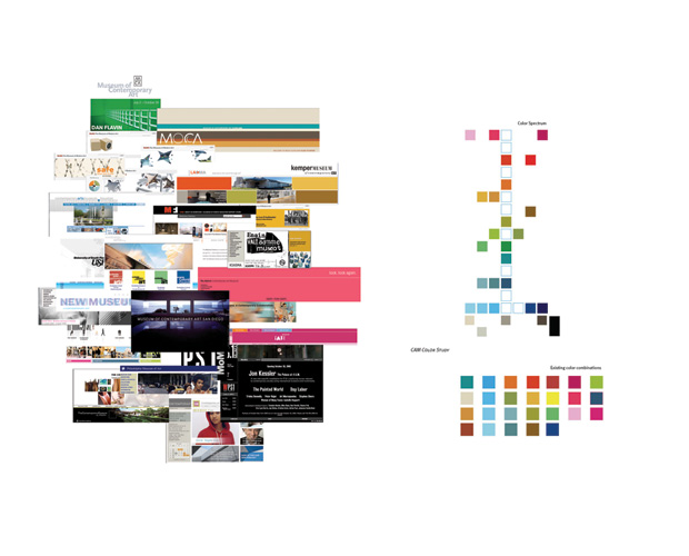
This is my most recent study. I am asking myself what CAM feels like, and what the CAM experience is. I expect for their experience to inform their identity. Right now I am looking at color. I searched for "Contemporary Art Museum" online, and looked at the first 50 websites. From these websites I found common colors and created a spectrum.
Posted by Andre Thompson on October 19, 2005 03:39 PM
nice, jon - I love that the logo can translate into two-color like that - and it's nice to see it in a more subdued color palette. I think the range is important for a institution like cam (especially considering the vast range of "contemporary art") so that it can respond to each event and show differently and appropriately.
Posted by Libby Levi on October 23, 2005 09:59 AM
Regarding logo design: I learned about one Saul Bass, who designed a lot of famous logos, many of which are still in use. Go to
http://www.thelooniverse.com/movies/west/saulbass/logos.html
to see what he's done.
Here's a good site about logo design:
http://www.businessknowhow.com/marketing/sfullogo.htm
Posted by Doug Alexander on October 23, 2005 09:27 PM
I've been working on a website design as well. I thought I'd post it for comments. I don't know if it's too simple. It's not quite what I want yet, but it's what I got so far.
Thanks,
Jon Knox

Posted by Jon Knox on October 25, 2005 03:07 PM
Study of Organic Logo for CAM. Every iteration is the logo. How it's folded is the logo. CAM is alive, CAM is always changing, CAM is what you take it to be.

Example of Range of Logos

Sequence of Folds and optional Logo with Logotype iterations.
Compressed video of how logo works.
Logo 1.6mb
Posted by Islam Elsedoudi on October 26, 2005 02:26 AM
Islam,
At first, I thought your idea was interesting visually but I didn't have a lot of confidence in it's execution... UNTIL i saw your quick video. That was an excellent mock up (and actually, 100% more compelling than seeing all the versions from an illustrator file). Now, you need narrow it down to a few "main" marks. I don't think it would be really safe to have a logo always be different (even if it is from a set of ~30). The transition of it's change from mark #1 to mark #3 could definitely be found in that video that you created. On the web, that's a whole different story, though. Consider the difference.
Good luck.
Posted by mia on October 28, 2005 02:06 PM
color studies and logo type

black and white form studies

color form studies

Posted by rachel gamage on October 30, 2005 09:48 PM
Ok Guys,
Heres what I'm thinking. In the whole concept of branding, I don't think it is a good idea to venture too far away from cam's current logo because I still want it to be identifiable. However, CAMs current logo has one problem. It is a box. They are essentially putting that which is so obscure (i.e. contemporary art) and putting it in a box. So, maybe it is so simple its scary, but I decided to break the box. Tell me what you think.


Posted by Colleen on October 31, 2005 02:55 PM
Rachel while those are very interesting studies in repitition and contrast, I'm not really sure how they align with the CAM branding. What do they mean and what is the point in focusing SO indepth into one idea that every minute pixel because a different variation? Granted, I know you've probably got a lot of ideas, but why this one? What makes it stand out?
Colleen nice observation. I like the idea of breaking out of the box, but what does it say when your images begin to look like they're closing instead of opening? be careful to make that clear. secondly, your comps start to look very digital (i immediately thought alarm clock)... do you want someone to read "c i" or "c" and "a" in the same figure? where's the m? I don't mind overlapping letters, but don't drop the m. i'm afraid you start to lose the idea of "breaking" the box.
Posted by mia on November 1, 2005 08:38 PM
Islam, dood. I've told you once, I've told you twice. That idea could be a mark and typography. Look into it, before I take that and use it against you in Type 4 next semester dun son. Peace.
Posted by Travis Stearns on November 2, 2005 12:40 AM
I've had so many ideas swimming around in my head and I'm having a hard time organizing them. Art isn't just canvas on a wall anymore. I wonder what would happen if CAM hosted small concerts? It could even be local musicians. It would get a crowd with artistic sensibilies into a space. The Bicket Gallery does this. Hybridization in this case widens the audience as well. I know a lot of people that go to shows and like art, but never find themselves in galleries and museums. Having a concert every month/week or so would increase urgency and get people into the space, as well as offer entry points to those who may tend to shy away from going to a gallery and being "artsy." This idea just came to me, so I haven't had time to make a mock flyer. The flyer could advertise the music, as well as the current exhibition. Input, anyone?
Posted by Jon Knox on November 2, 2005 09:56 PM


