
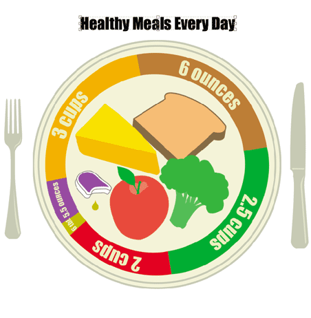
this variation, as well as the flat, vector-based version are so clear that you might not need the call-outs to explain. at least in this one, having the photographs could be sufficient. do think however on the connotations that arise with the use of photographs.
I like the roundness of it, and people should be really comfortable with this approach. I think you should think about the idea of the cafeteria tray a little more though, it would be cool to see a variation with that. (could have a milk glass and other elements that elevate)
Posted by carolin on May 3, 2005 04:36 PM
I like this idea, however I think it's a little rigid. The lunch tray is nice too. But I think that the reason it doesn't seem to work for me right now is the hard lines. Maybe If you drew on the plate the food as if it were to appear on a dinner plate, but keep in in propoartion. For example, instead of placing a picture of broccoli in the section, vectorize some broccoli and place it like you would your dinner. It's just an idea.
Posted by Jessica R on May 3, 2005 06:03 PM
the sans type is clearer in your other version. the pics are immediate. the pie chart gives good sense of relative value and comparison.
the additional type notations might be good as a secondary version. this is the strategy that the new triangle takes (for good or bad). certainly your use of pics skips the need to identify what individual colors represent. this takes a step out of the decoding.
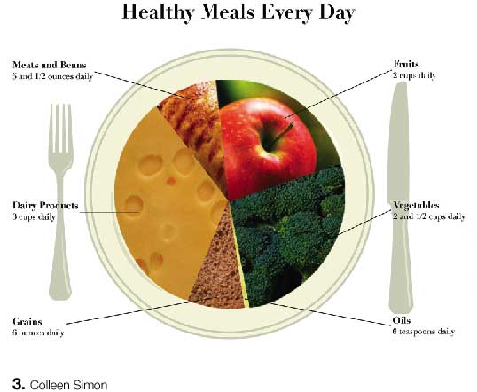
cheese is not #1review data.
nice. to the point. continue to look at tight variations.
Posted by tony on May 3, 2005 11:03 PM
I agree with Jessica about the pie slices being very rigid. The food items you chose to display have very organic curves and interesting textures that shouldnt be hidden. I also like Jessica's idea about presenting this chart just as it would appear on someones dinner table. Show the textures, colors, curves and scale relationships between the proportions.
Posted by Candace on May 4, 2005 02:44 PM
Posted by colleen on May 5, 2005 06:56 PM
Posted by colleen on May 5, 2005 07:35 PM
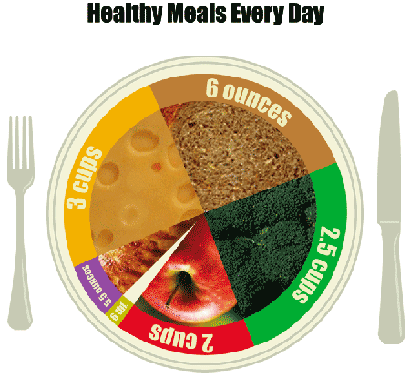
ok, ignore the upside down apple
Posted by colleen on May 5, 2005 07:37 PM
OIL what? Work the white sliceit dominates and confuses. can you have milk and cheese in the same orange/yellow slice? too complicated at that point? i just keep thinking about downing 3 cups of swiss cheese every day and my mind blows up as well as my body! how bout some fat-free yogurt?
Posted by tony on May 5, 2005 07:42 PM
your composition in the first draft is a better balance. slice placement is much better.
Posted by tony on May 5, 2005 07:43 PM


