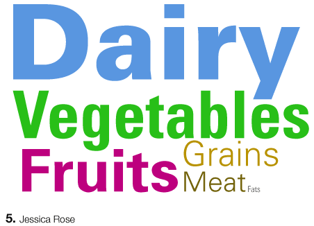

Jessica, anther great logo/poster/whatever. I really appreciate your simplification of a complex amount of information. But then again, is it too simple? How do you explain to a kid what "dairy" includes?
Posted by mia on May 3, 2005 03:30 PM
this is the food pyramid for grown ups, they dont need no stinking pictures!
Posted by colleen on May 3, 2005 09:34 PM
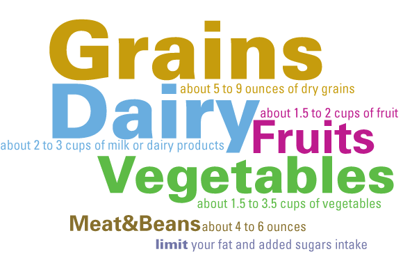
Grains are top billing. Go with the general mark + hierarchy.
Great to see a typographic solution. How can you get the exercise issue in there? absolute proportions? If this functions as a legend, what opportunities do you have with establishing and making reference through color? You have a few more avenues to explore along this line, but keep the moves immediate + uncluttered.
Posted by tony on May 3, 2005 10:48 PM
Posted by jessica on May 5, 2005 06:22 PM
same reproduction issue here. consider repo size and cmyk color build on super thin type. this will be a real mess. must consider black on all small/thin type in this case. sure we could use c or m or y but they would be too tough to read.
maybe you should team up with Adrienne
Posted by tony on May 5, 2005 11:24 PM


