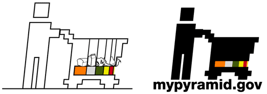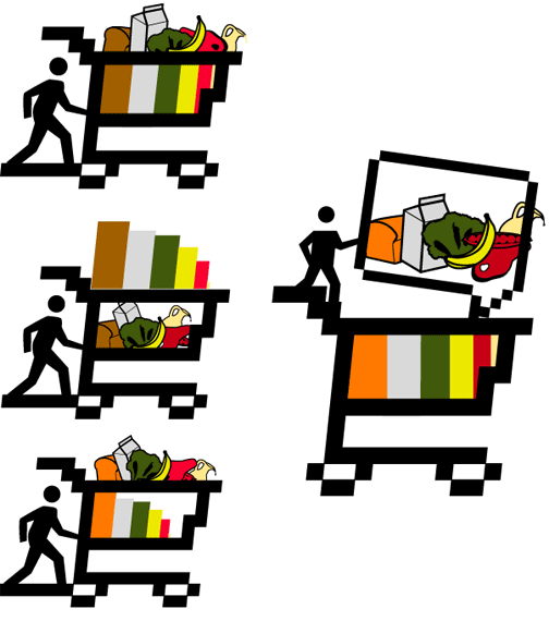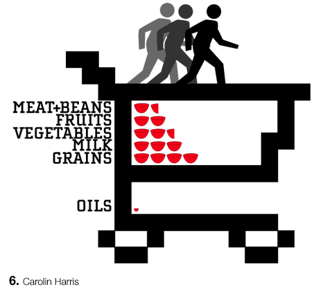
I like the bowls,but righ now they aren't making much sense with the shopping cart. It's taking my brain a little longer to read this. I like your type though, it looks really clean. I like the shopping cart idea, because you need to start thinking about the pyramid-whatever when you are in the store. But it doesn't seem to make sense with the bowls (although, the bowl idea seperated is nice). Sorry I'm not much help, but I think your ideas are good.
Posted by Jessica R on May 3, 2005 06:08 PM
I like the uniqueness in formal investigation of this peice, however, i don't quite yet feel everything is working in unison formally, from the choice of typeface (which I like), the pixelated shopping cart, and the way the bowls are representing suggested serving sizes. I know that's a lot of jumbo, but I might consider something else other than a shopping cart. Perhaps an actual cabinet, since they are bowls after all, or visualize the different bowls of different food groups with different shapes, sizes and styles. Maybe use really nice, different types of china dishes...maybe also consider working the excercizing person moreso into the design (?) (just a side thought).
Posted by Liollio on May 3, 2005 08:51 PM
I like the shopping cart idea, maybe these should be cans, boxes, ect that relate to each food group instead of bowls. Oh also it would be cool if the active guys were facing the other way, because the pixelated handle bar looks like steps that they could be walking/running towards! And to be picky, I think the line weight of the cart causes it to become dominate over the actual information you are trying to get across. Maybe if it was thinner it would be better, it would also open up the area that holds the bowls.
Posted by colleen on May 3, 2005 09:32 PM
milk
oils
?
(if) i am really dumb and take this at face valuewhat words / wording should be used? do images work better?
shopping cartconsumers consuming. what about Js measuring cups? how can you use image to bring other nuances to a quick read?
should this be an italic bitmap shopping cart with the three runners pushing it? should we get exercise by speed shopping?
the connections are mind-boggling.
nail down a clear read of the proportions.
keep the punch and immediacy!
Posted by tony on May 3, 2005 10:06 PM

Posted by carolin on May 4, 2005 08:56 AM
you took me quite literally, eh? this actually becomes more of a commentary. the essentials are getting lostscale of main info is lost in the overall illustration.
Posted by tony on May 4, 2005 09:02 AM

Posted by carolin on May 5, 2005 09:15 AM
Will the fruit industry think they are getting the middle finger?
Posted by tony on May 5, 2005 09:43 AM

Posted by carolin on May 5, 2005 04:24 PM
i think the shopping cart is problematic however you want to "shop it" - mainly because the public (smartly perhaps) have a keen suspicion that this whole food pyramid business is more about manufacturers / food industry "pushing" (like a cart even) product rather than being health related as first priority. The essence of good food might have more to do with alternatives to food processing (commodification in stores - and trans fats) which the shopping cart indexically signifies. ...yea, i know sound like a organic /farmers market pitch - an agenda too.
Posted by kermit on May 5, 2005 04:59 PM
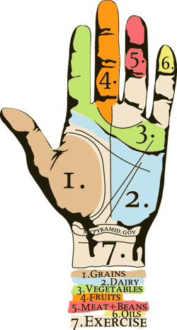
the hand. what do you all think about the hand? yo, carolin, talk to me about the hand.
Posted by tony on May 5, 2005 11:15 PM
hand is too damn spookey - like a hand code, message from alien visitor -i.e., "i come in peace" (in lieu of not being able to speak or something). The numerical geography and color assignment makes even more mysterious.
a pop culture phrase (now passe) come to mind - when something or someone does not communicate:
"TALK TO THE HAND",
but it ain't talkin' back, (i.e. does not communicate).
Posted by kermit on May 5, 2005 11:48 PM
REFLEXOLOGYpressure points in the hands and feetmany charts on the subject look like this hand.
PALM READINGlife lines and all that.
I think that OILs should get the middle finger.
Posted by tony on May 5, 2005 11:58 PM
i was actually drawn to the hand more than any of her other sketches. it seemed to be the most unique approach. not necessarily the best, but i think it has potential. despite some of the previously mentioned popculture ideas of the hand... i think its interesting how someone can continuously look at their hand as reminder of the proportions of food they should be eating. the logo travels with them. they don't need a health book or a cereal box. the proportions are 'tatooed' on them.
i like tony's take on the middle finger. you know middle school kids will get that.
Posted by mia on May 6, 2005 12:00 AM
I am eating some planters peanuts right now that claim on the lable:
" a HANDFUL" a day may MAY be good for for your heart"
......
whose handful i wonder - in any event / measure i am over my limit.
Feet big, hands small .
ha!
Posted by kermit on May 6, 2005 12:15 AM
What if the proportions were only in the palm, like Tony was suggesting with the palm reading comment. That way you won't have to worry about connotations with the finger, specifically the middle one.
Posted by al. f. on May 6, 2005 12:26 AM
I like the hand too. I was actually thinking about the hand because there are 5 fingers and no finger is exactly the same. I think the palm idea is good, Im trying to think how you would incoorporate exercise into it? On the shopping cart ones, it seems like there is too much dependence on the shopping cart. Nice concept, I mean thats where it all starts when you are shopping and buying the food, but again, I think a problem with a lot of americans is that we go out to eat a lot too, and the hand, like mia said can go with you every where.
Posted by vb2k on May 6, 2005 08:27 AM


