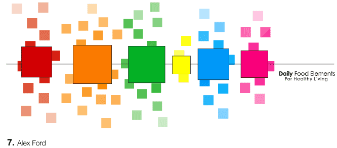

I like the idea of creating a pattern for daily food elements. However, I'm not sure that the way the illustration is organized, one would be able to clearly identify the difference between any of the groups except the yellow/sweets section. How can you push the idea of elements further? What is it about the organization of those squares that create specific patterns? Why the specific order? What would accompany the squares for further description? Just food for thought. har har. that one was for you, fjord.
Posted by mia on May 3, 2005 03:28 PM
The title of elements makes me think it should be elements forming one bigger entity. Mia mentioned the organization of the squares into specific patternswhat about a shape that could represent the daily intake? Kind of like puzzle pieces that come together in one, but you have a variety of ways to achieve this.
Posted by carolin on May 3, 2005 04:29 PM
I know that you are a huge square fan. But on a completely formal note, squares always make me think late 80s/early 90s. Have you tried different shapes? Circles may look more contemporary or maybe just really abstract shapes. Is there a specific reason for the squares? Are they building blocks? Just curious.
Posted by Jessica R on May 3, 2005 06:23 PM
I think you've set up something very interesting here. I will agree with everyone else on the formal/organizational/pattern aspects of the image. However, you are starting to suggest with the color-faded and closely juxtaposed squares the idea of interrelation of different food groups. Whereas in different groups represented from fellow peers are certainly engaging, this starts to suggest how the certain food groups may OVERLAP one another. I don't know if this was intentional or not, but I might work on really making that idea an inherent part of this particular visualization.
Posted by Liollio on May 3, 2005 08:45 PM
you are doing two things here... Each square is a different size to represent the portion size of each food group. You are also showing how many of each of these portions are needed in each group. Very smart. I know that was a big issue with the first pyramid because proportions vary between the groups. The only problem is that it took me a while to understand this. It may help if the smaller squares stayed consistent with the size of the larger squares and if you made it more obvious that the larger squares were a "zoom up" of the smaller squares.
Posted by colleen on May 3, 2005 09:25 PM
good comments to you from the group.
what happens if you remove color? what happens to perceived hierarchy?
tucking small squares in close to the main squares changes the perceived size + relative scale to the other groups.
you are relying on an orientation to color and respective food groups that is missing. without this info, this is more of a logo than a teaching mark.
more, more, more!
Posted by tony on May 3, 2005 09:57 PM
Posted by alexF on May 5, 2005 11:11 PM
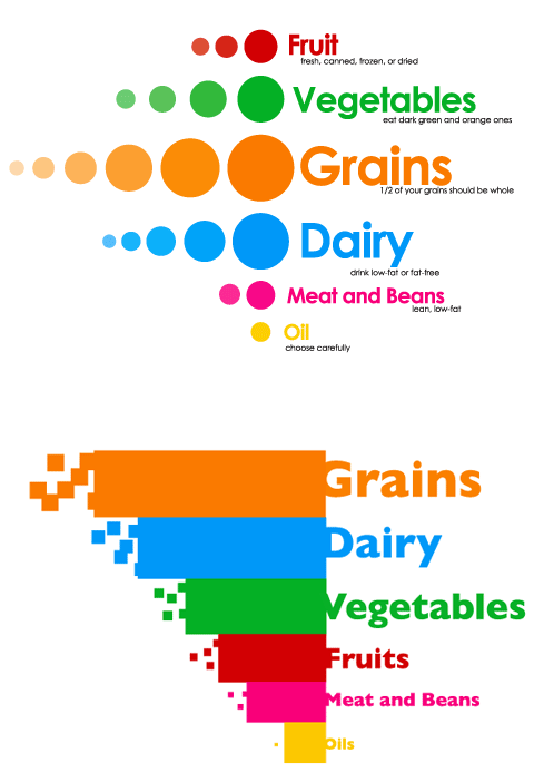
the dot one is my pick. the secondary text is too small. i like that it is there, but it must be bumped up.
Posted by tony on May 5, 2005 11:13 PM
dots! the squares seem kinda arbitrary. you may as well just use the color bars. but the circles actually act as a gradient. i like that the larger text kind of curls around the circles, but make sure they are consistant (it looks like meat and beans might be a bit off). i agree with tony about the small text. also look at its location. it seems arbitrary right now.
nice to see the variations young fjord. i miss you. do you miss me?
Posted by mia on May 5, 2005 11:54 PM
Thanks to those staying up to welcome the morning of Friday.
I have made some revisions and moved the small text (now at a few sizes larger) to line up directly with its title. I'm actually liking this one, but I'm wondering if it needs some more info, like why are dots radiating from the larger ones.
Should I also include the serving sizes with the rules?
And yes Mia, I am sitting here staring at your desk. I sat on it tonight. It was nice. And I took your chair for a ride. I missed you while this was going on. Come back soon. Thanks for the post.
Posted by Alex Ford on May 6, 2005 12:17 AM
Ahhhh, it's nice to see you are off your square trip. Love the circles.
Posted by Jessica R on May 6, 2005 02:04 AM


