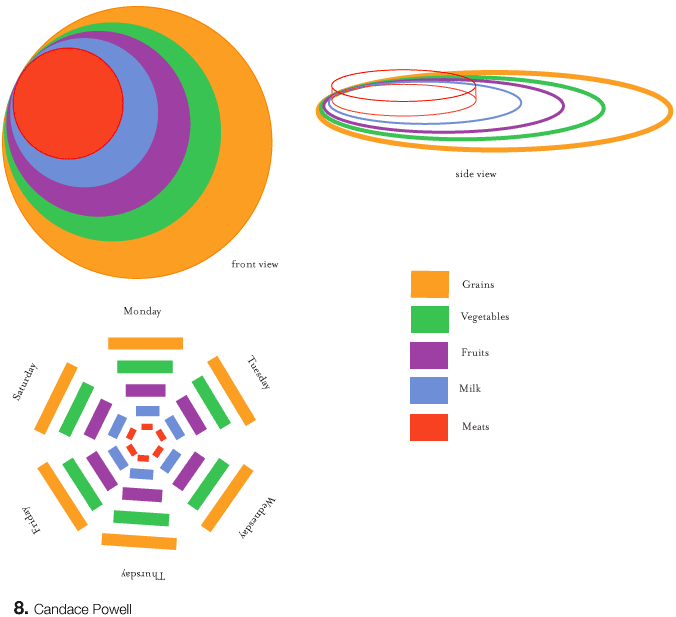

Your top idea is interesting because it starts to hint at the idea that this object would be tilted in different directions based on the individual's needs. If you havent already tried this, attempt at placing the red further in the middle and move the other circles further around so we see them more around the red. This would start to show the differences in the design. The iterations could open up new possibilities.
Posted by Alex Ford on May 3, 2005 07:16 PM
I like the application of a third dimension to imply maybe the idea of actually measuments of food, while simultaneously showing the "universally reccomended" proportions of each food group. I would definitely try some way to incorporate that into the layout. I agree with alex, be careful with how you orient the 3-D logo in relation to the viewer, keeping in mind that nothing should be hidden "behind" anything else, obstructing the access of vital information.
Posted by Liollio on May 3, 2005 08:40 PM
i dont know that I agree...to me I totally understand the proportions in the first one. Whether the red is in the center or not, each ring still has the same circumference and diameter. And right now it looks 3-d and seems to be projecting forward...could this be hinting at being active??? worth a shot
Posted by colleen on May 3, 2005 09:18 PM
this is an interesting study for all to evaluate. more in terms of chart type and how one gets a sense of comparative value. how difficult is it it to compare stacked circles? 3-D perspective / volume and depth? (tough indeed) you can't go too wrong with a simple, straight-forward pie chart. as for the new pyramid: wedges of a triangle are not common visuals that we easily compare.
relative or absolute quantity of food groups is thrown out in the first chartit saysEAT MORE MEATfocus on MEATthis flashing red focal point brought to you by McDonalds. you have illustration skillsfire em up!
Posted by tony on May 3, 2005 09:38 PM
I really like the circle idea, it is simple yet very effective. I'm drawn somewhat to the 3-D perspective of the circles, to me it gives off a more contemporary feel. I could visualize it animating very easily. Your second idea of a weekly schedule is another interesting idea that lets the audience know they should never take a day off from their plan.
Posted by Matt H on May 3, 2005 11:02 PM
Posted by candace on May 5, 2005 04:20 PM
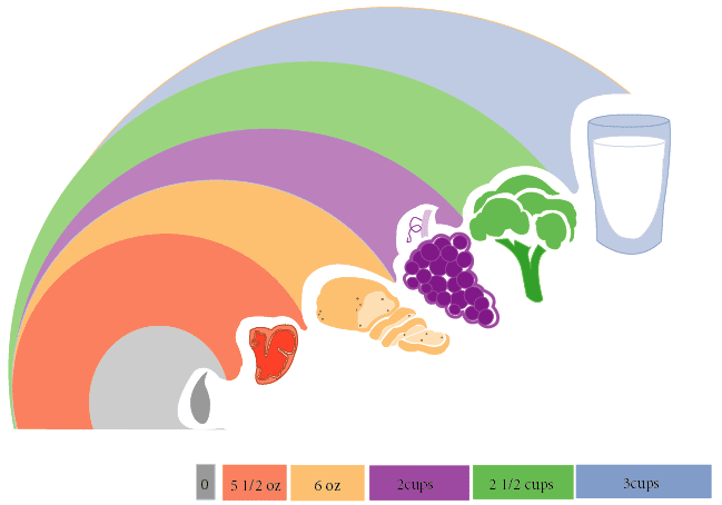
nice imporvement, your illustrations are beautiful (as we all have noticed recently). however, your type is lacking a little bit. (notice how the squares at the bottom are all askew... try lining those up and whatnot). i like that for once, oil/fats is GRAY. its not a color. its not as "appetizing" as a color. NICE. it also talks about being artificial, whereas we think of vegetables having true colors. anyways, what about the accompanying type?
whatcha got, candace?
Posted by mia on May 5, 2005 06:40 PM
hmmm, interesting, but is the overall form too much like a Tsunami wave (still in our mind via recent news) or a peter max (60s / 70s pop art) adorned in pastel colors. You might really want to test out the "perceptual distance /difference" of the gray (fats) and blue (top of chart), especially in terms of RGB calibration. Are they too close in color? Are there two charts ? Type legend at bottom, form above? The two seem somewhat divorced. I see the "literal logic" of color choices for all except the milk /dairy - does this strategy then break down? How many color does Bertin argue one can use in a chart - and remember easily?
Posted by kermit on May 5, 2005 07:27 PM
Posted by candace on May 5, 2005 09:55 PM
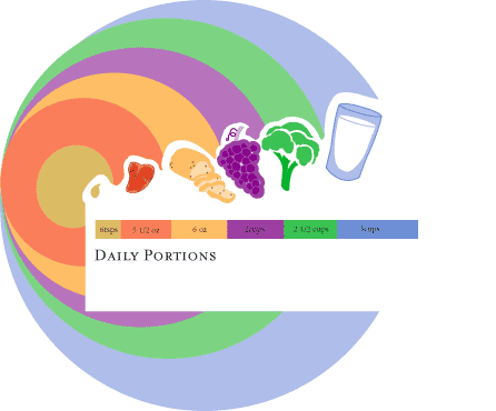
scale. if you make the mark this large, you must rescale the type + reconsider the scale relationships with all component parts.
awkward shape. difficulty judging relative scale when you stack the circles. oil becomes too prominent.
your earlier ver is much closer.
Posted by tony on May 5, 2005 10:19 PM
i'm not sure showing the whole circle is purposeful. i agree with tony, the previous version was a lot closer. now you focus on why the things are stacked and why the orange is a different proportion from the goldish (oil). type and boxes improved. how can you make those boxes become part of the "horizon" line that would crop the bigger circles? also think about your wording choice, daily portions. is that all? whats clever about your design and how can that be emphasized in the titling?
Posted by mia on May 5, 2005 11:00 PM


