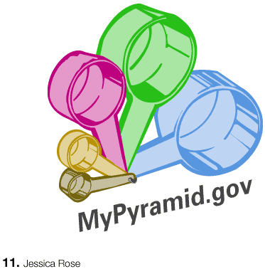

What i really like about this illustration is that its a logo, a poster and an information graphic all at the same time. I think the colors well represent their "groups" and are easy to understand. The illustration is clean. I'm not sure this illustration can be reduced to anything more simple that what Jessica has illustrated here. However, I would like to see how this idea expands. What would accompany this logo on say a large poster in a school cafeteria? At some point, you would have to give further detail. Nice.
Posted by mia on May 3, 2005 03:25 PM
i love this, because everyone in the world can associate with it. you have managed to find that one commonality that was previously a point of misunderstanding, and have turned it into a complete solution. The idea leaves enough room for the various food amounts (i.e. packing the cup high or leveling it).
WHat's your idea on the incorporation of excercise?
Posted by carolin on May 3, 2005 04:22 PM
I agree with Mia that this design could be placed on a poster or on a smaller document. What's nice is that the measuring cups infer that one must take time in deciding what amounts are right for them, that it is not some rash decision. The wrong amount could mess up the recipe. This is such a cool idea. Have you tried adding in measurments on the side of the cups?
I could also see the cups breaking apart seperately to show the individual amounts - kind of the same way it is done on the current website's flash piece, except this would be so much better.
Posted by Alex Ford on May 3, 2005 07:06 PM
This one is visually appealing and easily understood. It lacks labeling and amounts but it would most certainly appeal to a wide range of people. It is a mark, but so is the current pyramid. It also resembles a pyramid in form, which would help people accept it as offical. In most cases additional nurition information is going to be required to educate. I like it a lot. Additional labeling could make it just that much better.
Posted by Stimmel on May 3, 2005 08:12 PM
Beautiful! But I need labels, a legend or something to let me know which food group goes where.
Posted by Candace on May 3, 2005 08:29 PM
I could totally see this as a keychain ring. This is the first that i've seen so far that really directly correlates with the idea of applying appropriate "serving size." Definitely push it furtherincorporate measurments of each food group in there somehow. I know Ford mentioned putting hatch marks on the side, or maybe have pictoral representation of acutal food inside the cups. Something that can hint at actual measurments being allocatedyou already nailed the proportion system. Its the HoTTness.
Posted by Liollio on May 3, 2005 08:32 PM
Jessica, you rock! I think the suggestions that everyone has made is right on. I could so see this work in motion, stacking like those things normally do and then seperating like Alex mentioned.
Posted by colleen on May 3, 2005 09:05 PM
The crew seems to have the right angle on this. You are certainly thinking with a quick-read, abbreviated set of visual elements. Don't stop hererefine and listen to the comments of your peers, but consider other objects/images along the same track you have already established. Stay away from legends, keep the language loaded by using iconography + symbolismyou have us making good connections with an economy of means. Very nice approachcarry on!
Posted by Tony on May 3, 2005 09:16 PM
This is really clever, Jessica. I agree that there needs to be some kind of reference to the food pyramid. But great idea!
Posted by Caroline on May 3, 2005 09:53 PM
Jessica, I really like the illustrative quality that this has. It reads very well visually and communicates clearly to a broad audience, the measuring cups representing food measurements is a clever idea. I think you face some of the same problems I have in that we need more information about quantity, color representation, and the whole exercise thing. But overall this is a great concept to run with.
Posted by Matt H on May 3, 2005 10:49 PM
This is a great illustration and its very easy to understand. It has such a strong visual language that it speaks without type. Can't wait to see it with all the information. Nice work, Jessica.
Posted by Adrienne on May 5, 2005 04:36 PM
Posted by Jessica on May 5, 2005 06:18 PM
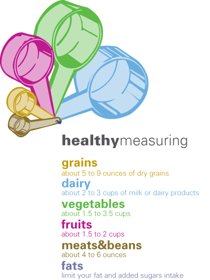
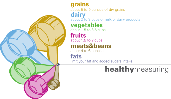
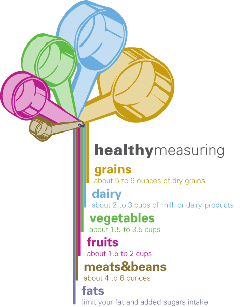
i like the 2nd and 3rd (if theres any difference, i'm not seeing it)... nice composition. i like how you tried to combine them in the last illustration, but it becomes a little messy at the bottom. its odd that the words nudge left every time (but i see why they do). its just a bit akward. however, i like how the colors stream down. maybe a variation of this could be really successful.
one thing you might want to think about is creating a system for this. what it looks like alone (horizontal, vertical). what if it was printed in black and white??? what then?? also, with certain amounts of information. it'd be lovely to see this as a whole system. mm system.
delicioius, jessica.
Posted by mia on May 5, 2005 06:37 PM
hey, i don't really make any claims to cooking knowledge (thus, do i really understand measuring cup analogy?) - but i did look at my wife's kitchen utensil and a cup is 8oz. (An amount of smaller quantity than the 2 - 3 cup range you denote in the dairy measure -2nd) - Grains in your chart is only 5 to 9 oz., but stangely represented bigger -1st. This confuses the limited cook in me. But in fact, i am probably a good target audience candidate. Your oz. and cup perceptual logic do not "jive" (to the limited cook) as they do suggest (shown) quantities in the given pictogram. This is fortified in the one to one color correlation. No "cup" for "good" fats - or oz?
Posted by kermit on May 5, 2005 08:20 PM
i totally agree with kermit. even those of us who cook often can be easily misguided. perhaps try using "equivalent to." for example, with the grains, is that the equivalent to 1 cup of cooked rice? or if at all possible, keep them all in the same measurement (despite the fact that we never measure meat with cups???)
uhoh. design problem.
Posted by mia on May 5, 2005 09:36 PM
the thin secondary type is too thin + too small. consider the range of sizes that it may be reproduced + in many cases reproduced poorly. CMYK color build at that size is a mess. set all that type in black so that it is a "flat" color.
check out KB on the logic. good call.
Posted by tony on May 5, 2005 11:20 PM


