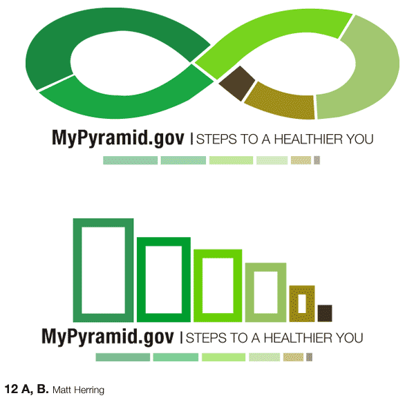

I find the first option very intriguinginfinity. Every day. Have you looked at how that "logo" (and thats really what it is) might break out? The amount of information that the food pyramid deals with is extremely complex, and this logo suggests that. However, can it support the ideals at a more detailed level?
Steps to a healthier you? Well, how can exercise be incorporated into that mark? Personalization? Are there different versions, or can you incorporate that? Could you provide a template for individuals to create their own mark? They could print them out on stickers and slap them on their trapper keepers and take it to lunch. A daily reminder? Think about your experience in interactivityhow can you make it an experience? A personalized experience? I think thats where this could hit home.
What is great about this mark and Jessicas (the one with the measuring cups) is the flexibility of use and I commend you both on that.
PS. your spacing between the line and "steps to a healthier you" needs a little fixing. its not equal on both sides.
On the bottom one, could line weight represent something? It varies some here, but could it be even more dominant in the design? Does using solely green > brown have an affect on the audience that isn't intended? (think about how green makes you feel that its healthy)
Posted by mia on May 3, 2005 03:38 PM
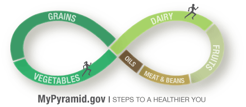
I really dig the first piece, for its unity and color coding, as well as the idea of incorporating a tagline within the design. As far as showing excercise within this thingit already reminds me of a running track or race track, so if you could add just one more element to clarify that, it might click with the audience.
If you don't feel like creating multiple versions for personalization, could you make the white divider bars into something that in theory could be dragged to one side or the other?
Posted by carolin on May 3, 2005 04:18 PM
I like the top logo that you have designed. The curves and color make me think of organic. The separations in color need to be represented to show what each color stands for ie. Grain, dairy...
You might also want to think of your own tag line to say since the shapes are not of a pyramid. Thinking about different colors, rather then shades may help to differentiate the different food groups you have in mind.
Posted by quentin on May 3, 2005 04:39 PM
I know I was there when you showed me this before, but now that I see it in a different context, I think it's clear that although your colors are nice, they aren't indexical enough. The organic feel is a plus, but it's hard to understand what is what. That doesn't mean you have to change your color scheme, but finding more differentiated colors. The infiniti sign is really nice, although I would also submit a version that doesn't look as squashed (if you still have it).
Posted by Jessica R on May 3, 2005 06:12 PM
The idea of infinity being applied to our health and diet makes perfect sense, and the the symbol is a nice opportunity to show how the groups are interrelated This could be done with a simple blending of the colors instead of breaking them up, because this disrupts the idea of infinity.
I also agree with the others that thinking of a new name for this piece would drive the concept home.
Posted by Alex Ford on May 3, 2005 07:00 PM
The infinity symbol in the top logo is perfect! I agree with Quentin about the color scheme, I feel like you should consider colors that are normally associated with each food group. Right now it looks as if they are all apart of the same group. And you are going to include a legend right?
Posted by Candace on May 3, 2005 08:20 PM
I know this is kind of a nit picky thing, but have you thought about incorporating a physical activity aspect into your infinity mark? Maybe it could consist of the actual width of the infinity getting thicker, meaning more excersize, and thinner for less. I like the color scheme, but as mentioned, maybe you need to differentiate a little more.
Posted by Liollio on May 3, 2005 08:25 PM
but you dont nessessarily have to differentiate by color, you may choose to incooperate text or icons instead. No one says fruit HAS to be red, and I like that you chose the greens because of what others have previously said, organic and all.
Posted by colleen on May 3, 2005 09:01 PM
Nice symbolic gestures but it is difficult to get a sense of relative or absolute quantity. The mobius strip addresses parts of a whole but judging values/quantities of one food group with another is a stretchalso, don't make your audience use a legend to figure out your color coding. These might make for an agreeable logo application but they lack detailsyou have to fill in the gaps here. Forward ho!
Posted by Tony on May 3, 2005 09:08 PM
ahh the moebius strip. I like the idea but I wonder if it might give the impression that you should eat all the time and never stop, just change out one food for the other
Posted by Caroline on May 3, 2005 09:43 PM
Posted by matt on May 5, 2005 07:08 PM
I understand if they run together, its a "couple" . Yes maybe avoid. -- I understand why you represent both genders. Yes, politically correct. But as shown, the gal is always (of course ....- ladies no flames please) chasing the guy - he seemingly can not escape her gaze, attention and desire for his "upward" (in the chart) mobility/position. - to address caroline point, maybe its not eating all the time - but (maybe even more unfortunate) having to exercise all the time- at least connotatively.
Posted by kermit on May 5, 2005 08:52 PM
maybe you put kids + a range of other folk in the loop.
Posted by tony on May 5, 2005 10:32 PM
Posted by matt on May 5, 2005 11:05 PM
I think george clinton (parliament funkadelic, circa 1982) says it best:
"WHY MUST I CHASE THE CAT, MUST BE THE DOG IN ME"
....now reverse problem. I agree with tony, kids "might" offset the problem - right now, it reads as being chased.
Posted by kermit on May 5, 2005 11:23 PM


