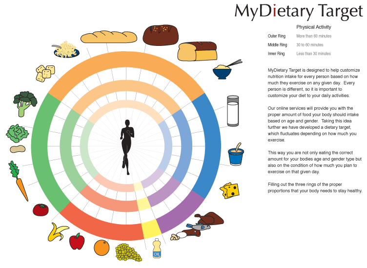
In general, I like the idea of having something that shows the amount of food one should receive based on activity. However, I think right now, its a bit unclear/inconsistent. The idea of a circle, decreasing with amount / proportion based on activity is nice. However, would it be exactly proportionate? Ex. should one eat less carbs if they are less active? What is also nice about this illustration is that it doesn't limit the represented food to one item, unlike some other ideas I have seen. When it comes down to it, customization of "my diet" and target seem to be a bit more realistic and more like guidelines. Granted, you might have already thought of these things, but from someone who isn't working on the project, I thought I'd say it anyway.
Posted by mia on May 3, 2005 03:23 PM
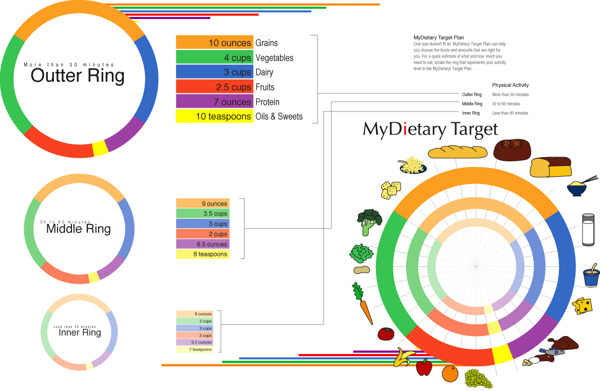
It's proportionate based on the X and Y factor. Your food intake is based on your level of excise, Therefor, your body would need more intake of nutrition for energy. A person who is less active would need less intake. It is made for the general population. No food pyramid well ever be EXACTLY correct for each and every person in the world, its made for the mass majority.
Posted by Quentin on May 3, 2005 04:04 PM
whats nice here is that this diagram clearly represents how important of a role excercise plays. More activemore food!
The representation is super-detailed, clearly color-coded and easily understandable. The final piece reminded me a little bit of one of those circular things where you can move the bottom piece and the top piece has a hole to reveal something (sorry don't know the word). That could be a cool addition to your already well thought out piece. One thing that could get complicated is the application of the piece on smaller food items, when it has to be reduced to a very small size. But then againreferring to a website could solve this.
You could maybe try one more variable where you work with only one circle, but the color bars slightly change according to fitness level. This because it seems that the dairy levels remain the same, while other proportions change.
Posted by carolin on May 3, 2005 04:11 PM
just stumbled across this site, this project is very interesting. i especially like your design, it's very visually appealing. and the idea of customization based on physical activity levels is fantastic, it really helps people eat as much as they actually need. however, i am a bit confused on the physical activity guidelines you set for each "ring"...to put it simply, it seems to me that the numbers for the outer and inner rings need to be switched. because doesn't it make more sense that the outer, most physically active ring would be performing more than 60 minutes of physical activity rather than 30; and the inner, least active ring would be performing less than 30 minutes of physical activity, as opposed to 60? or, to make things less wordy, shouldn't it be:
outer: more than 60
middle: between 30 and 60
inner: less than 30
this seems like it would make a little more sense to me. of course, i might be completely off, but it's just a thought.
Posted by ryan on May 3, 2005 04:35 PM
Carolyn made a nice point about the circles revealing something. It would be cool to think what that might be, and that the circles might actually be revolving around this object/idea/concept. This is well thought out though, and the idea of exercise being the subject that the servings of food depends on is a great concept.
Posted by Alex Ford on May 3, 2005 06:54 PM
You've organized and reinterpreted the information well. I especially like how you've made the important distintion that the more excersize means the intake of more (but the right proportions and quantities) of food. I'm a little unsure about the manner in which you decided to illustrate relative proportions, with the bars extending out to the side. To make the design more economical in terms of use of space, why not try to take that bar and incorporate THAT into the middle of the circle, as many have suggested before me to do. Maybe some other way to visually represent that idea. Just a thought. Or maybe find some way to show different exercises in the middle. I certainly agree, howeverthat void in the middle seems a little too big. Maybe its just a matter of making the circle smallerin any case, something to consider i suppose.
Posted by Liollio on May 3, 2005 08:20 PM
going along with the idea of a target, what is your bullseye?? it would be really cool to have something representing the main goal in the center. Maybe this is where you put the active, healthy person or something like that. Great idea, just push it a little further.
Posted by Colleen on May 3, 2005 08:54 PM
Q-man: seems you have an editing issue here. This amount of info is simply too much for the general population (or anyone) to digest and remember. Distill the info down to something that would work on food packaging. I did a project that dealt with CPR skills and found that the big issue was not getting folks to learn CPR but to refresh/maintain what they had already learned. The "pyramid" should teach but it should also function as a quick reminderI don't think it should require more than 10 seconds to decode/2 seconds to refresh.
It is nice to get the point across about physical activity variables. Consider how this can be done through icons + symbolsexplore your range of visuals. How do you shift from text description to more picto means? Nice research + small food illustrations. Keep trucking!
Posted by Tony on May 3, 2005 08:59 PM
Quentin, you should submit this to a textbook company - I like it! But I think it's better for older kids and people - maybe too much to remember for a kid. But your food icons are awesome!
Posted by Caroline on May 3, 2005 09:46 PM
p.s. check your spelling! (outter)
Posted by Caroline on May 3, 2005 09:46 PM
Quentin, I like the circular, target, bullseye idea. It makes a lot of sense conceptually when thinking about weight loss or eating healthier. You seem to have really gotten into the information and diagramed it quite nicely. I agree with other posts in that you need to consider editing the information down some, it is an awful lot to take in when you first glance at it. Otherwise keep pushing this idea, your sensitivity to color and those illustrations are working very well.
Posted by Matt H on May 3, 2005 10:40 PM
HI I think this one is really working. What others have said about the length of time to decode applies for me as well. But I don't think it's about the amount of information, I think it's more about the way you have to move your eye around to connect things. Have you thought about condensing the two sets of rings? The vertical set on the left doesn't add a lot of value, and seems to take up a lot of space. The labels "outer ring", etc., also seem superfluous, since you can see which rings they are just by their scale.
I like the title (MY dietary target) because it emphasizes the importance of tailoring this thing for the individual, and you've done a great job with that.
Two other small things: I didn't figure out what the horizontal color bars are doing, and if it's just for their formal value, they look too much like they're holding some sort of information and need to be decoded. Second, i think the outer ring is supposed to be "more than 60 minutes of exercise a day" not 30; also "inner ring" says 60 minutes in the legend on the top right.
Posted by berkoWho? on May 5, 2005 11:27 AM

Posted by Q-man on May 5, 2005 07:19 PM
still too complex, but certainly getting better. if you can fold the text info into the mark then i think you will be on to something. you may only need to express the activity vs. proportion issue. this can be done. scrap all the other text. let this mark stand alone - let it explain itself.
Posted by tony on May 5, 2005 10:30 PM


