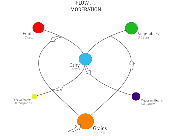

expressing a dynamic relationship between the food groups is an excellent angle. you get the heart innice. hmmm, well, this is where we begin to talk about the line between exact + true with effective + memorable. are the exact relationships diagrammed correctly? are the scale relationships right on the money? nope, but what harm is done? what is gained by mapping concepts instead of numbers?
nice tagline. type too small. do a version where you maximize your use of spacetighten it uplarger line weight, etc. look at how small you can make it and have it read. how small can you make it at 72ppi before lines disappear, etc.
more, more, more. good stuff!
Posted by tony on May 5, 2005 09:09 AM
I agree that the proportions don't have to be exact or correct, but I do think that they have to be able to be assessed in relation to each other. Fruits and Veggies dots are almost the same size, but 3.5 is so much more than 2. I think that the great distance between the colored dots hinders our ability to compare the sizes. If you don't think the dots should be compared in that way, maybe they should not be the same shapes.
Also, there is a weird perspective thing going on, and sometimes it feels flat but can also feel more 3dimensional, which further complicates the comparision of the dots. To clarify, is the orange dot big because it is closer to me? How can it be more clear that they are all on the same plane?
Posted by berkoWho? on May 5, 2005 01:44 PM
hmmm, maybe an encoded message pun - if you look closely, the top half sort of (kermit says, sorta kinda) looks like a womans BRA - and guess what? its also denoted as "dairy" in all the right (or wrong) places. What "cup" size is it? Triple C? I guess you see this (too) right?
KB
Posted by kermit on May 5, 2005 04:41 PM
snap
removing a few lines may solve this punniness
good eyes KB
Posted by tony on May 5, 2005 04:45 PM


