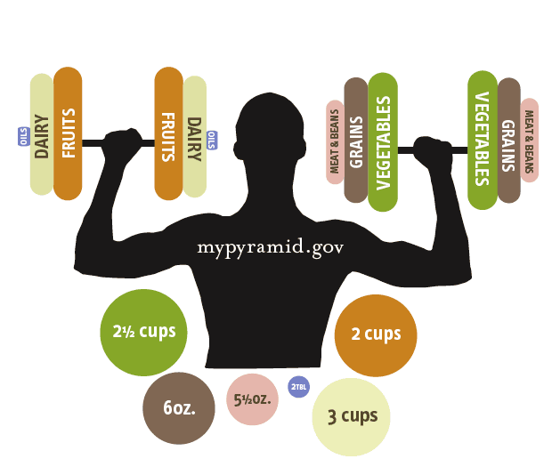
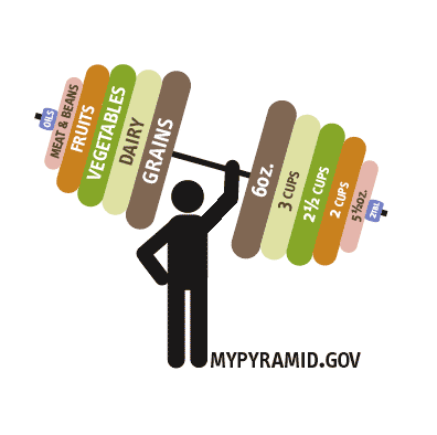
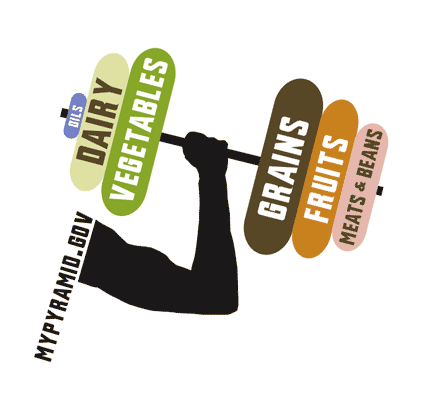

This whole idea is great because it compares the portions of the food groups and talks about health and fitness at the same time. I like the third one best, i think all you need is just a hint of the person holding the weights. This keeps the focus on the food groups and not the siloutte of the man. I dont think you need the additional circles that is in the first one, because the weights themselves show you the porportions, they are just squashed circles. But if you feel you need the actual serving sizes in there maybe the weight should be done like the 2nd one.
Posted by colleen on May 5, 2005 11:21 AM
Yeah, 3rd one by far. The person is too dominant in the other 2 plus the food groups are more clarified in the 3rd. Its too hard to make the comparison between servings and food in the 2nd. And in the 3rd you get a general feeling of the amount. Plus it shows that all of them are important. I wonder about the balance though in the 3rd mark. It seems a little heavy leaning towards the right like its not so steady. That's an easy fix though.
Posted by sarah on May 5, 2005 11:30 AM
what about the cause and effect (impact of weights ) to the representation (muscles) of the body. Is the figure a 90 lbs weakling? message: even with all these good foods, i still look "just okay" (maybe normal, yes) - not that the figure should look like on steroids. But a little "pop" in the bicep of presumably a man representation would not hurt. Maybe the figure is leaning forward because its too heavy for the weakling...
Posted by kermit on May 5, 2005 12:59 PM
I like the way your ideas look formally. But I'm a afraid that they may be too gender specific. It automatically read to be a male. I know it's a little late to start working on new stuff, but is there another way to get a less-gender specific arm in there?
Posted by Jessica R on May 5, 2005 02:24 PM
hmmm, take this angle for a spinfun approach + well rendered. nice simplicity in general, but picture these marks on a cereal box. in this context they seem a bit campy. i find myself chuckling a bit
i'd love to see you take this aesthetic in new directions. no body builder stuff. it is the economy of form that is right on the mark for this project. very nice.
Posted by tony on May 5, 2005 10:26 PM


