- - - - - - - - - - - - - -
- - - - - - - - - - - - - -
- - - - - - - - - - - - - -
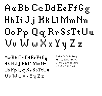
Bitmap 2 is a reworking of my first one, with an attempt at further
systematization through simulation of stroke width variation and more
rounded-out letterforms. This time I extended the ascenders to reach above
the cap height instead of stopping a pixel short like last time.
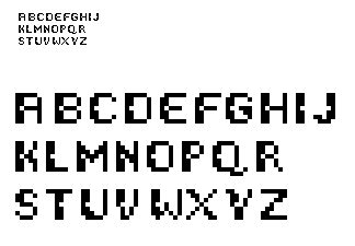
Bitmap 3 is a totallly different approach, an all-caps sans serif face
with a systematic removal of a single pixel from the left stroke of nearly
every letterform and a greater contrast of stroke width. I didn't want to
lock myself in too early to one face, but I think I like the challenge of
a serif bitmap face.
- - - - - - - - - - - - - -

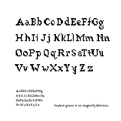
nice work here doug, just a few comments...looking at the alphabet at the smallest size one letter sticks out to me, the V. It is the only one (other than a hint in the W) that has little "horn-like" serifs on the top. What would happen if you incorperated this into more letters? The V is also a lot wider than others, almost twice that of the H.
Posted by Colleen on January 30, 2006 09:47 PM
Beautiful start Doug. The face exudes an organic, stitch-like quality.
It even looks nice at full scale. Taking a closer look, I noticed the E, F,
L, & T seem more slab serif-like than the rest. Maybe shift a few pixels
around to create a similar organic flow within the rest of the system.
Nice job ::
Posted by adrienne yancey on January 31, 2006 12:44 PM
Doug, there are some really beautiful subtleties in your exploration, like how you recognize that the ascenders of your lowercase set don't need to reach the maximum height realized by your capitals. Your "V" does look too wide, echoing Colleen's comment, though I was studying it with the "U" and even though it looks to be the same width, the "U" isn't problematic. One thing you might want to look at towards resolving the "V" is to have it mimic the 'stairstep' effect of the "Y" as it moves outwards.
One word response to your lowercase 'g' HOT.
Posted by tracy on February 3, 2006 09:23 AM
Doug
Nice process, from top land to middle land. your g's kick butt. I think there are some weight issues with the uppercase especially in middle land. It might be helpful to look at them without the lowercase? you might have done this but if not i think it would work in your favor. There is the possibility for a nice unique elegance in middleland, fix the weight and i might have to invent a new adjetive to describe it.
As for the bottom dweller i've dug the holes from the letters. The 's, x, y, z' need some resolving. you can handle that. SO what did you take out of these holes and what are you putting in them? my first thought about what to put in the holes were colorful jolly ranchers.
Dude you are doing a great job, keep it up I look forward to more!
PS. I appogize if i offended you by not using a notable adjetive from the two proceeding posts. It was difficult for me not to use it but I was strong to avoid too much repetition
Posted by britt hayes on February 8, 2006 05:32 AM
Doug
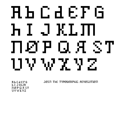
These variations are nice! The first and the last sets are my favorite. Overall, I like the way you are exploring maintaining the traditional letter structures, while adding just a little flavor. For instance, the first set from a far looks very ordinary, but the subtle shift of pixels provide nice texture. The middle set feel a little inconsistent to me, but I dont know if that was your intention. The middle set begins kind of heavy and then towards the end the weight changes. As for the last set, well thats my favorite because of that one absent pixel in each letterform! I love how something so simple can do so much.
Posted by Candace Powell on February 16, 2006 08:27 PM


