update 01.31.06 } - - - - - - - - - - - - - - - - - - - - - - -
update 02.28.06 } - - - - - - - - - - - - - - - - - - - - - - -


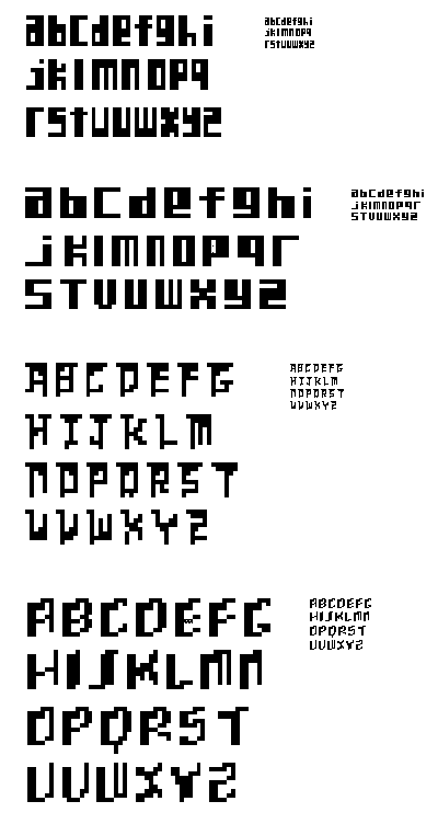
oh yeah, colleen! the bottom one! it totally reminds me of those 'living in 3d space' blocky fonts you see with the shaded sides and stuff. look at these:
http://www.myfonts.com/fonts/t26/toit/
http://www.myfonts.com/fonts/t26/cubica/
can you make the V a little more pointy at the base?
on the J, try losing the top right corner pixel that's hanging, and see what a one-px curl on the tail looks like.
your X is wacky -- a hard one, eXpecially with this idea. keep playing with that one.
of the top two, the top one feels more systematically resolved and consistent. it's starting to have some good character -- a big lug, but a softie too. keep playing with that -- maybe you can introduce even more subtle quirkiness without going overboard.
Posted by tyler on January 30, 2006 01:39 AM
colleen, me again. i ran across another face today you may wanna check out:
http://www.typebox.com/fontbox.cgi/specimen?mv_session_id=HBaiInPj&mv_pc=264&font=Hex
if that link doesn't work, go to typebox.com, select fonts, and look at Hex.
Posted by tyler on January 31, 2006 10:43 AM
Hey thanks Tyler! Those are some pretty interesting typefaces. The last one I find especially interesting because it has a three dimentional feel yet at the same time it has a historic calligraphy feel too...
Posted by Colleen on January 31, 2006 10:23 PM
missy:
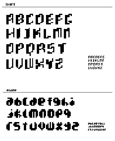
nice improvement on SHIFT. I think that the U,V, and X could still use some tweeking.. . I'm not quite getting the movement in them that I am in the other characters. But it is looking good, maybe write out a phrase or something so we can see SHIFT in use!
ok now for ELUME. are you having fun or what? when i first scrolled down the pages i thought they were little black pixel circles with letters taken out of them, obviously on actually looking at it I realized that that was not the case. I think it is neat taking a familier geometric form and making our regular familier characters out of it. The fat "i" makes me laugh. It seems like the "j" and "t" could use some more weight.
lastly you've experimented (as far as I can tell here in this wonderful busy dialoging community) with uppercase and unicase. Where is the lower? give it a try maybe, after all lowercase is what it is all about or small caps but in this instance definitely lowercase
Posted by britt hayes on February 8, 2006 05:12 AM
Colleen
Pure hotness! I love plump and shift. Shift gives me a sense of a 3-D environment and perspective. Those factors may be very helpful when or if you apply motion or if you want to just imply movement. Now plump is in a separate world of its own. Thanks for adding a little humor and human character, I think letterforms need that.
Posted by Candace Powell on February 16, 2006 08:32 PM


