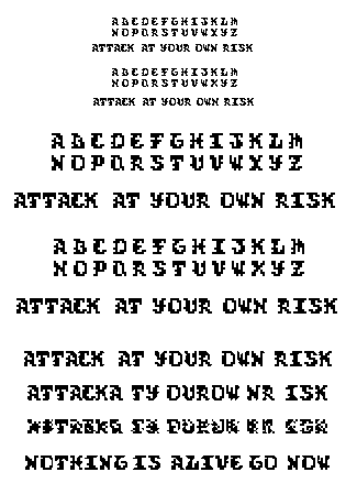

the second set of alphabet and the sentence are the revised list i made of the typeface. Here are the things i changed based on your suggestions. Better weight distribution of B, N and G. J and L have been changed for better thick to thin strokes but still need work. The O has been distinguised from the D and works better. "i" looks less odd and the X works better but not quite there yet. Motion type for these soon, or just a completely new typeface. Any comments would be great!
Posted by Islam Elsedoudi on January 30, 2006 12:57 AM
islam: great start here. looks somewhat blackletter-ey while still staying in its own world. after looking hard at why you had two versions, i began noticing minute changes in the forms. i'd look at larger issues that will dictate the overall character first, then worry about those individual pixels. i'm wondering if the F and Y could have descenders, even as caps. the M, W, O, and D feel a little bit wimpy, especially compared to the boldness of the T, I, F. i'm looking at all of this at 'actual size' (the smallest setting) -- i think it helps me spot overall discrepancies more easily. again, nice work! i like the drawings up top too. keep those ideas for later, they look like they may prove useful.
Posted by tyler on January 30, 2006 01:28 AM
islam: great start here. looks somewhat blackletter-ey while still staying in its own world. after looking hard at why you had two versions, i began noticing minute changes in the forms. i'd look at larger issues that will dictate the overall character first, then worry about those individual pixels. i'm wondering if the F and Y could have descenders, even as caps. the M, W, O, and D feel a little bit wimpy, especially compared to the boldness of the T, I, F. i'm looking at all of this at 'actual size' (the smallest setting) -- i think it helps me spot overall discrepancies more easily. again, nice work! i like the drawings up top too. keep those ideas for later, they look like they may prove useful.
Posted by tyler on January 30, 2006 01:29 AM
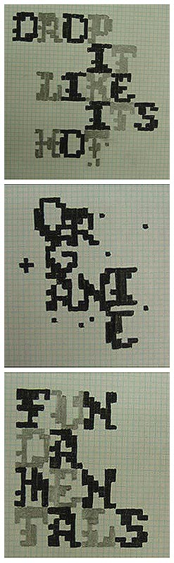
islam islam hello. i deem you mr bitmap letterman, not sure if i have that athority but we will make believe i do for this instant. Rather than commenting on your post here.. . I'll post on what you showed in class last.. . because it isn't up yet I'll write on what i remember and we'll leave analysis till its posted. ANYWAYS 7x7, is that what you called it? well I think the name can be a lot more than that based on everything you told us about the face. I like the concept of your seven continents. different fun intriguing. I remember when you had pixeled out "7x7" it reminded me slightly of a world map.. . maybe this face could be more than just the regular character set. It could have possibly character that were iconic of physical land forms (countries, continents, etc.) take a bite, chew, swallow, and get that stuff on the computer!
Posted by britt hayes on February 8, 2006 04:58 AM


