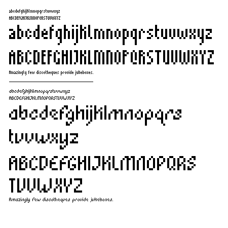
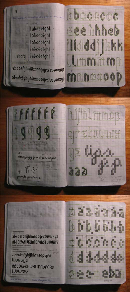


very nice work libby! they are both very nice but i will talk about the top example first. i lied. the way you lay out your examples is excellent. it's really hard for me to judge the quality of these things when you only see the big version. it HAS to be shown at actual size. setting a whole sentence allows me to judge the legibility of the face. *take note everyone*
okay, now the top example. first know that i'm a sucker for condensed faces for whatever reason, and this one feels condensed. i think the caps add to that feel more than the l.c. this is a pretty standard looking face (seen it before kind of thing) but several things give it that hint of character that becomes an important balance: the transitional serif on the l, the 'interstate'-like clipped descenders on g, j, y, the k that rises above the x-height, and then the condensed caps that still match quite well. very nice details.i'm jealous of your solution for the tail of the Q -- great idea there.
Posted by ty-nerd on February 2, 2006 04:51 AM
Nice work. I appreicate you laying out the type in a sentence, it makes it much easier to critque.
The first face is completely functional but lacks personality, you probably know that.
I love the second one though, at least I love the lowercase. The uppercase and I are still just close friends. You may want to consider how the Uppercase letters reads/sits next to the lowercase. For example 'Amazingly' looks a bit like 'flmazingly'. Also 'v' and 'u' are tuff to discriminate. You've drawn the lower leg of the 'k' vertically, making is seems like an u.c., forexample 'jukebox' looks like 'jvKebox'. I think you've got a great face altogether with the second one.
Posted by stimmel on February 2, 2006 10:13 AM
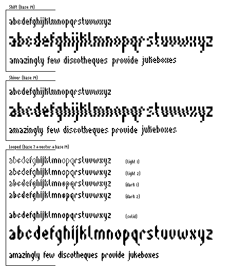
I want to see full paragraphs set in this! Maybe the paragraph will look as if it was moving in one direction. I'd also like to see it in a more graphic, logoish context where some of the slopes of the letters just come together. hot stuff though!
Posted by Islam Elsedoudi on February 5, 2006 05:19 PM
number 2 is the winner from my desk. how lovely, the sentance definitely helps to look look at it. and I agree with islam in setting a paragraph would be awesome to see. the characters have such a wonderful energetic personality. something i noticed in looking at the sentance, and maybe this is just a mistake, but the "r" seems so extended that the spacing between the "r" and "o" in "provide" is akward. just a thought.
does the baby have a name yet?
Posted by britt on February 8, 2006 12:39 AM


