
Hi Matt,
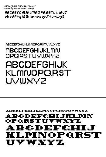
I like the explorations you have started so far. In your middle typeface I like the inner negative space on your P and R. The letters B C D E F G P R S all seem to be reading at the same weight. However the others seem to be a reading as a lighter weight to me. The B is cool looking but I wonder if it is legible outside of this context B. Try putting into a sentence and see if it hold up as a B. Good work.
Renee
Posted by Reneé Seward on January 31, 2006 10:31 PM
go for the last one.
that direction seems more unique for a pixel font.
look at antique wood type as a general direction -- not necessarily 'western' stuff, but somewhere in there.
try making the bowls of the P and R the same size as the crossbar on E and F. see what happens. actually, for the R, just cut the bottom bowl off your B and add your existing leg. does that look weird?
you should always make sure your last name is colored red whenever appearing in print.
Posted by tyler on February 2, 2006 04:58 AM
Kick ass matt. Your faces show a nice range of exploration and an attention to detail and high level of craft. Personally, I favor the 2nd one. It would be interesting to see how it transfers into lower case while still trying to maintain the openness. The Q U and Y seems to be reading a little lighter than the majority, but otherwise great job.
Posted by stimmel on February 2, 2006 09:45 AM
Matt,
Nice range of exploration across the 3 versions, but definitely the 3rd set; it's a =very= interesting historical/digital hybrid. However, I'd like to call out the "c" as looking a little too much like a "g"; when you build some panagrams, the context might make this more obvious. Also, have you experimented with the way the "x" and "z" might shift? Currently, they seem to be bookends to the "y".
Nice work!
Posted by tracy on February 2, 2006 10:03 AM
woohoo. face number (1) liken on the lowercase g and q that space is great. fun how eyes like to play connect the dots. face number (2) There are some nice beautiful thin characters there. If that is what you are going for a few of them seem a bit heavy in comparison. and I like the "n" but proportionally to the "m" it seems too wide. maybe it needs to narrow or mr. "m" needs to gain some girth.
Posted by britt on February 8, 2006 12:33 AM


