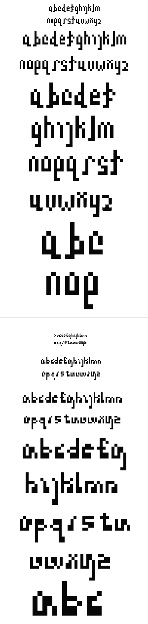

I really like your first typeface...the varying x-heigh emphasises certain letters over others, which could make some very interesting arrangements when spelling out words. The only one I think doesn't fit is the x, i want that one to match the lower x-heighted letters. Also, try moving up the pixles for the dots of the i and j just one pixle. Right now I am reading them as part of the letters, as a curve.
About your second typeface...that g is CRAZZZY! : )
Posted by colleen simon on February 2, 2006 04:53 PM
You have some really interesting letters in this type face. the f and t are definitely my favorite in the top one because they're trying something new. The f is rocking a cool serif while the t looks like it's almost dancing. I like what you're trying to do with the bottom one in terms of the block of pixels in each, but the f is looking more like a capital E. keep it up.
Posted by Islam Elsedoudi on February 5, 2006 05:27 PM
Nice explorations Candace. The first one is reading better at scale,
although there's something quirky about the 2nd one. Its amazing
what can happen with an extra pixel or two. The texture on the
3rd one from the bottom on the top set is nice, it kind of vibrates.
I want to see some of the capital letters that go with the lowercase,
and I'm also curious about italics. ::::
Posted by adrienne yancey on February 6, 2006 08:18 AM
The first face has an attractive toughness to it, due to the very striking and hard vertical strokes on some of the letterforms. I'd like to see the h and k have a little tail on the left stroke like the others, to make them fit in better. I think dipping below the baseline is a very clever trick to create the appearance of a greater variation in x-height and adds a little bounce in the flow of the characters.
Posted by Doug Alexander on February 6, 2006 08:27 PM
loving the top one.
seeing the a and b lowercase though I can't help to think about what would happen in a word like.. . ummm.. . able you might need an "ab" ligature. could be a fun thing to do with some of those letter combinations.
Posted by britt hayes on February 8, 2006 12:08 AM


