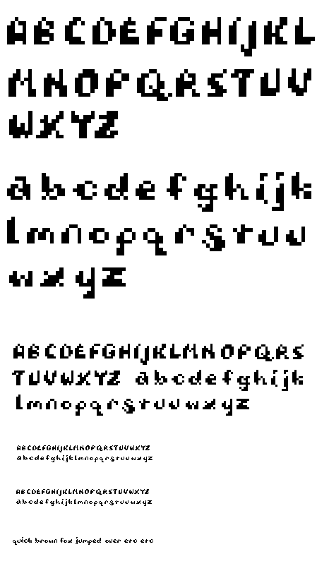

glmisenh, so your face looks like your sketchbook. what a wonderful thing whether you ment to or not. And what a pretty Q. are the characters to be heavy at the top or bottom? most I think went the bottom route, and if that is what you are doing.. . the K,O,T,X,Y,Z are a little inconsistant with the rest. the lower case s also is very cool, but a little big compared to the rest of the lowercases and could you maybe try that little s as a big S?
Posted by britt hayes on February 7, 2006 11:57 PM
graham, there's a nice play with weight given to these letterforms.
i love the Q, what a nice tail. the face looks good at actual scale too.
what base are you working from? some letters look longer than others.
i agree with britt about the lowercase s, it seems unproportional. also
the lowercase z looks too bold, delete/shift a few pixels.
Posted by adrienne yancey on February 8, 2006 09:11 AM
I agree that the "s" may not be a good fit for your lowercase, but it is a beautiful form. It should find a home somewhere, for sure. Maybe it moves out and starts it's own typeface... I also love the little upward slant several of the letters have...the H, J, K, U, and y are the best examples.
Posted by Libby Levi on February 10, 2006 10:52 PM


