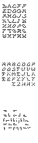


Hi Amber,
I am liking the way the negative space is flowing through your top experiment. I am having difficulty making out a few of the letters. Such as the three letters after the N and the letter after the y on the bottom row.
The face at the bottom in interesting. At the size I am seeing it at it looks as though it could be someones handwriting. Can wait to see all of the letter in this experiment.
Posted by Reneé Seward on February 7, 2006 09:47 PM
I really like your last experiment.. . the characters remind me of snails! cute little crawling snails. some crawl up some crawl down others west or east.. . If you keep working with it maybe they are moving characters.. . little animated gif what what. Just thoughts.
Posted by britt hayes on February 7, 2006 11:47 PM
I agree with Renee about the top experiment, the letterforms
are given some room to breathe, creating a nice pattern.
I like the elongated ascenders on the bottom one.
I'd love to see it big and how the words work in a sentence
structure. Curious to what happens if the descenders are
treated the same way.
Posted by adrienne yancey on February 8, 2006 08:57 AM
All three of your faces have a wonderful quality of motion. I would love to see them all bigger, as adrienne said, so that I can really tell what's happening in the details. From here, it looks like the second face has a really interesting system going. I think that little errant pixel outside many of the forms - like the "v" or "j" could produce some pretty interesting effects when you start setting sentences or paragraphs. Also, in the first face, are there multiple versions of some of the letters? Possibly "alt" versions for different applications?
Posted by Libby Levi on February 10, 2006 10:46 PM
the top face reminds me a little of 'hair crimes' -- a pretty amazing family:
http://www.typekut.com/fonts_info.php-kid=4.htm
i know it's not really the same, but the breaking and offsetting of the forms reminded me.
can you try setting some words in each face? it would help determine success -- they look like they'd actually be more interesting (and possibly more legible even) when you see that visual flow through a few words. right now i don't see a consistent rationale for why the forms become divided. sometimes it looks like a cut, sometimes more of a mirroring effect. very nice ideas though, on all three.
Posted by tyler on February 14, 2006 10:43 PM


