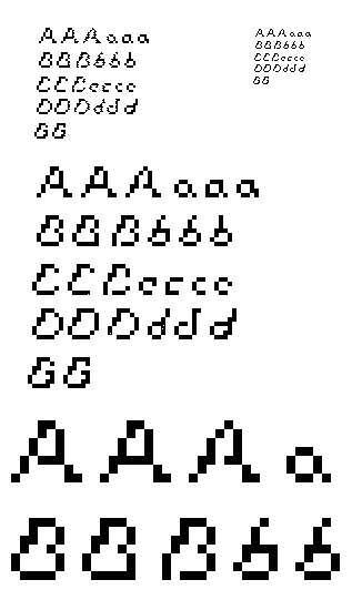

You first typeface has a really cool approach! I love that you are creating a typeface with three different levels. I can see a progression through the 3 steps that has a sense of movement in them. The first letters look very stable and motionless whereas the third letters look as if they are zooming off the page! Awesome, lets see this through the entire alphabet and maybe a sentence that demonstrates this idea of movement.
Posted by Colleen on February 19, 2006 03:53 PM
I had some issues sending the correct file type which turned out some interesting motion effects up on the top left.
Posted by rachel gamage on February 19, 2006 04:57 PM
dude it looks good at actual size! it has kinda a heart balloon (maybe those mickey ballons from disneworld) feel, free of cares, clean, innocent, floaty/flying etc. Nice variation/trials you have there. I lookforward to update 2!
Posted by britt hayes on February 23, 2006 05:59 AM
some awesome things come from mistakes...go with it!!
Posted by colleen simon on February 23, 2006 05:44 PM


