Post process work for online review...
. . . . . . . . . .
How to post an image. [1] Upload your image to a server of your choice. You can use your NC State www space if you like. The image can be a gif or jpg no larger than 300px x 300px. [2] post a reply to this thread wherein you place the following code that will point to your image:
<img src="http://www. ">
Of course you will need to complete the specific URL for your image.

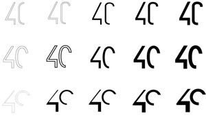
this might be a little small to read but ... is this worth continuing?... suggestions/comments/anything please!
Posted by chrissie cobble on September 27, 2006 11:11 PM
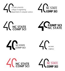
Chrissie: The top row of "40's" has the best presencenot too heavy. The first one could work with a reiteration of the incomplete 'O' as the 'C' for computer, but this would ride a line of being a little gimmicky. As for the type, don't jam it all into the space you have created. This kills the dynamism set up by the edited form. Move the text out of that space and look at it being secondary. It is competing with the "40" right now. Consider a single line of text (possibly all caps for a clean, simple line). The third row of "40's" is not bad, but I gather you want more life and love in this mark. Is this too expected? It sounds like you know.
Posted by Tony B. on September 28, 2006 12:51 AM
This is my second attempt at posting I hope it works...I like the exclamation point in the negative space, and Im playing around with filling it with a color. Biggest concern is reading it as a "40" Text integration is underway.

Posted by george on September 28, 2006 09:40 AM
George: Its good that you are considering the counterform. You are rightit is tough to make out what it is. The sense of linking/connecting is coming though a little. This is the best aspect of the mark. The mouse trailing off is playful. Maybe make the 'tail' longer/play up the gesture and length and simplify the 40. My guess is that you will get compsci folks who think a mouse is appropriate and those who do not. What other ways can you convey linking/connecting?
Posted by tony B. on September 28, 2006 11:34 AM
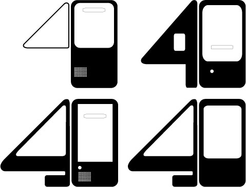
I started working on the "0" to make it look like an tower of computer. But i'm not sure if this style fits for them. Like Tony said to George, this might be not appropriat to compsci people. what do you guys think?
Posted by MaSaTaNaKa on September 28, 2006 07:18 PM
I think it works, i especially like the third one because the treatment of both forms work together, and the negative spaces retain the readability.
Posted by George on September 28, 2006 11:01 PM

I read the comments on George's post after I attempted this idea. Can anyone suggest a way to give my mouse friend a more direct computer science reference without losing him completely? I'm still addressing type, but as far is the icon is concerned, does anyone have any ideas?
Posted by jaime on September 28, 2006 11:38 PM


Posted by george on September 29, 2006 02:20 AM


