This is an open discovery phase so please share any comments you may have on the current CAM site, the future CAM site, other sites, audiences, accessibility, functionality, aesthetics, etc. Everything is in bounds and we hope you will comment freely. Many thanks for your feedback. It will be very helpful as we establish the site architecture and navigation.

Here are some of my intial ideas for the content etc for the new CAM site...
CAM WEBSITE
The content of CAMs website needs to exemplify its mission...
"Through contemporary art and design, CAM explores the role of creativity in everyday life to inspire understanding and appreciation of our changing world."
The website should also reflect CAM's programming tenets:
Thematic approach
Broad spectrum of artists
Innovative interpretative tools
Education & community
Are there design elements that the user can adjust to their liking? For example in myspace you can adjust your space through different editing programs also some websites let you adjust the font size & color can users save their preferences via their ip address?
Can the navigation of the site be adjusted according to the users interests ?
Content Outline:
About
The mission/vision
History
Future plans (w/ link to Contemporary Art Foundation)
Staff/ Board and contact info
Projects
Exhibitions, community projects, ed programs, events (anything that involves the public). I think it is better to organize this information in this way, instead of separated out
Will look like there is more going on and will allow overlap of all programmatic content
. How can this portion of site grow as CAMs programming expands?
Current Projects:
GROWTH exhibition project
Moore Square Museums Magnet Middle School Partnership
Exposure Time
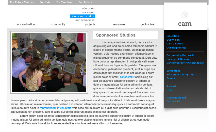
Sponsored Studio
Design CAMp
Resources
For teachers, kids, artists, some overlap with Projects and Dialog
Question: Are these pages of the website OR different interfaces?
Teacher Resources Link List: list of online resources for educators
Online Fun for Kids: link list to fun online activities for kids, include sponsored studio modules
Artist Resources: call for artists announcements, etc
Community Resources: links to community groups, Raleigh/Triangle event websites, university links, links to CAM community programs
Join Us
Fundraising
Volunteer Opportunities
Links to CAM events, ways to get involved
Dialog
A blog/ message board: On going communication between staff and board and the community
A podcast archive and download center. Can also listen to the casts online without downloading. Would feature interviews with artists and participants
links to related podcasts etc.
Posted by Nicole Welch on August 29, 2006 12:11 PM
Mina put forward these sites as reference:
Contemporary St. Louis
MCA Chicago
MCA Denver
New Museum
Contemporary Seattle
Walker
Posted by Denise on August 30, 2006 04:35 PM
another website to check out...
Wexner Center for the Arts
http://www.wexarts.org/
Posted by Nicole Welch on September 1, 2006 09:28 AM
this list of resources for educators!
wow. that wasn't on my radar at all (and should have been)
what this could end up being is some form of wiki, because the ultimate question is: are these valid resources, and if resources are just another form of information, shouldn't the community as a whole be allowed to update these resources?
in that case, resources for educators could be housed under the community forum... but it would have to be called a different name, because we have limited expectations of message boards. would some hybrid between these functions be useful for a section like this?
link:
MCA Australia
staying on top of newe technologies:
TechCrunch
Posted by Josh on September 1, 2006 05:36 PM
Thanks for the initial content information and list of art museum websites! The list so far definitely provides an interesting range of what can happen, but also this could be also an opportunity to play with the typical expectations of a museum website. Nothing too extreme that could jeopardize functionality and go beyond our timetable, just I think it would be important to ask questions on how information can be received and how the latest html/web technologies could be utilized to balance function and aesthetics. I think what Josh accomplished last semester with his website proposal (camicd.org) - how those colored interfaces could be controlled by the user - should be the types of things we should look at. On a more basic level, type-image hierarchies could be looked at as well: what if the CAM website wasn't just print information put onto the screen but rather more like a movie? Not only would this underscore the "innovative interpretative tools" tenet of CAM, but this could help distinguish itself from other contemporary museums.
The list continues...
# Whitney
# MOMA NYC
# MOMA NYC
# Tate
..more soon.
I also encourage anyone to post non-museum websites as well. It would be good to see what other inspiring things are out there, it might help break the "museum mold" so to speak.
Posted by Paul Venuto on September 5, 2006 12:09 AM
More sites
http://www.risd.edu/
the pull down content area is interesting, the floating navigation is cool but potentially annoying
http://www.artcenter.edu/
check out the scrolling image boxes on the right
http://www.mpsix.co.uk/
podcasting program example
this is probably beyond the scope pf this studio but what if we could have online tutorials for podcasting and then organize themed community projects that people can participate in by posting to our site?
http://www.thelighthouse.co.uk/index.php
Posted by Nicole Welch on September 5, 2006 02:13 PM
I know this jumps the gun, but Textpattern (http://textpattern.com/) is a content management system designed by a guy who wrote some good articles on A List Apart.
Questions I am asking as I map out the site:
What if the whole thing were chronologically organized- into past, present, future?
What if as much as possible were directly accessible from the home page, so that it is conceivable that a person can get all the info they need from one page, one click, possibly never even having to scroll down?
Posted by Amy C on September 5, 2006 04:57 PM
a few non-museum sites i found interesting...
http://www.hadw.com/ : i loved the unique navigation system
http://www.fitch.com : simple, but easy to navigate while still having sophistication
http://www.ideasonpurpose.com : another interesting navigation system, i also liked how controlled it was
from my research so far....i found that the sites i spend the most time with have a clear hierarchy of navigation, a site that is crowded with too much information on one page keeps me from staying interested.....so im using that to begin thinking & maping out the CAM site....i agree with Amy's idea of not having to scroll down, im much less likely to keep reading or even looking for something if i have to stop and scroll down the page
Posted by Jessica W on September 6, 2006 12:34 AM
what i heard in the meeting was that CAM is for everyone and we are ready to start organizing info and crank out all kinds of webby wonderfulness
Posted by Amy C on September 7, 2006 10:23 PM
See Graft Lab site. Frank Webb (who couldn't make it to the meeting last Wednesday) wrote: "...very interesting Web site with lots of movement, cool graphics and interesting navigation at the bottom of the page. ... worth looking at."
Posted by Denise on September 9, 2006 11:00 AM
I love the wexart site -engaging with the changing parts- and MCA australia is fantastic-I laughed a lot and got involved right away; MOMA is so busy as is the Tate site.
Besides 'visit us' and 'calendar' we may need other future content areas that we haven't even thought of yet. Looking forward to this Wednesday.
Posted by Mina on September 10, 2006 08:07 PM
One way of organizing our buckets (in parenthesis: alternate language)
ABOUT (CAM DEFINED, WELCOME, WHO WE ARE, YOU ARE CAM, ENOUGH WITH ACRONYMS, CAM WHO?)
-mission (vision, goals, the common objective, creed)
-contact
-history (past, the cam heritage, where cam began, the old cam)
-future (beyond the present, cam tomorrow, the new cam)
-link to CAF- might live as promo link somewhere
EVENTS (do CAM, CAM does, participate, involve, engage)
-community projects (citywide, local)
---Raleigh/Triangle events
---community groups
---Exposure Time
-educational programs (learning at cam, learn)
---sponsored studios
---university links
---design CAMp
---magnet school partnership
-exhibitions
---GROWTH exhibition project
-volunteer (cam needs you!, get cammy, be cam)
---join us (be cam, join cam)
---fundraising (contribute)
specific events should have promo links/ reinforced methods to arriving there
MEDIA (audio, podcast, listen now, listen, hear cam) this might be something that lives on the home page and doesn't have its own section
DIALOG (talk to cam, blog, conversation)
with a link to CAF & NCSU somewhere prominent. i left out the entry points teacher, artist, kid, because that does exclude some people and i think each might cross-interested and too difficult to predict & control what they'd want/expect to get out of the site.
Posted by Amy C on September 14, 2006 12:40 AM
Great dissection of the buckets, Amy. I was thinking on the same line regarding the CAF and COD links as well.
A possibility for a universal navigation at the top of the page either listed as below or put into drop down menus. I hoped for simplicity by limiting each section to no more than four links.
Promise
- Thematic approach
- Broad spectrum of artists
- Innovative interpretative tools
- Education & Community
Projects
- Current Exhibitions
- Community Projects
- Educational Programs
- Unique Events
Community
- Advisory Board + Staff
- Educators + Volunteers
- Future Center + DIrections
Support
- Volunteering
- Donate
- Contact
-----
A section for COD and CAF was originally put into the Community section of the NAV, but it seemed it would be more appropriate for both to have a prominent link on the main page OUTSIDE the navigation. This same line of thinking could be applied for the links for Exposure TIme, design CAMp, Magnet School Partnership, and GROWTH, you certainly would want to promote those with their own real estate on the main page as well.
Posted by Paul on September 14, 2006 12:32 PM
My current Language for CAM site with some word/language tweaking/crafting/brainstorming in the works. Any suggestions, comments, ect. would be appreciated! Thanks!
PHILOSOPHY
History
Goals/Vision
CAF
PEOPLE
Team CAM (includes info on staff, donors, board members,volunteers & potential employees)
Educators (useful links & education specific Programs offered through CAM)
Artists/Designers (useful links & relevant programming, info/bio on CAM featured artists)
PARTICIPATE
Visit (admission, accessibility, maps, directions, parking,ect.)
Support (how to donate, volunteer, possible employment)
PROGRAMS
On-going ( Middle School, COD Initiative, ect.)
Current (events, shows, openings, ect.)
DIALOG
Blogs
Podcasts
Contact Info (web, phone, email, specific people)
Posted by Jessica on September 14, 2006 05:21 PM
our goals
thematic exhibitions
dynamic approach toeducation
innovative interpretive tools
community outreach
cam + education
college of design
moore square middle school
art + graphic design studios
art + education resources
programs + events
title of upcoming event
exhibit archive
our community
building cam
raleigh downtown rejuvination
message board
support us
volunteering
giving
and then another link to the COD and a link for CAF would be pulled out separately from these
Posted by Josh on September 15, 2006 02:34 PM
recap of our Wed meeting
primary questions:
1. How should the site content be organized? What information can/should be combined, separated, or called-out?
2. What language best suits the primary/universal navigation? Is a secondary nav that focuses on audiences appropriate?
3. In the proposed sections and subsections (above), is something missing?
a few sites to review:
Posted by Tony Brock on September 16, 2006 09:15 AM
our motivation
history
philosophy
future
our projects
exhibitions
education
events
(important or current project, such as Design CAMp or Exposure Time, could also link directly from the home page, as part of a "featured" area that would allow visitors to jump directly to what they want)
our community
people
blog
resources
online activities
our supporters
NCSU college of design
CAF
Volunteer
Support CAM
I still think that it is important to have alternate entry points, perhaps named differently than the main navigation, to provide browsing opportunities to target audience. These links could lead to somewhat tailored pages that pull links important to that audience from all the buckets. While the divisions presented Wednesday may not be "it" yet, I think that eliminating them entirely will be losing an opportunity for members of these key audiences to make new connections and see the posiblities presented by CAM in a new way.
Posted by Libby Levi on September 17, 2006 03:56 PM
More development based on everyone's site navigation....this is my version of merging all our ideas into one. I particularly enjoy Libby's language for the navigation titles. This is my interpretation with some attempted collapsing of information. I also like how Amy has included the Triangle events and community groups. I also agree that keeping navigation options to a minimum (four within each main nav.) is a great idea and a good way to control the user's access and limit confusion because of too many options when searching for something.
9/18/2006
New Navigation/ Site Architecture
Our MOTIVATION
History
Future (development stages, building project, Raleigh Downtown rejuvenation)
Vision (thematic exhibitions, dynamic approach to education, innovative, interpretive tools, community outreach, ect.)
Our Community
Team CAM (who they are, what they do, possible employment)
Supporters (donors, volunteers, ect.)(can volunteering be put into support bucket?)
CAF (short blurb & link)
Our Projects
Exhibitions (Growth Exhibition, upcoming, ect.)
Education (COD-Univ. links, designCAMp, Sponsored studios, Magnet Middle School Partnership)
Events (Exposure Time, RDU/Relevant local events)
Our Dialog
Blog
Contact (feedback, info ect.)
Podcasts
Supplements (art, design, educational, community links)
Posted by Jessica on September 17, 2006 07:46 PM
Wow, OUR MOTIVATION is a great title, and the rest of the nominatives are really good too. I'm kind of leaning away from the redundancy of "our motivation, our dialogue, our, our, etc." After five or so links, it begins to sound proprietary, like the kid who won't share on the playground. The final dialogue item seems like it might be a bit crowded with parts that don't really fit. maybe it should be "participate" and could include a blog and an area for donation. we could tack a heading on that would be "resources" which would include supplements and podcasts and anything else that might be grab-bag material that wouldn't fit in a heading (or hasn't yet been forseen)
so, here's my revision:
Our Motivation
Education (highlighted initiative)?Our Vision (thematic exhibitions, dynamic approach to education, innovative, interpretive tools, community outreach)
Cam's Future (development stages, building project, Raleigh Downtown rejuvenation)
Our Beginnings
Community
Community Outreach (highlighted initiative)?People (who has been behind cam)?College of Design?Contemporary Art Foundation
Community Message Board
Projects
Exhibitions (Growth Exhibition, upcoming, ect.)?Educational Programs (COD-Univ. links, designCAMp, Sponsored studios, Magnet Middle School Partnership)?Events (Exposure Time, RDU/Relevant local events)
Resources
Podcast
Links (art, design, educational, community links)
Contact Us (feedback, info ect.)
Posted by Joshua Smith on September 18, 2006 02:56 AM
updates: so as of this morning, i roughed out a first idea. i'm gonna stop working on it and head in another direction
it's kinda tame
Posted by Joshua Smith on September 18, 2006 03:40 PM
The following summarizes the CAM committee feedback for the wireframes.
CAM WEB
WIREFRAME FEEDBACK
Main Page: prefer at least initially that all the content on the main page is visible without scrolling down open to scrolling once more is happening.
The Hierarchy
1. Universal Navigation: along the top?, prefer drop down vs. up sub-navigation so that there is room to grow without running out of space. Search function should be part of the universal navigation/ template.
2. Large Visual Content Area: this could be interactive and changing, highlighting whatever is most important at the time
3. Audience Portals: we like the idea of the audience portals as a secondary navigation. We preferred the Learners, Teachers, Makers categories but would like to add one more. This fourth group would capture the general art lover We struggled over what this group would be named Lovers? These portals would lead to resource links including highlighted CAM events/info relevant to the audience. (see Denises content area post)
4. Links to COD, CAF, For Press (press release archive), and Calendar
Posted by Nicole Welch on September 19, 2006 04:16 PM
You could look at www.nng.com This is the site of the Neilsen Norman Group. They have publications at http://www.nngroup.com/reports/ that deal with many of the issues that challenge the class.
But they are very detailed. I have one of theirs called "Designing Web sites to maximize press relations" and it is 165pp long. http://www.nngroup.com/reports/pr/index.html
I also have a copy of a book called "Research-based Web design and usability guidelines" by Koyani, Bailey and Nall. It is intended for information-oriented Web sites (especially science) but it is very clearly presented and many of the recommendations are universal. It is also long at 231pp but it has lots of pictures!
Posted by Frank Webb on September 19, 2006 06:01 PM
I also like the link for "Kids" thta Josh has in his latest image
Posted by Frank Webb on September 19, 2006 06:04 PM
Notes on our small group meeting RE: categories and sub-categories.
+++++++++++++++++++++++++++++
The following main categories (in bold) separated by "us" and "you" would comprise the universal navigation.
(Categories about you')
Experience
......Education/Exploration
............DesignCAMp
............Interactive Tools
............Middle School
......Exhibitions
......Events
......CAMmunity
......Calendar
Interact
......Blog
...........Blog threads/categories
......Podcasts
......Links
......Downtown
Get Involved
......Volunteer
......Donate
......Opportunities
+Search
(Categories about us)
Evolution
......History
............Beginning
............Warehouse district home
............COD partnership
............Downtown Renaissance
......Vision
............Statement of principles and values
............Programming
............Permanent Museum Building
............Interactive Interpretive Tools
......Staff
......Board
+Contact : staff response email
++++++++++++++++++++++
The following are secondary access categories cross-referencing above categories and sub-categories and would appear on the homepage only:
ART and DESIGN :
......TEACHERS
......EXPLORERS
......LOVERS
......MAKERS
......PUBLISHERS*
+++++++++++++++++++++++
Other portals, locations to be determined:
College of Design
Contemporary Art Foundation
*Press (add Publishers to the above personalized links?)
Posted by Denise on September 19, 2006 06:08 PM
A few comments, Denise, All:
Thanks for the list/sitemap. We need to be careful that the main nav lists do not get too long. The class will take a look at secondary pages and review the necessity of a full sitemap as the primary nav. What you don't want to do is get in the habit of adding future content areas into the main nav liststhis is better played out as folks drill down into the site and through secondary nav elements. For example: Calendar could be pulled out and become a dynamic zone on the homepage with its own prominence or Events could be subordinated into the calendar while current events become prominent on the homepage. Options...
+ Differentiation is very important so I would caution an approach that is seemingly synonymous as the follow 3 are: Experience / Interact / Get Involved. With the universal nav, there is a threshold where folks shouldn't have to play a guessing game beyond a second or two. I like the call to action these words convey and personally wouldnt have too much of an issue with them, but they may be too much alike for a general audience. For browsing purposes, OK. For a categorical search, a little soft.
+ Connotations/additional contextual references: Evolution, Lover? Thoughts?
+ COD is not preferred by the college brand guidelines. It gets long, but we dont have much of a choice.
+ Adding many specialized audiences can become a burdenare these areas that will be maintained on a regular basis or quicklinks? We can talk further on this. Publishers to the blogs?
GREAT! Thanks! Much to consider in the overall site architecture. More soon...
...
Thanks for the references, Frank. Jakob and Don...the super tag team of UX.
Posted by tony brock on September 19, 2006 08:19 PM
As far as Evolution goes, that could be really confusing for people who stumble upon the site without an initial directive. (What is cam anyway, and are they anti-creationism? I need to know what cam's starting with before i need to know it isn't that any more...)
Frank, these are excellent links, especially the reference to a very important part of our audienced: the pr people who are just regurgitating what they see on the site. Let's get them to the meat of it as clearly and quickly as possible!
Lover made me smile. It's my speculation that anyone considering him or herself an art lover would understand this terminology and embrace it. Typography would be key in preventing the word, "lover," from becoming an orphan... (lovers, like Virginia?)
Posted by Josh Posh on September 19, 2006 09:47 PM
what should we be doing with the word cam?
if it's in a sentence like, "I support cam." it seems like it should be capitalized, Cam, but it seems like cam almost wants to be a phoneme. Should it be CAM? then it seems like an abbreviation for something. should it be  so that lower-case characters have a cap height but the word still has prominence as a proper noun?
conundrums
Posted by Joshua Smith on September 19, 2006 11:03 PM
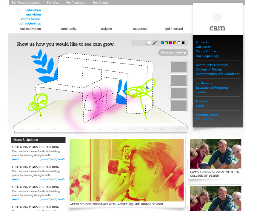
first iterations.


Posted by Libby on September 20, 2006 01:05 AM
Main Page:

Secondary Page:

Streamlined, maybe too much so. A direction to consider.
A Few things:
- The first pulldown menu on the universal nav is at the "press" state, which would be CSS-controlled typography, not an image.
- Also, the central image with the CAM logo would contain handdrawn, artistic elements that would animate/be interactive.
Posted by Paul on September 20, 2006 01:18 AM
Hey Libby!
I really like where you're starting to take this with a mutable feel. There may be a lot that we can still do with a page that is manipulable, and it's hot that someone else is giving it a go. One suggestion right off the bat is: what can we do with nothing at all? It might be the time when gradients and shadows fall off the face of the earth. Your second image is great at dealing with that minimalism as an æsthetic.
Paul, the image generation ideas for the page are great! (it could be unconsciously diagramming the user's navigation patterns, anything, it reorients anyone to consider... hey, i'm an artist. i caused form!) I think the serif looks really appealing at the small scale. Maybe there's a different treatment for the bigger serifs?


Posted by Joshua Brian Smith on September 20, 2006 05:19 AM
You guys are awesome. Here's my latest:
Posted by Amy C on September 24, 2006 04:29 PM
What about a continuously changing space made out of the ideas surrounding cam, kind of like the pipeline visualizations that were so horrible in windows 95, except this would be created with the typography supplied by community dialogue. here's an example of that motion on the homepage... (not necessarily the words-beget-center idea) click me!!!
Posted by Joshua Smith on September 24, 2006 09:22 PM

Posted by Joshua Smith on September 24, 2006 10:48 PM
From Frank Webb:
Denise,
Great job! Im so glad to see this progress and to read your positive comments about the class and the outcomes. I am only sorry that Ive been unable to contribute anything meaningful beyond that original meeting. I would have loved to be more involved. The class has greatly improved on the recommendations from our first meeting and the outcome looks impressive; the architecture outlined in the attachment makes a lot of sense.
Some comments:
1. As you may know Ive been developing fact sheets on CAM (based on other peoples previous writing) that will for the basis for a press kit, Board briefings, Web content and other collateral. We ran the draft past Linda and Carson to get the CAF perspective and check for errors. They made the important point that CAM is to serve the Triangle community and beyond and, while it is an important anchor for the downtown rejuvenation, we must always be sure to stress that it is not just that. I agree and want to be sure that your Web architecture, the channel and page titles respond to that to counterbalance the local feel that may come from being presented as a part of the College of Design. I dont have a specific suggestion
2. Where are we going to put info on the staff, board, etc?
3. I see contact information under the employment section but no contact us link.
Regarding the visual work, how are we tying this into the identity development, which I see leading not only to a logo but also the design vocabulary and color palette? I understand the need to press on with the Web site development but is there a chance that we shall later be retrofitting alternative visual elements and would that be a problem?
Once again, great job. Congratulations to Tony and the class.
Frank
Posted by Frank Webb on October 9, 2006 09:05 PM
MOMA has an interesting approach to the image banner that is "sophisticated" and more "modern" than ours is looking right now as an interactive space. Check it out....maybe they are on to something?
Posted by Jessica on November 8, 2006 11:03 AM


